Initial ideas
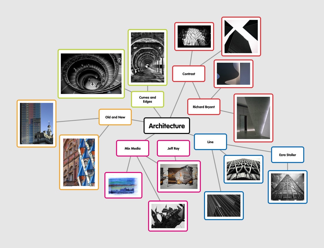
Mindmaps for unit two ideas and starting points.
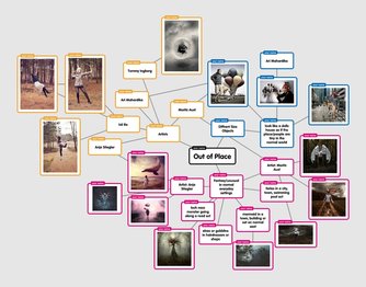
Out of Place
|
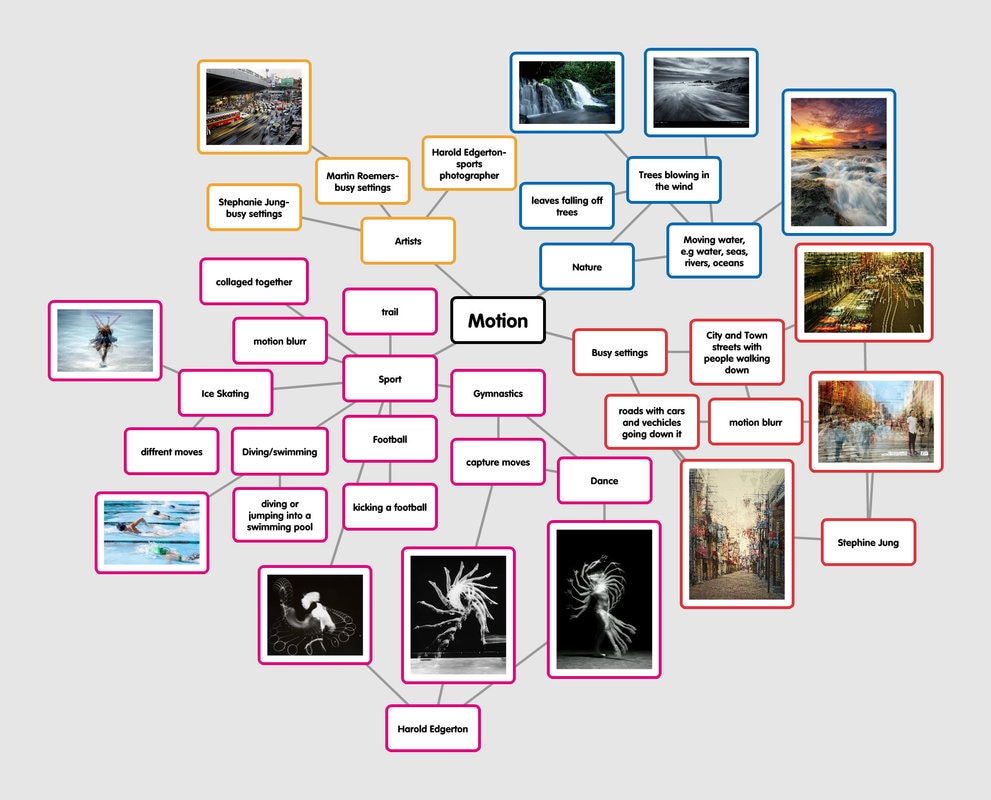
Motion
|
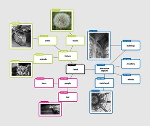
Detail
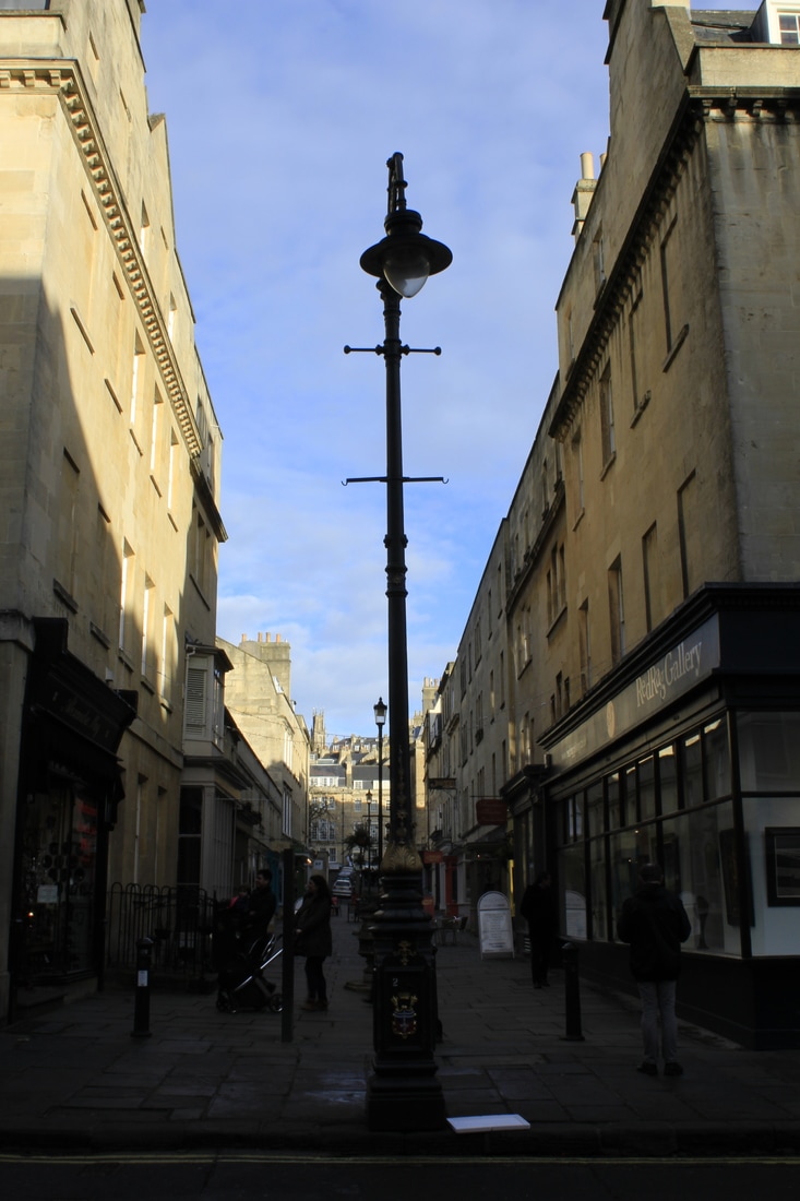
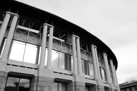
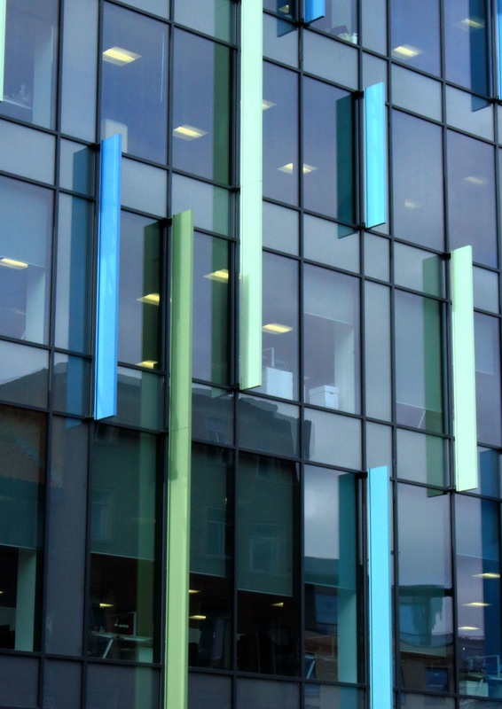
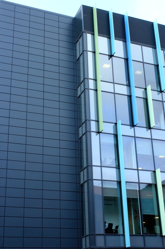
Architecture
architecture
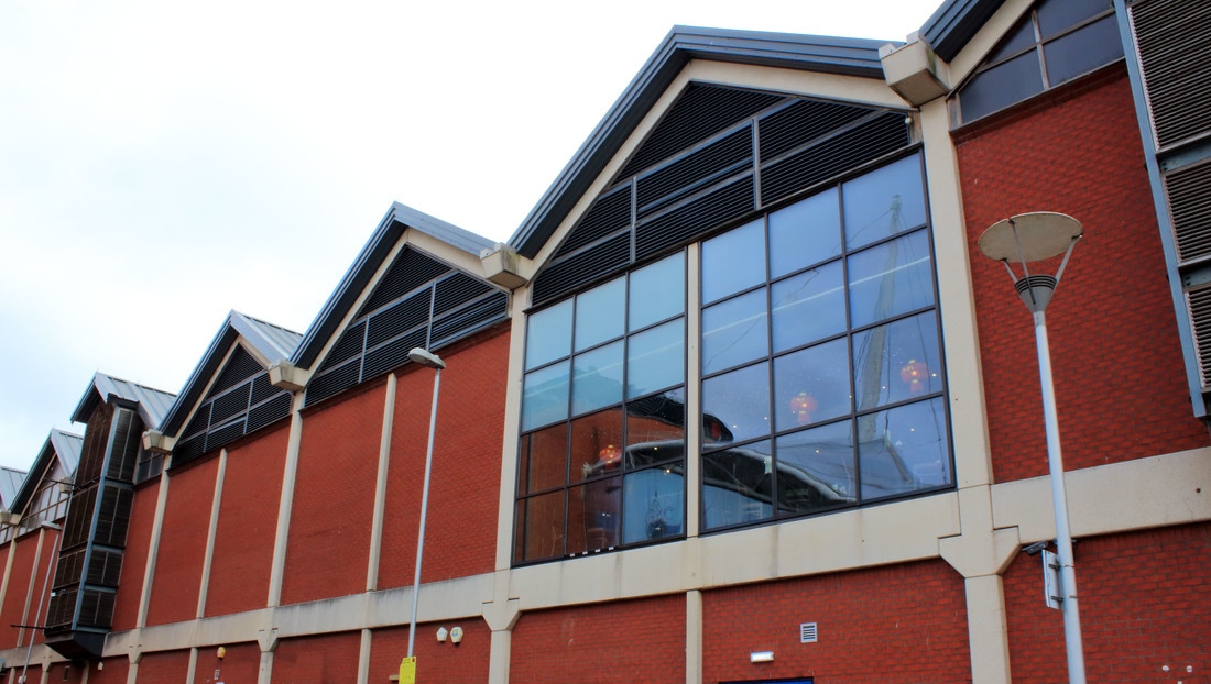
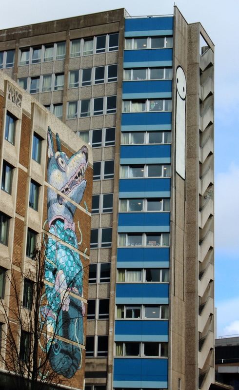
For Unit Two of GCSE Photography I am going to explore the project of Architecture, I want to look at different types of architecture from old to modern. I also want to look at both the interior and exterior architecture of buildings and explore different ways of photographing buildings by exploring the different angles that the images can be taken from. I also want to experiment with different ways in which to present my images and with this in mind I want to explore ways in which images can be manipulated after printing. I have chosen architecture as I feel there are many different directions I could take and it offers lots of variety. There are many aspects to architecture and I feel it will be interesting to explore this.
MOODBOARD
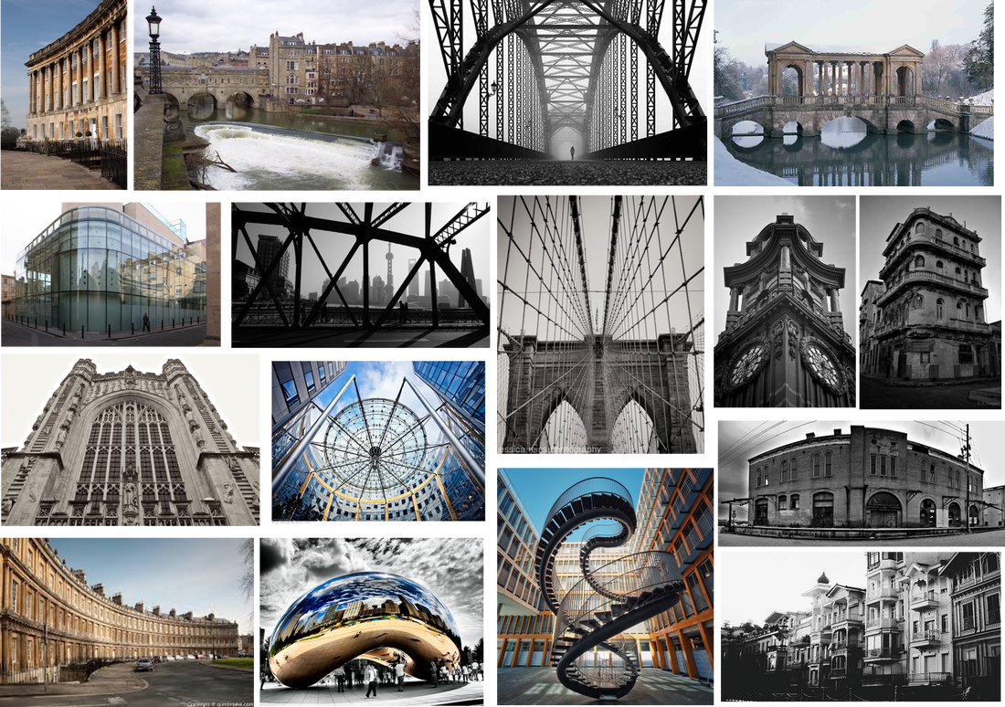
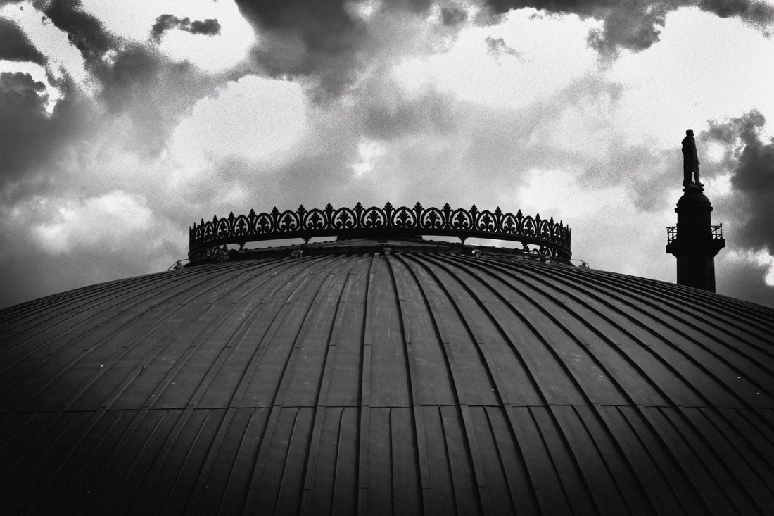
shoot one
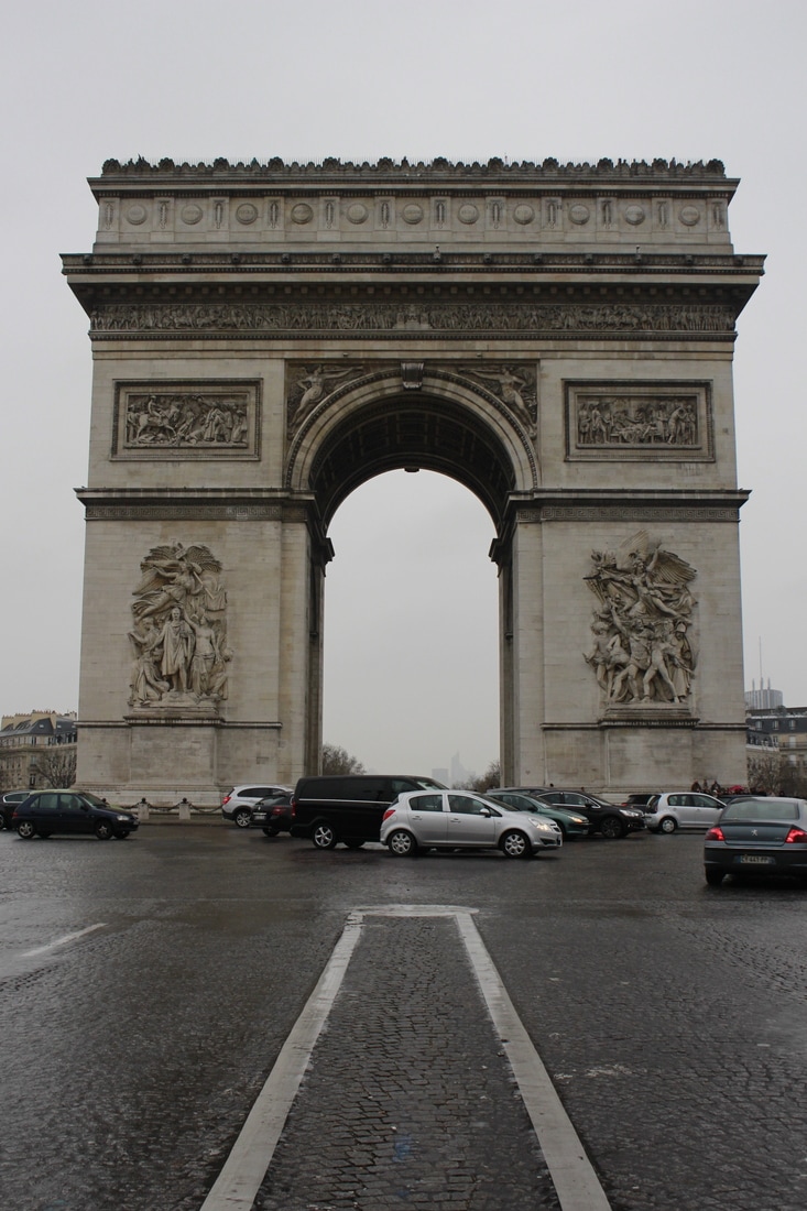
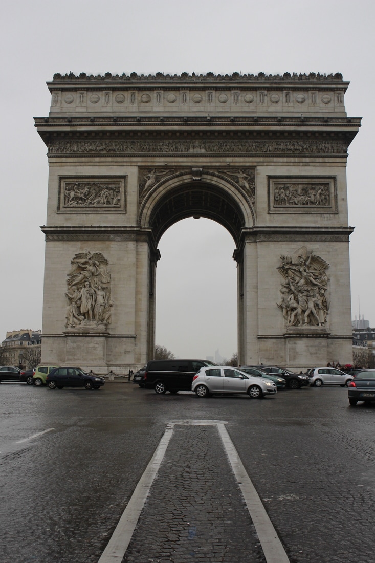
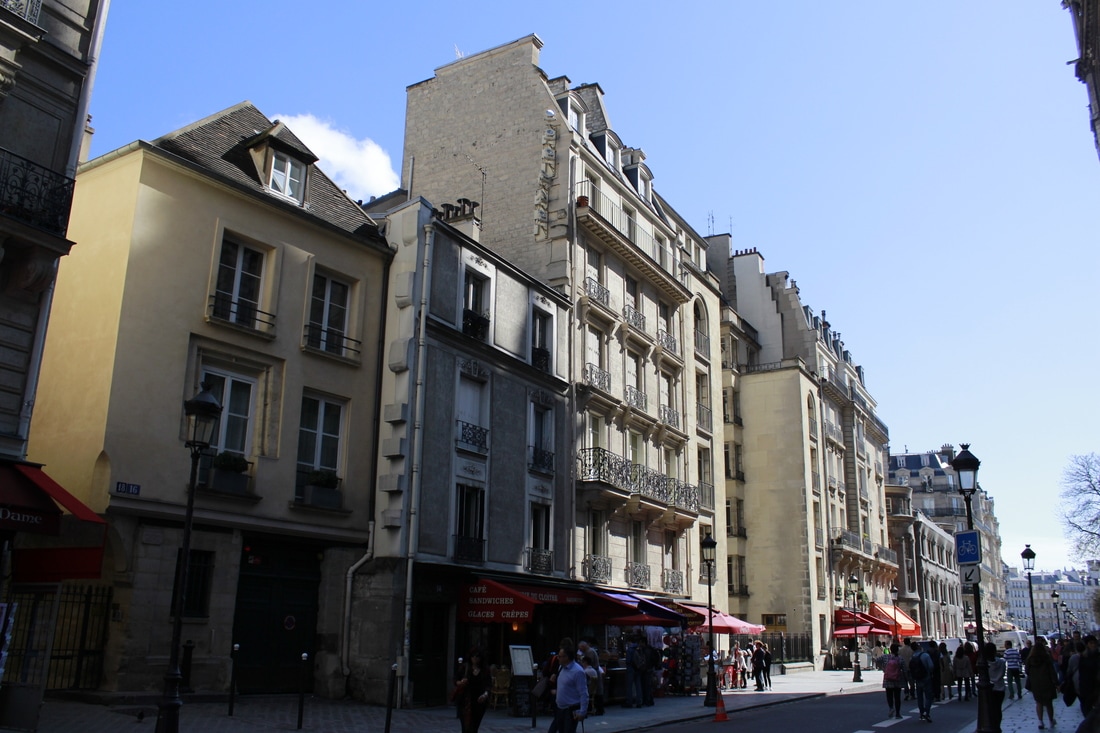
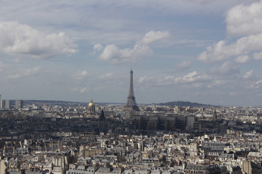
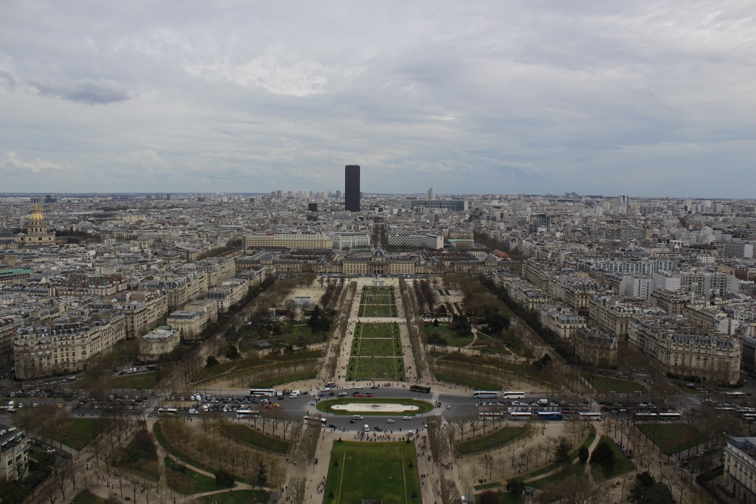
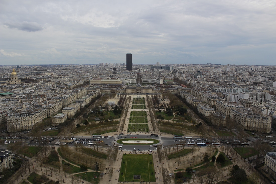
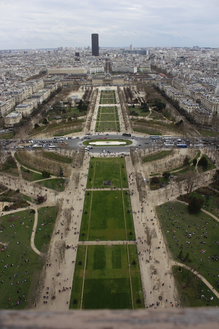
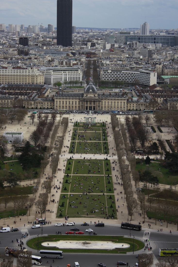
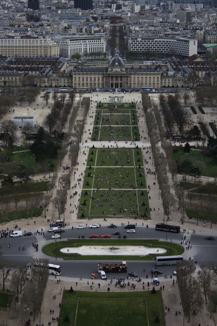
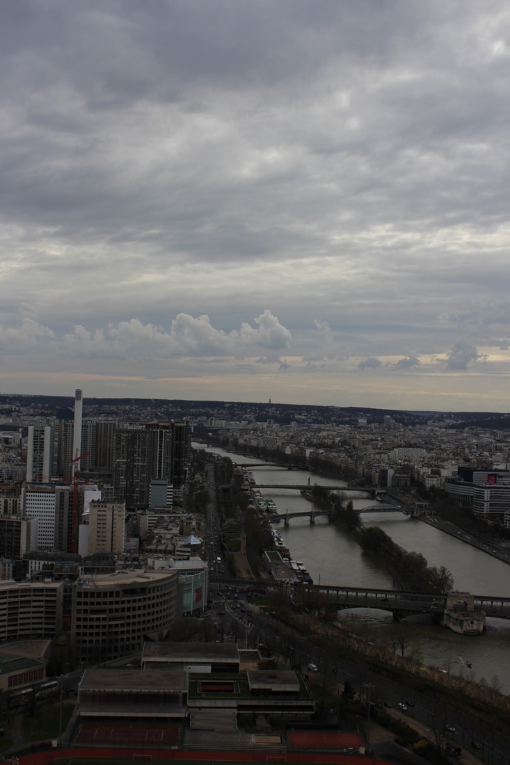
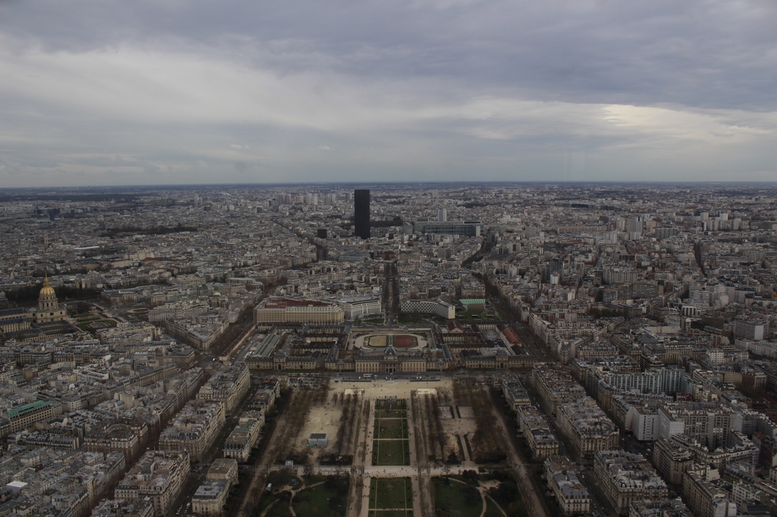
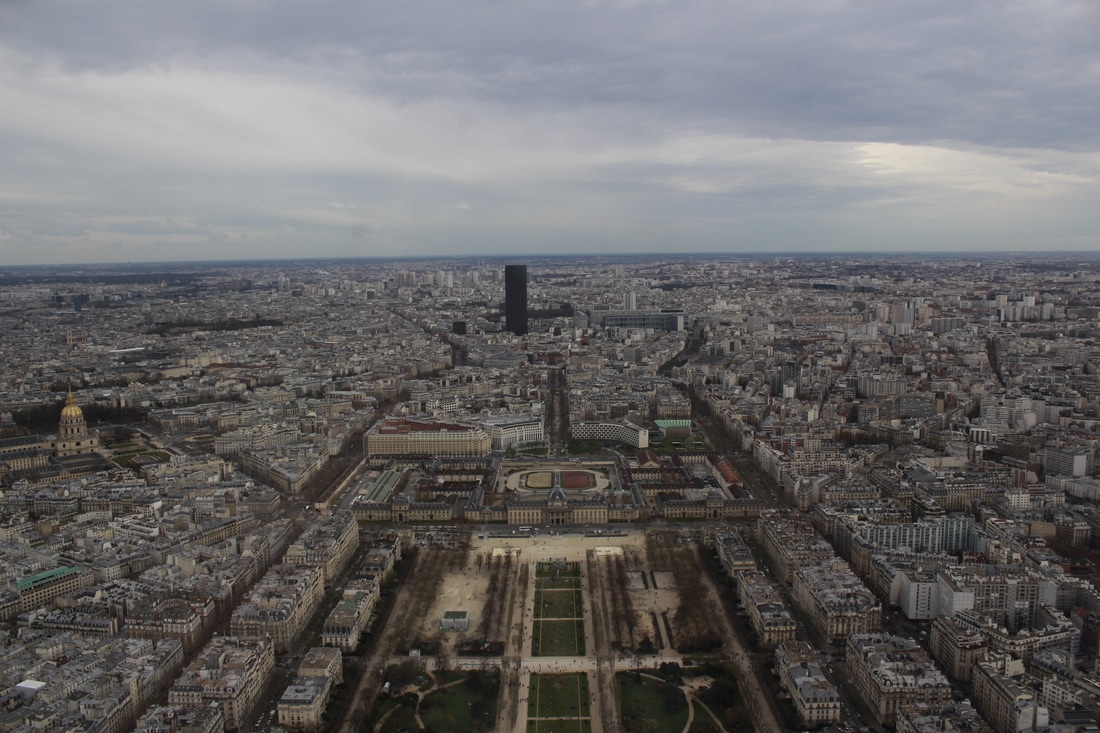
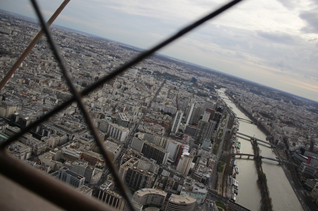
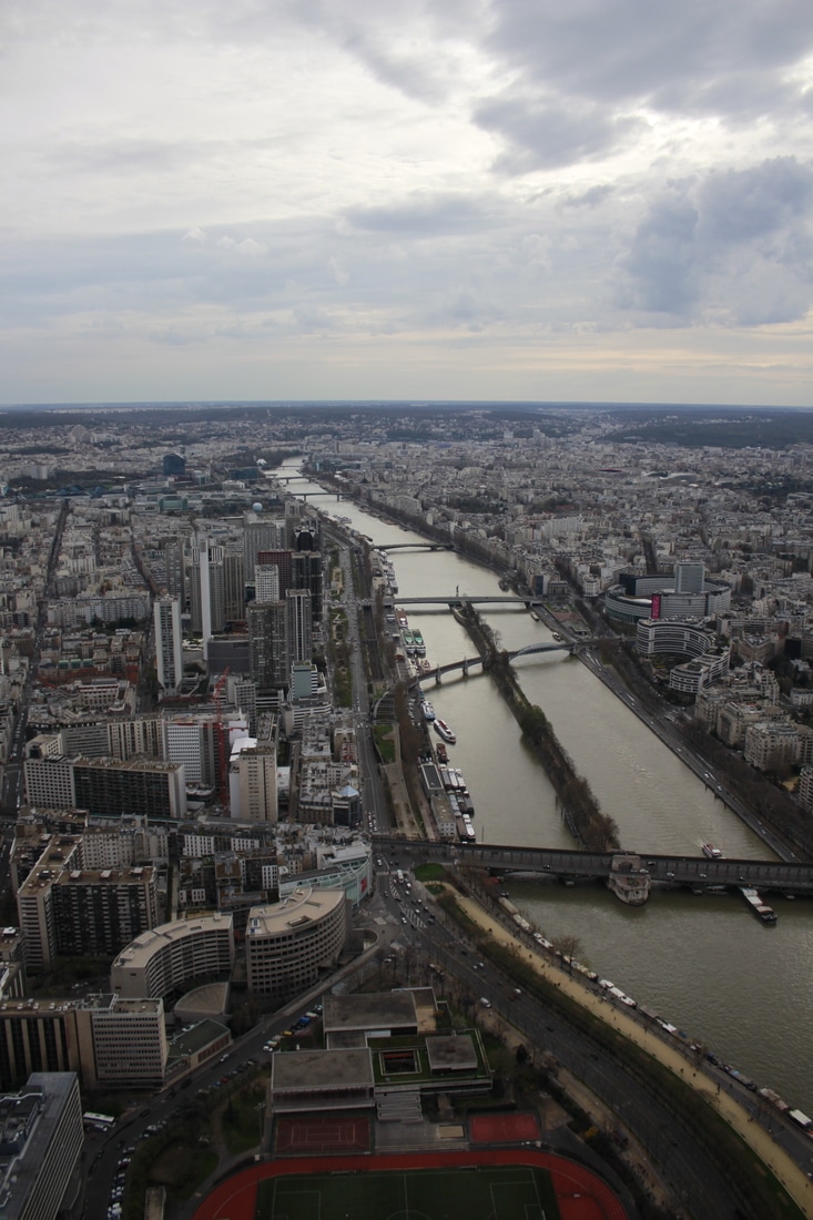
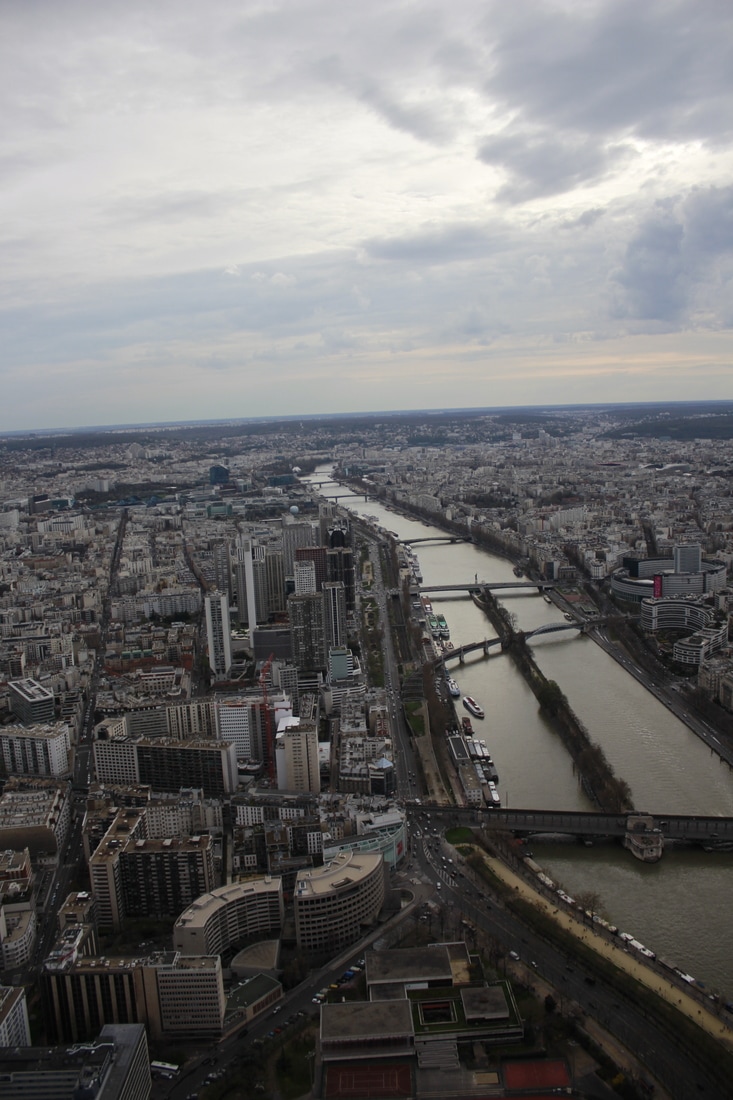
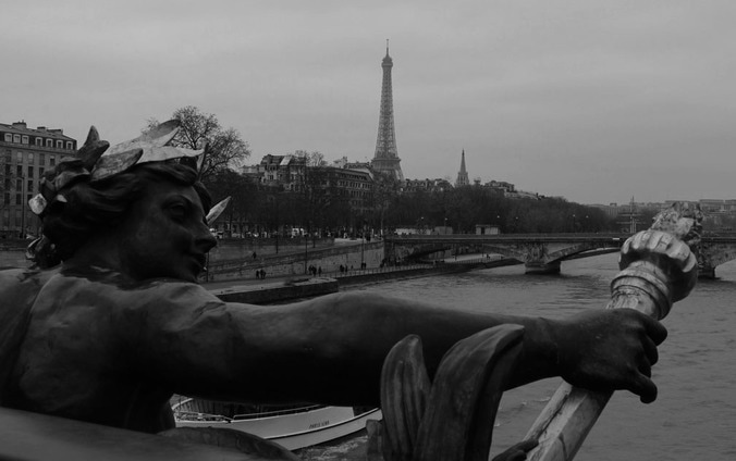
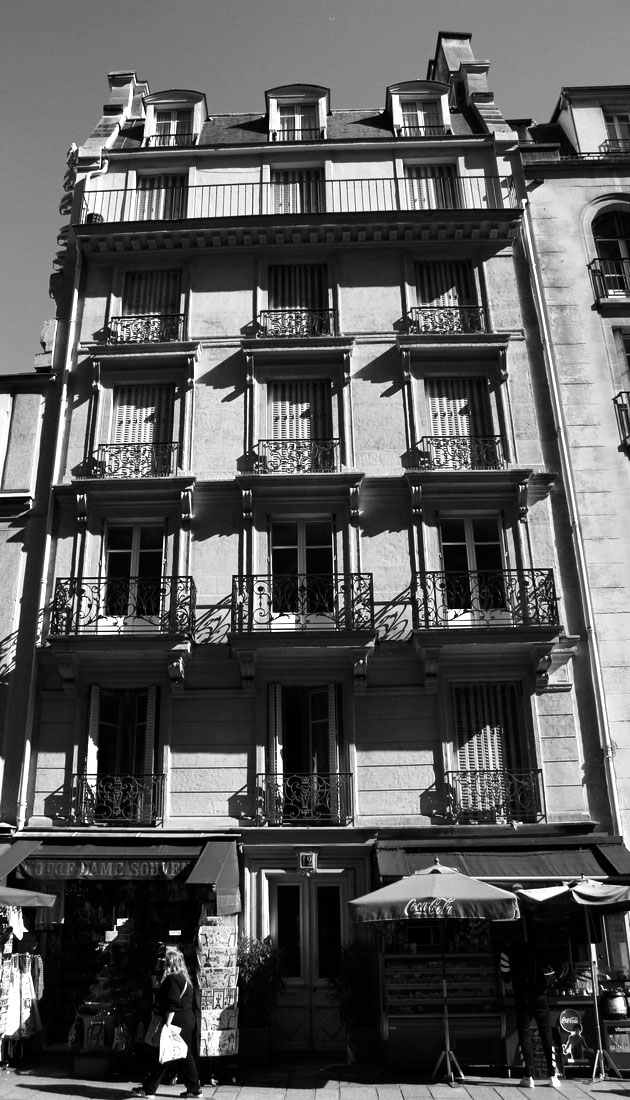
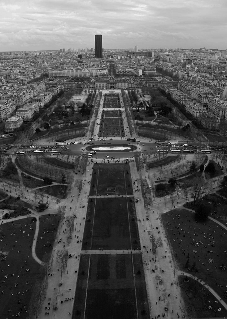
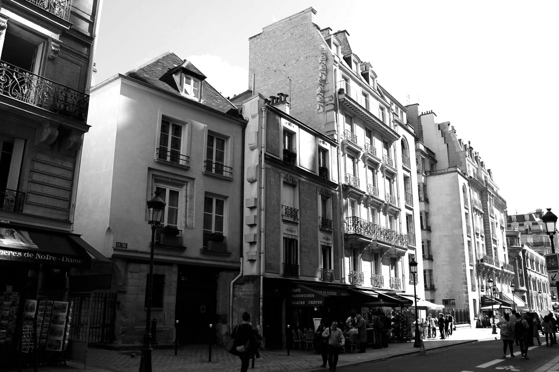
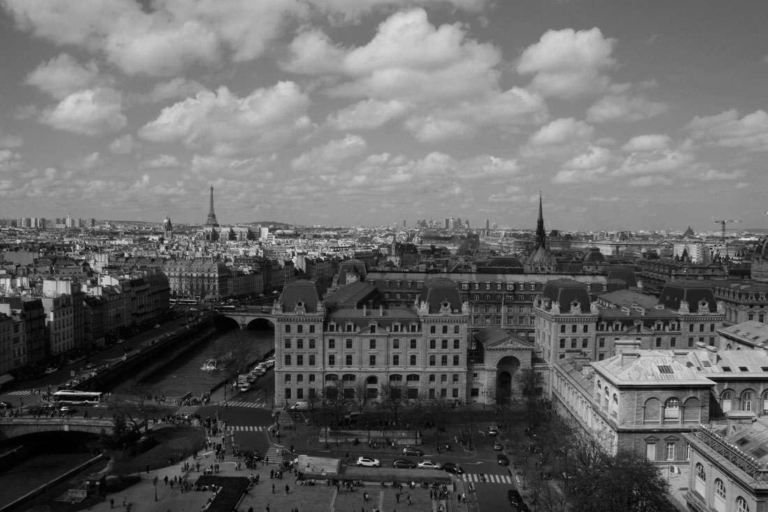
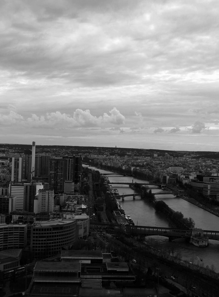
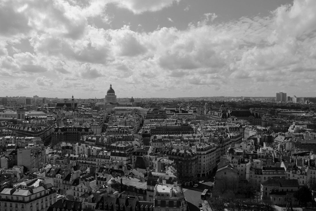
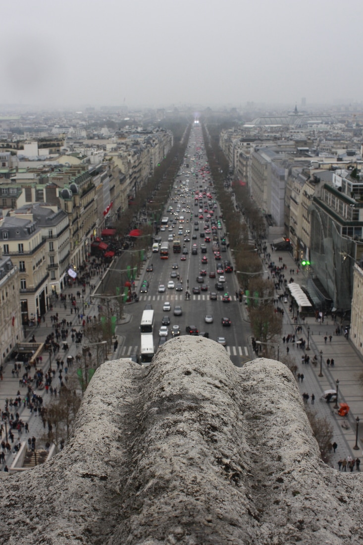
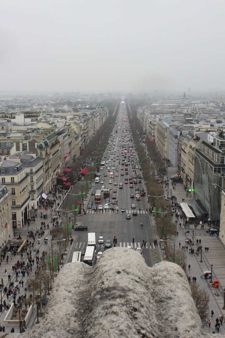
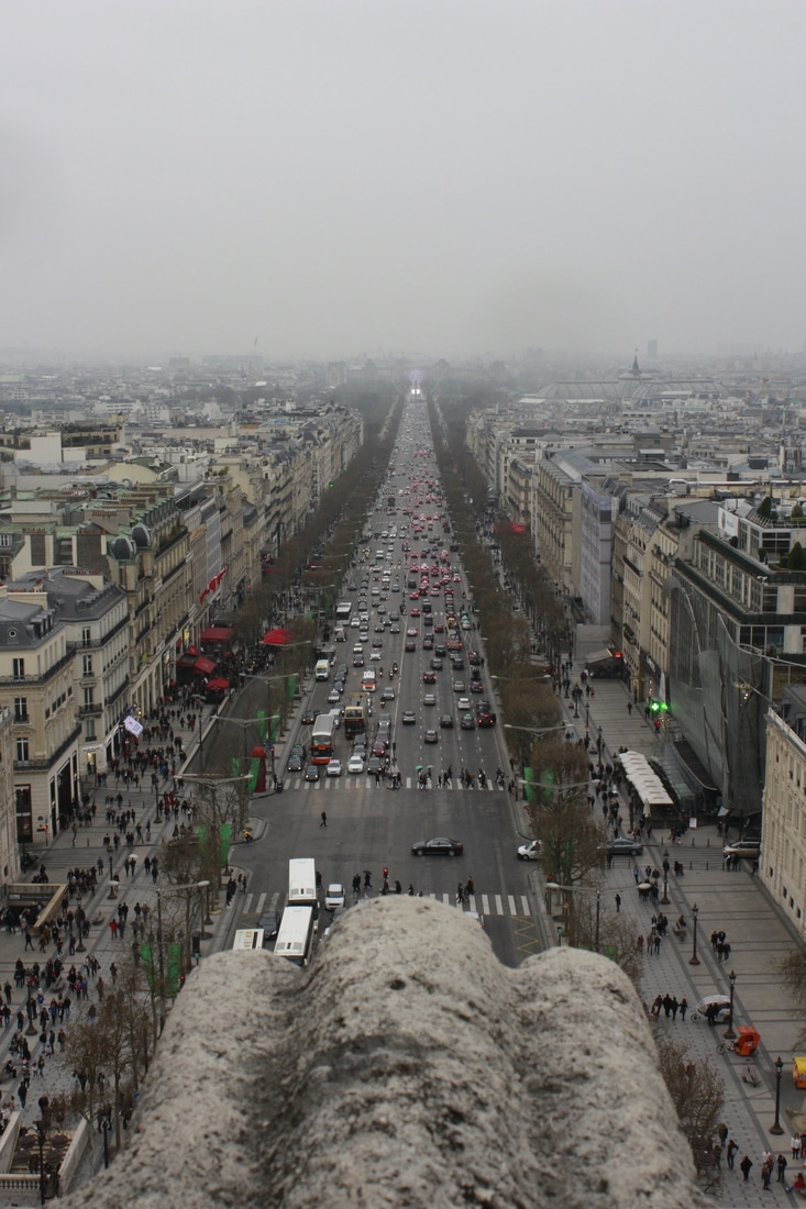
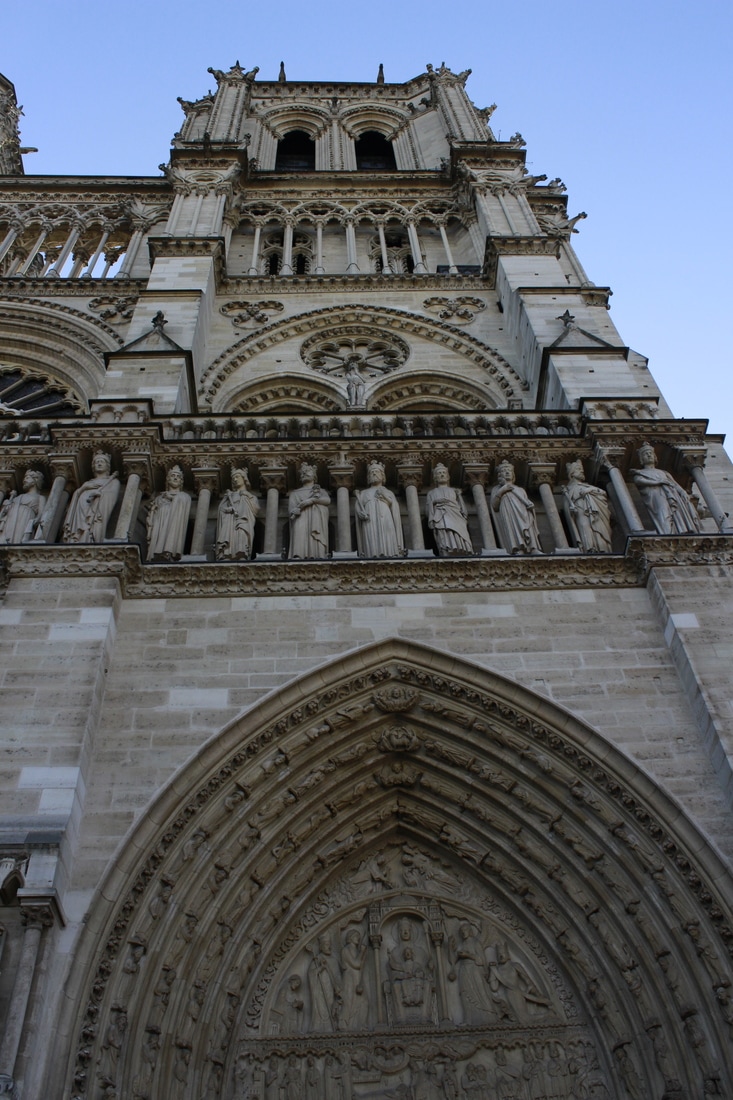
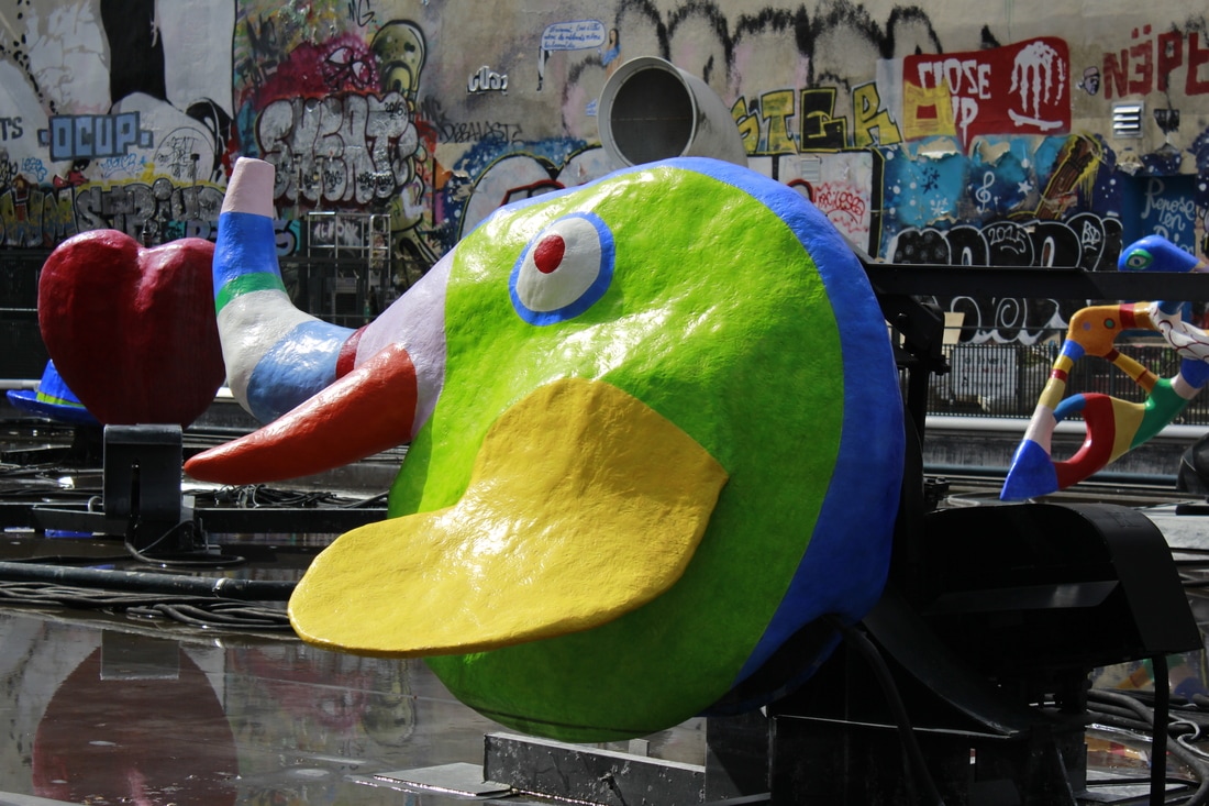
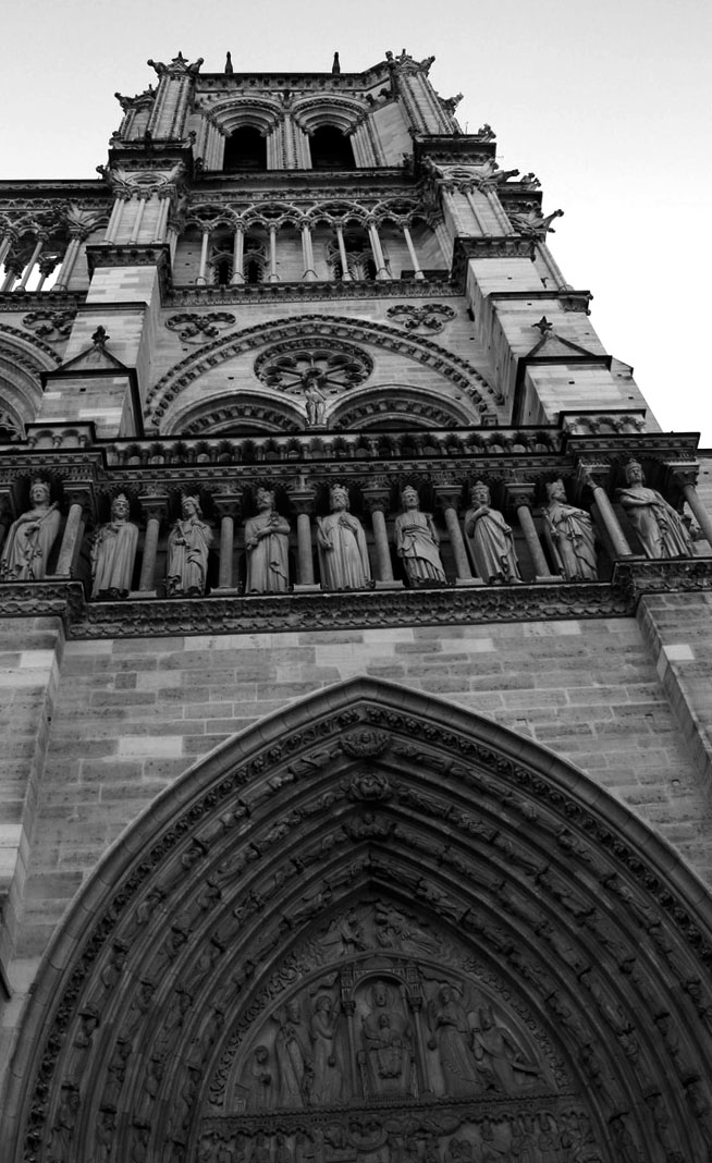
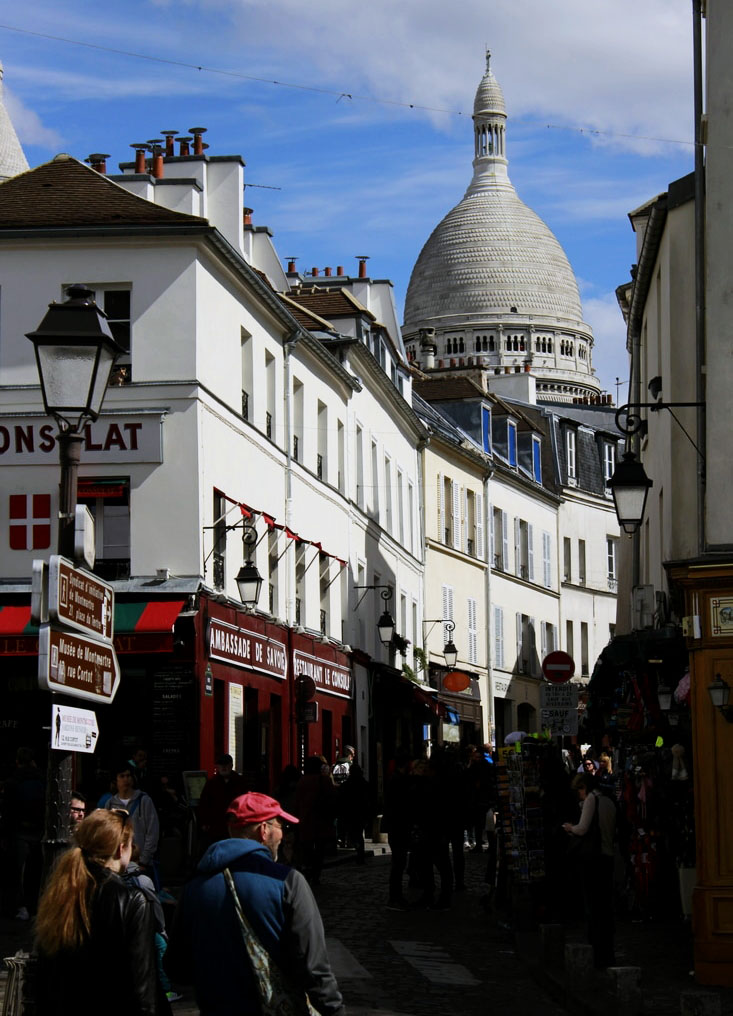
Plan: For this shoot I am aiming to take photos of different buildings and architecture. I am going to look at single buildings but also skylines. As this is my first shoot I am going to focus on taking a variety of different images to help me explore my initial thoughts about architectural photography. I am going to conduct this shoot in Paris as I will be travelling there at the beginning of this unit and it is a city that contains a great range of beautiful architecture. I will need a camera.

|
|
Critique:
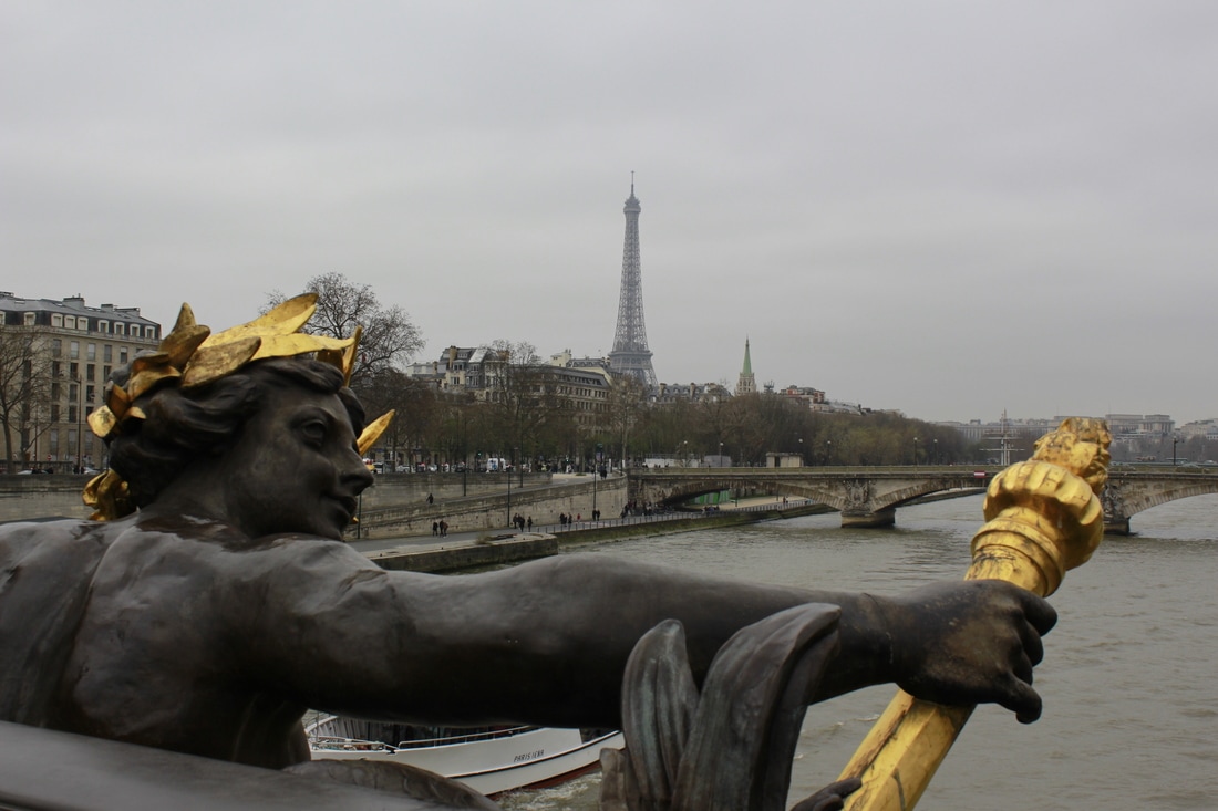
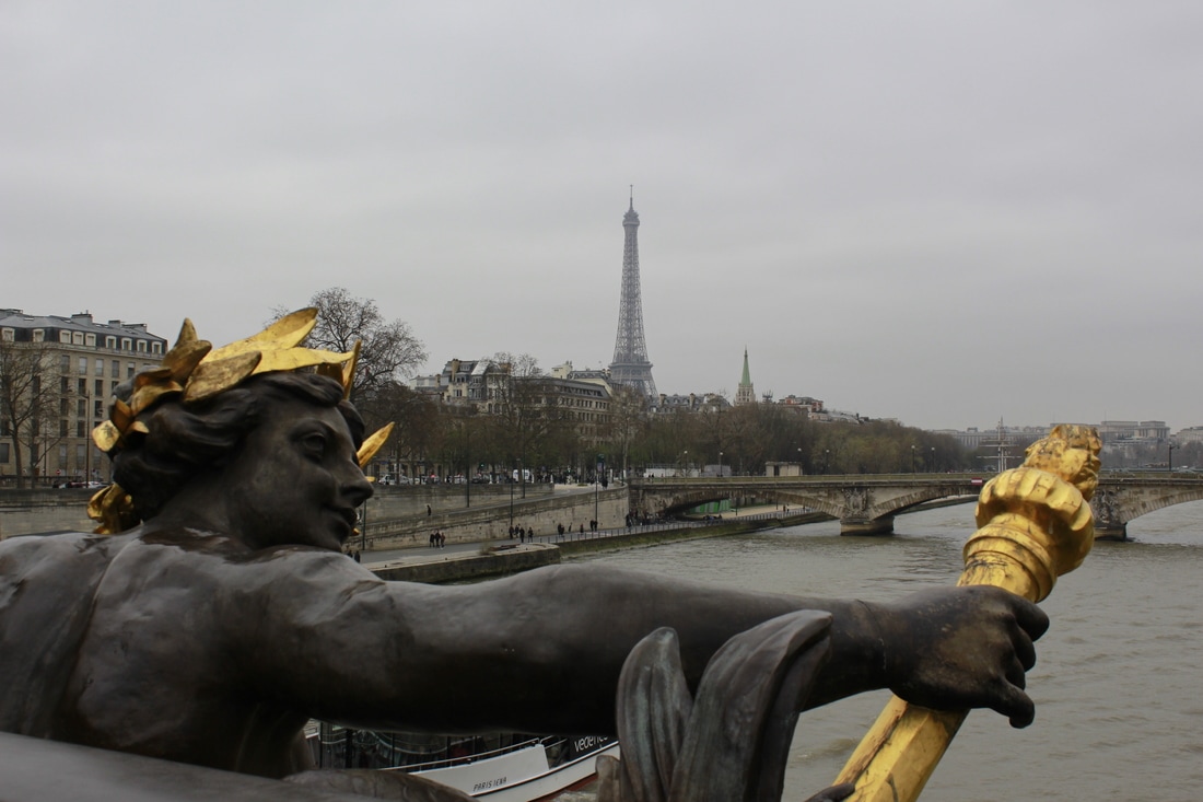
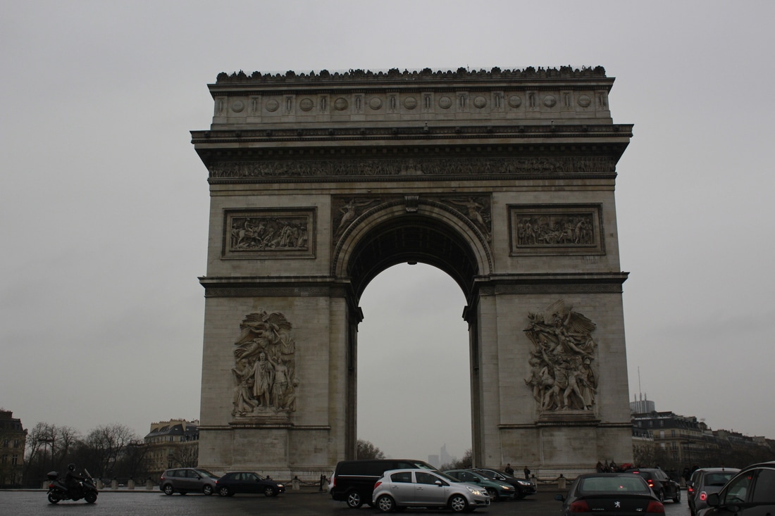
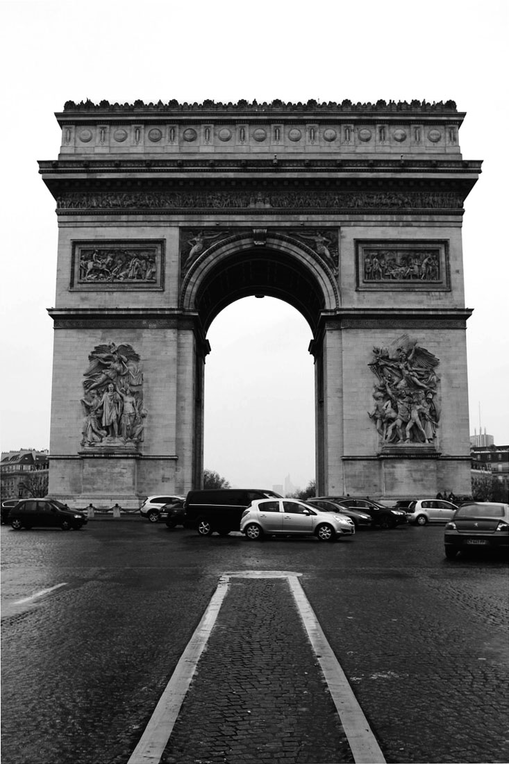
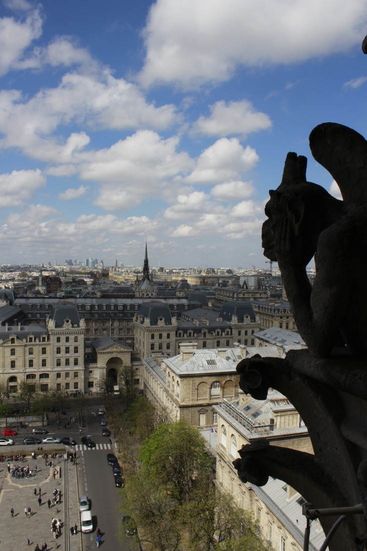
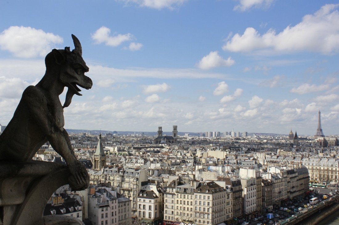
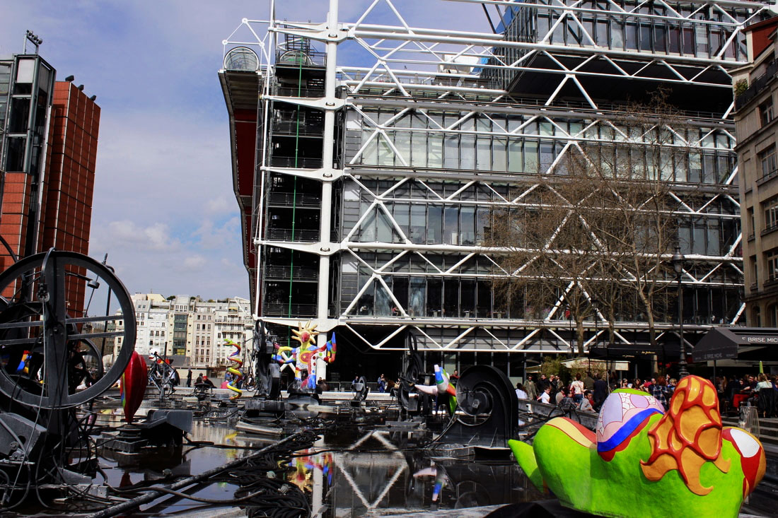
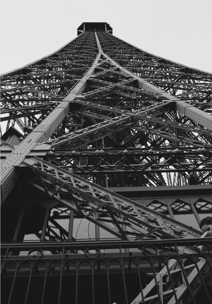
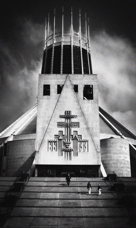
WWW: I was very pleased with the variety of images that this shoot allowed me to take and I was pleased that I was able to take images from many different periods of history and architecture. The photographs of single buildings are more effective than the skylines as I feel the skylines are often too busy and lack precision and detail. I particularly like the first image that has a statue in the foreground and the Eiffel Tower in the background. I think the detail of the statue combined with the iconic image, gives a different perspective to the classic images and is therefore more unusual and effective.
EBI: I don't think the wide angle, sky lines (with lots of buildings) are as effective at showing the detail of architecture. Whilst I like the single building images and they provide great memory shots, they are very similar to many iconic Parisian images. I would like to consider how famous architecture and iconic images can be photographed and presented in a more original way.
Next Steps: I need to focus more on single buildings rather than skylines, the detail in buildings and how images can be photographed in a more original way.
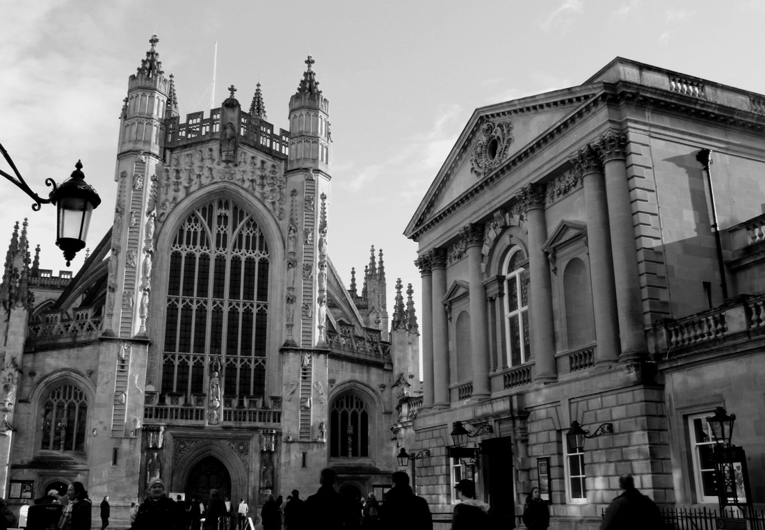
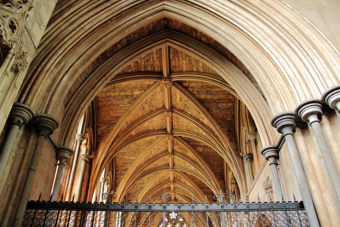
Frederick H. Evans: critical analysis
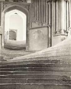
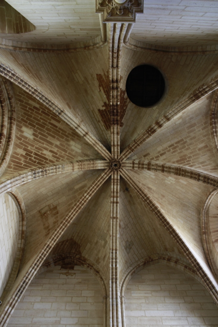
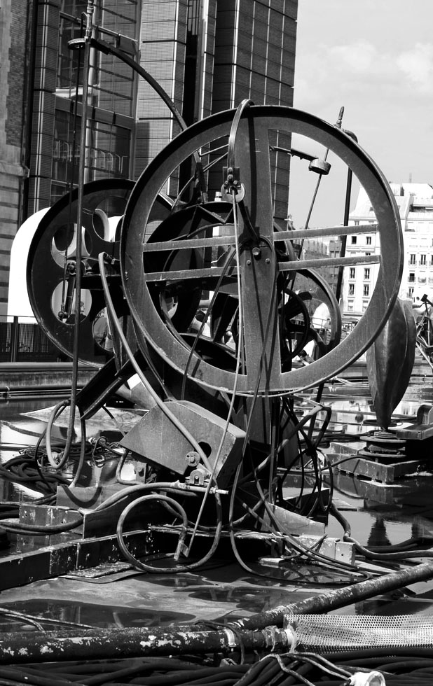
This photograph was taken by Frederick H. Evans (a British photographer) , it's call 'Sea of Steps' and was taken in Wells in 1903. He was a photographer of landscapes and architecture. He gave up photography after World War Two, as platinum was scarce and he was unable to print. In this photograph there are a couple of flights of stairs, an arch way and some pillars. This photo fits very well with the name it has been given. It relates to the title as there are lots of steps in the photograph and they are the main focal point of the photo, the steps also don't look straight they look slightly curved and wavy so it could look like the sea made of steps. The steps may also not be straight as its a old building. The photo is in black and white, the light white is effective as it draws attention to the lines on the steps and columns, if it had been more modern and taken in color it may have been less effective as the colour may have drawn the attention away from the lines and created shapes. I think the use of contrasting horizontal, vertical and curved lines create a very dramatic image. I like this photo because I like the use of black and white, the variety of different strong lines in the photo and the way the black and white emphasises this.
shoot two
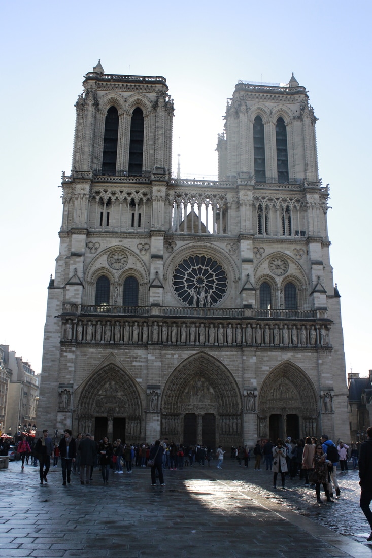
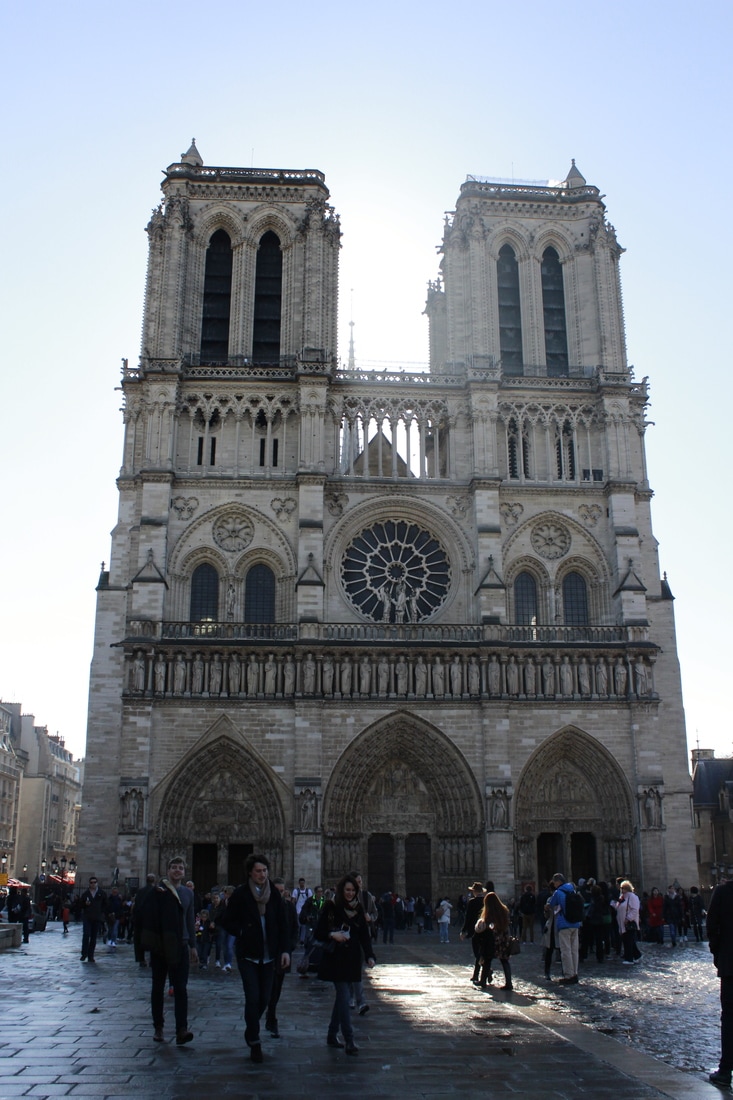
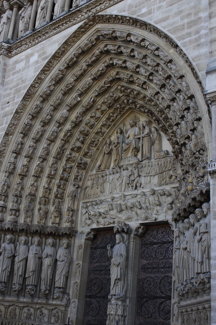
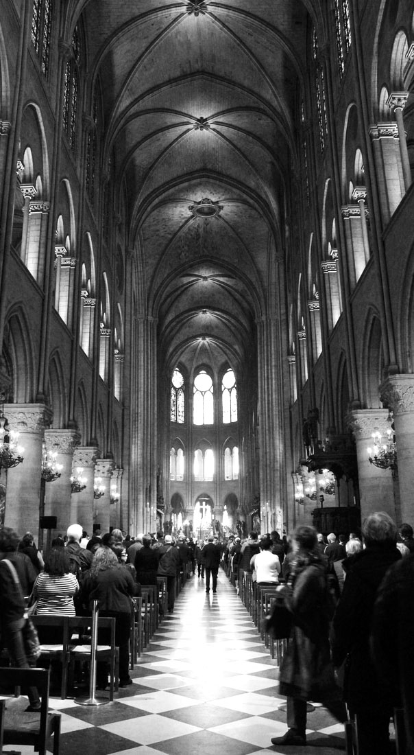
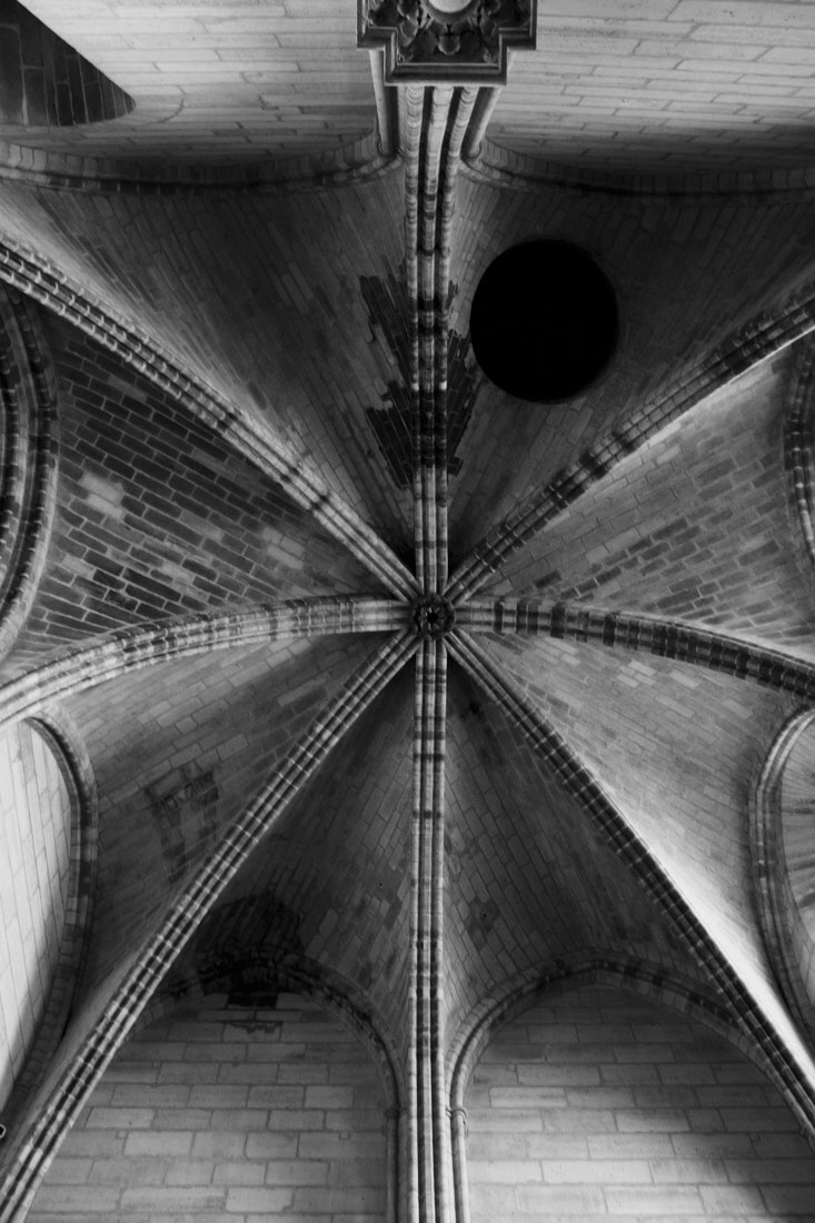
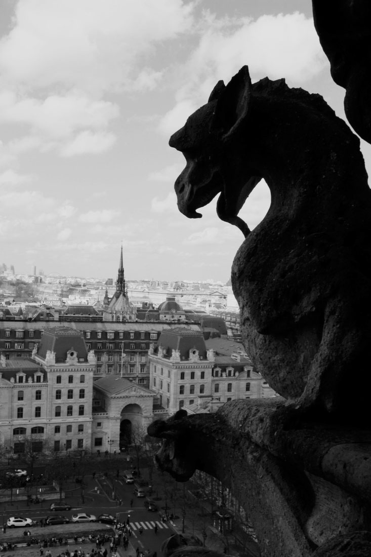
Plan: My second photo shoot will also be conducted in Paris. With this second shoot I plan to focus on detail and how iconic images can be photographed in a more unusual way. I plan to return to some of the places that I photographed more traditionally in my first shoot. I will need a camera.
|
|
Editing
I edited these photos using Photoshop. I altered the contrast, exposure and brightness and also made some of the images black and white. I did this to try and emphasise the lines and patterns in the images I had taken.
I edited these photos using Photoshop. I altered the contrast, exposure and brightness and also made some of the images black and white. I did this to try and emphasise the lines and patterns in the images I had taken.
Critque:
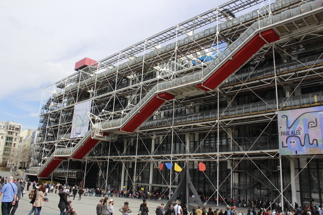
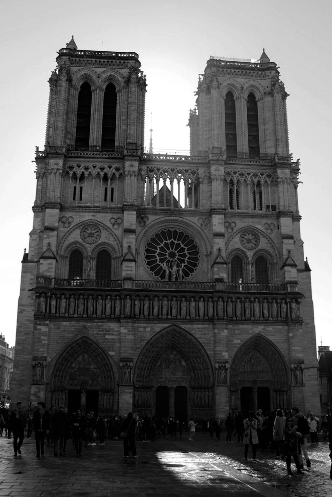
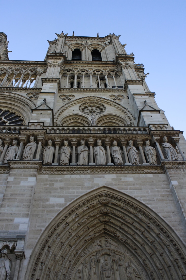
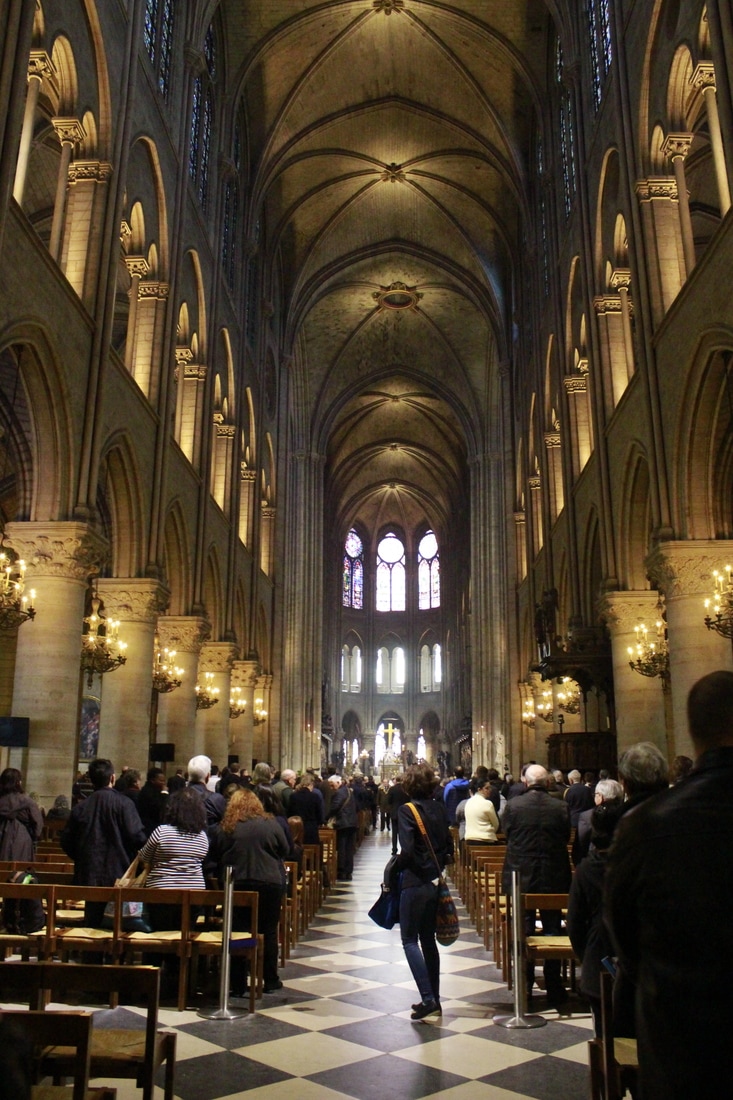
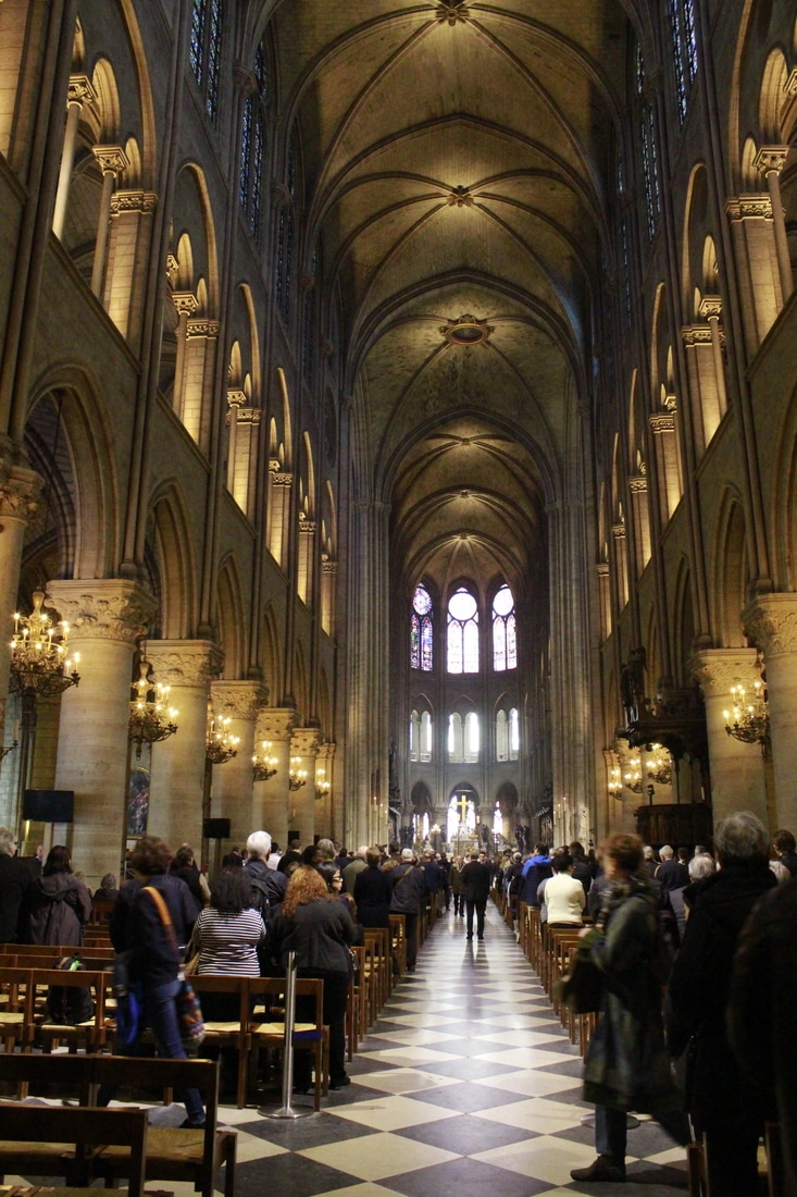
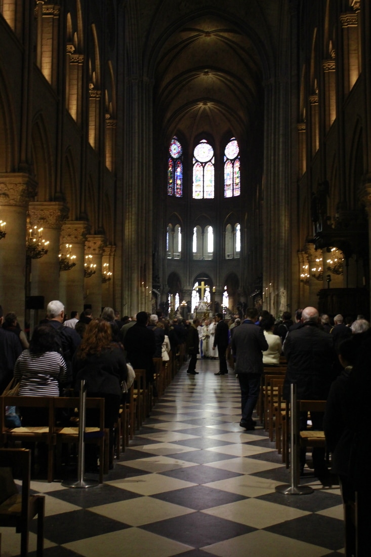
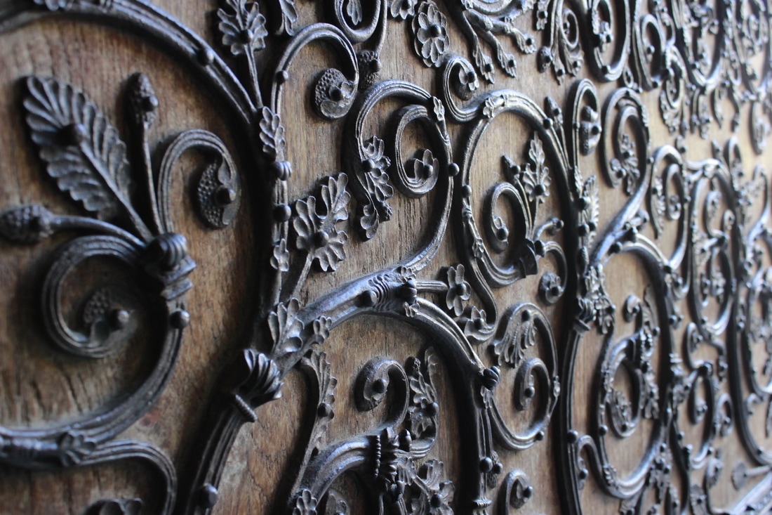
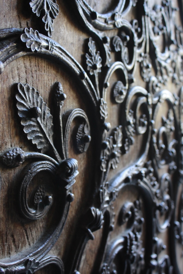
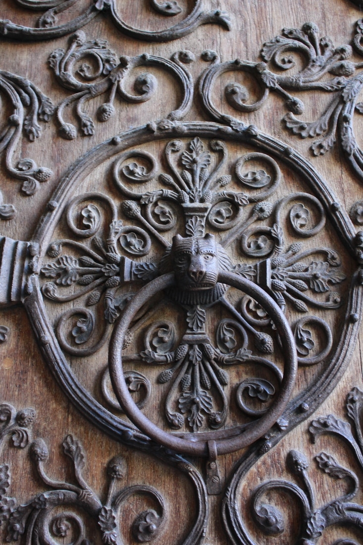
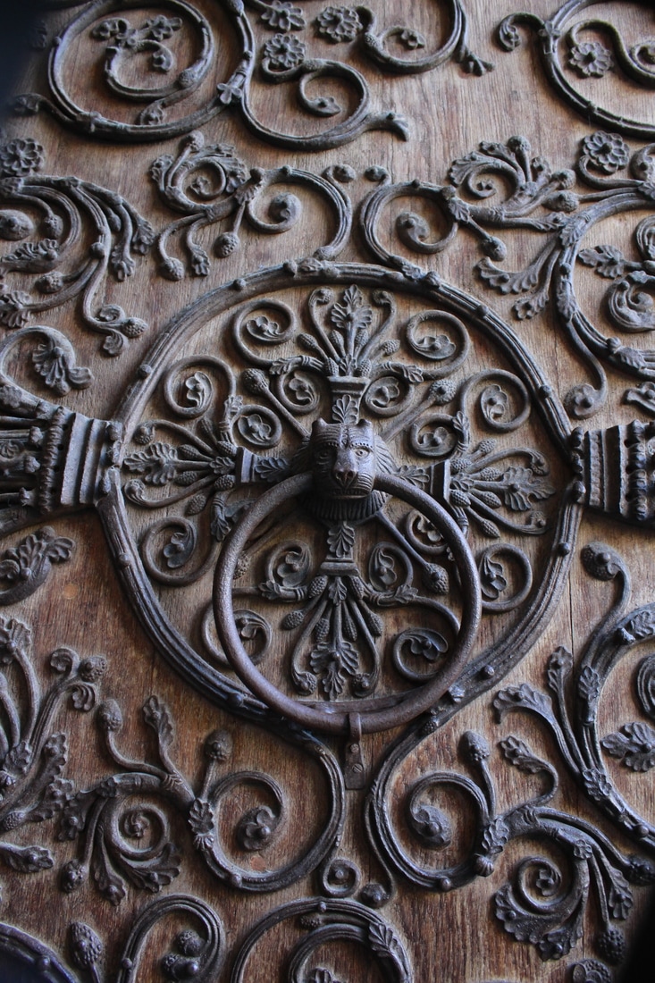
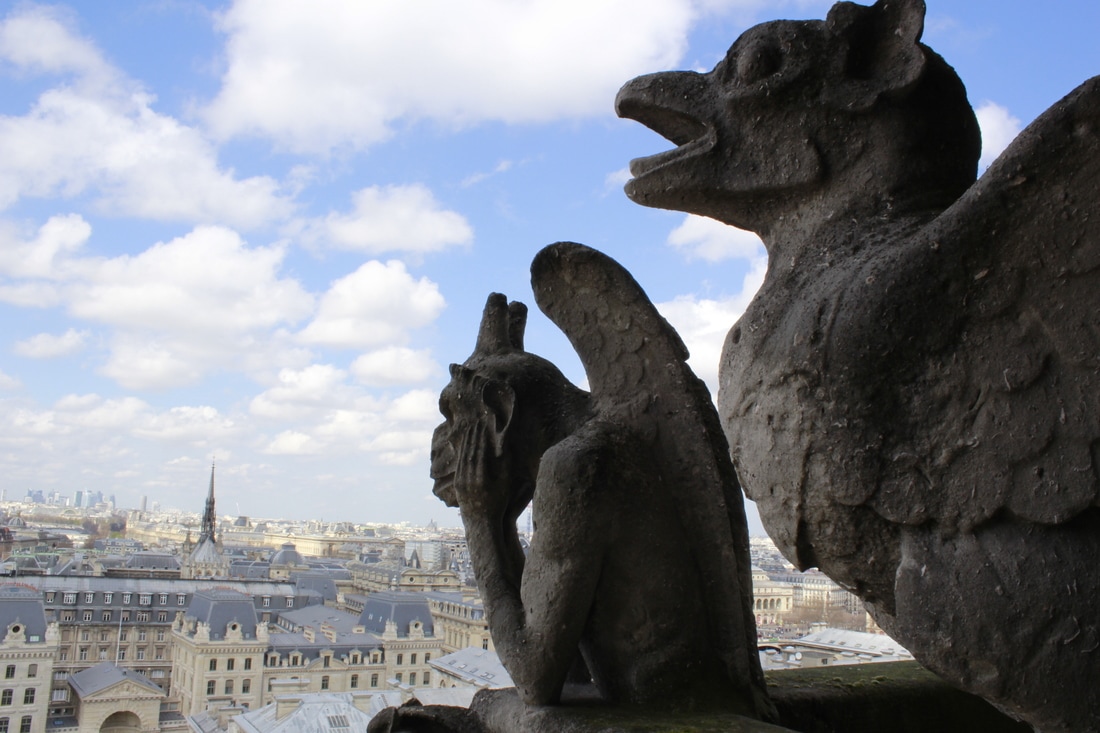
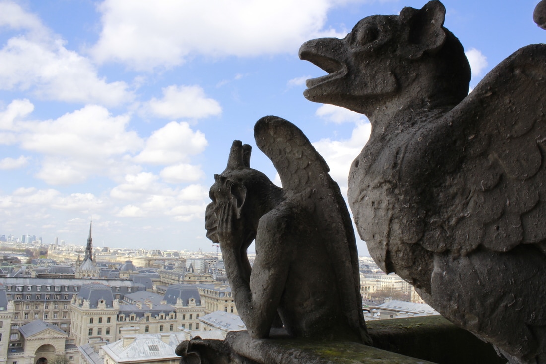
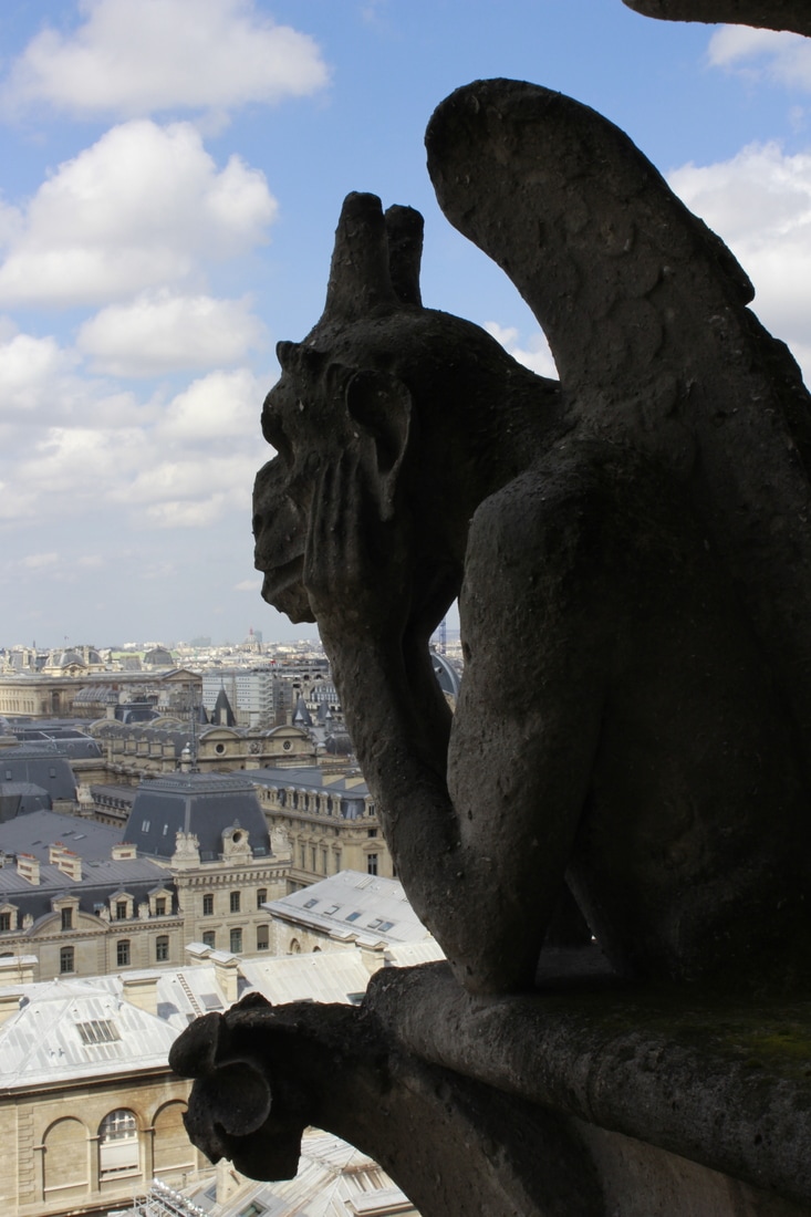
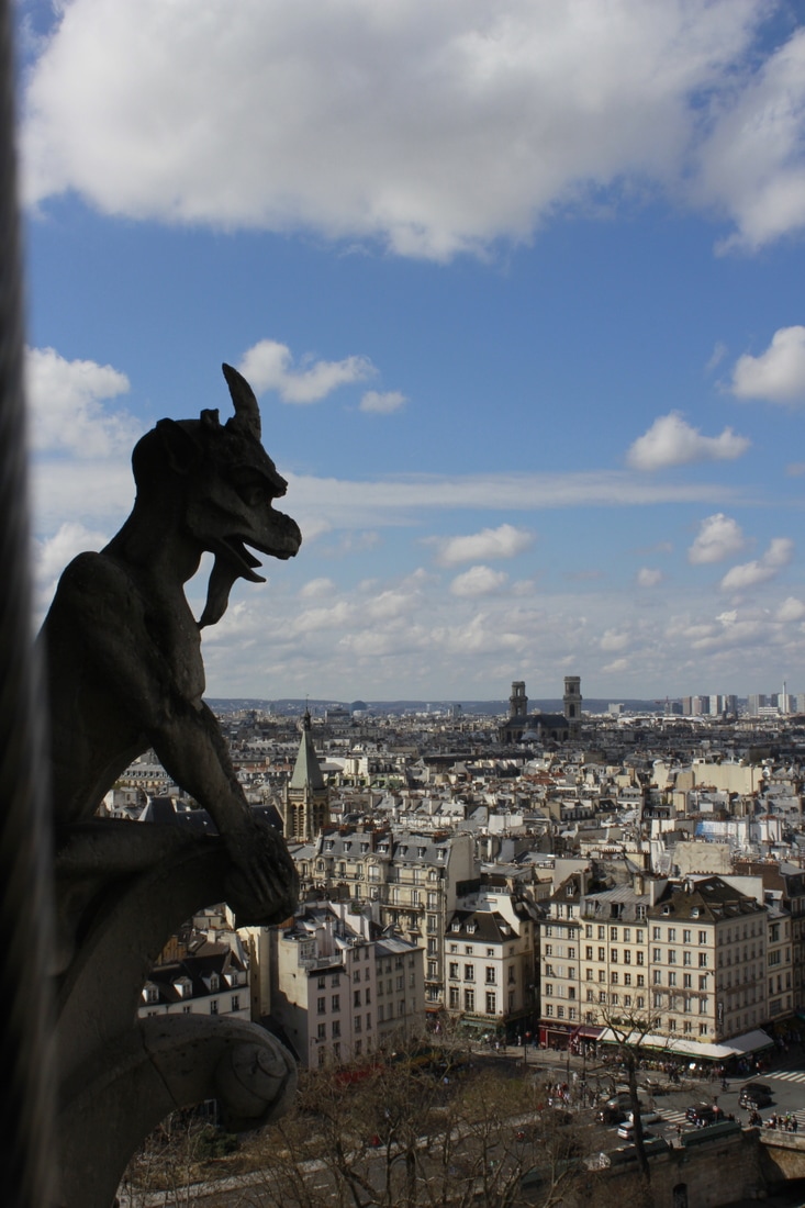
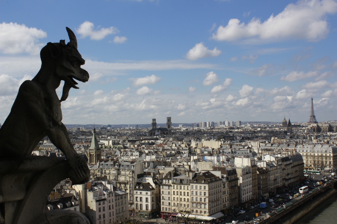
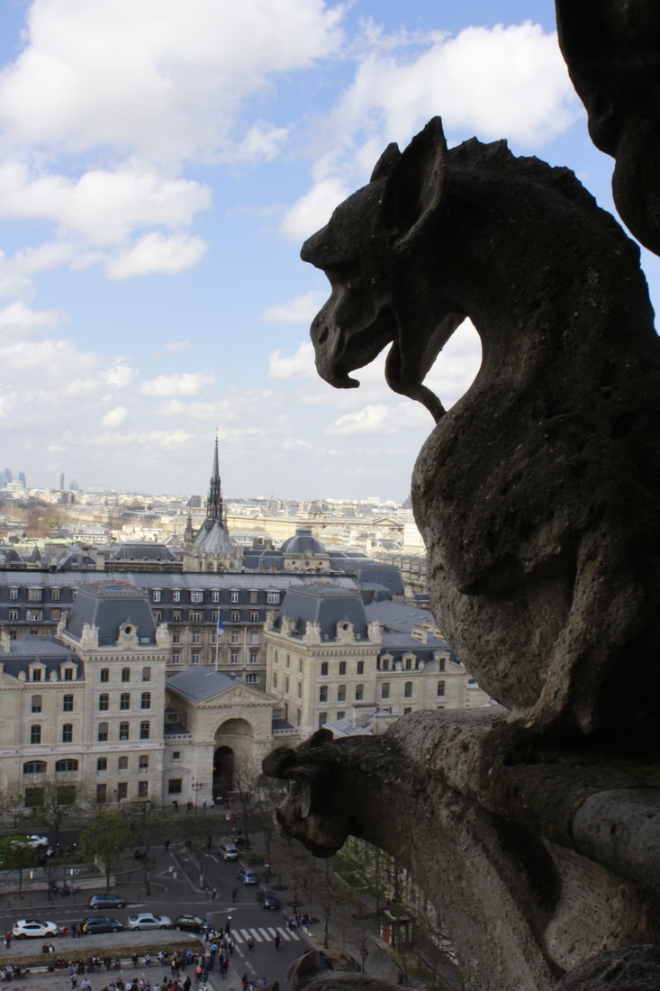
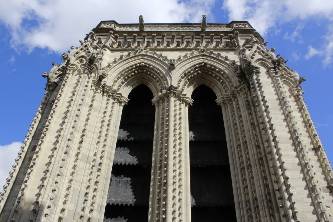
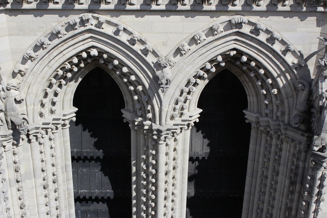
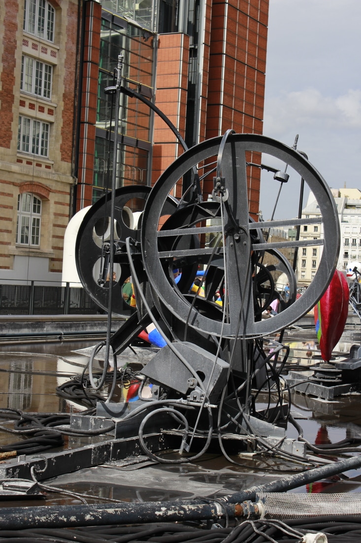
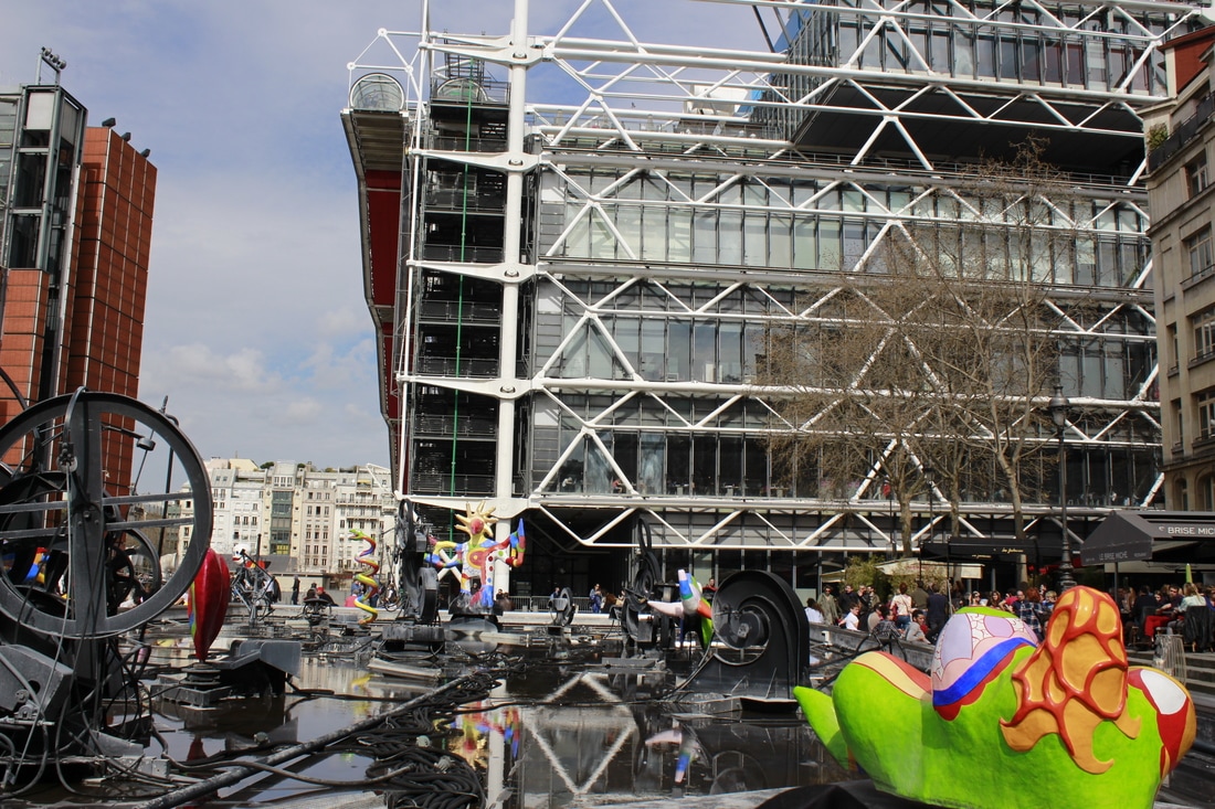
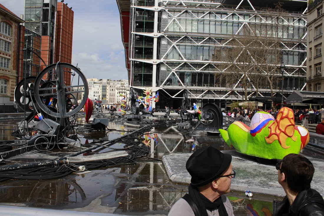
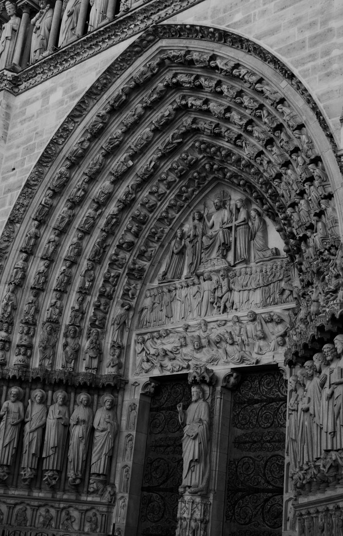
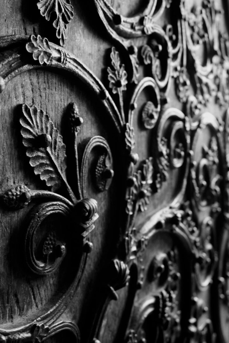
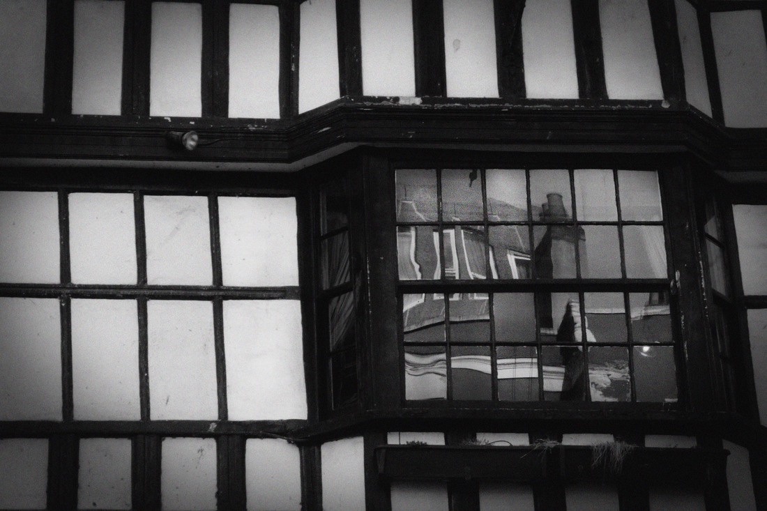
WWW: I was pleased with this shoot as I took more photos of detail in buildings and was also able to focus on internal as well as external architecture. Whilst these images were taken at famous tourist spots in Paris it is not as immediately obvious. I particularly like the fourth image taken of the carving detail on the door of Notre Dame cathedral. It is less of a touristy image, I like the use of black and white and how this highlights the detail in the image. I think the editing was also very effective in emphasising this and I hope this begins to explore how Frederick H Evans used black and white to emphasise line. Whilst I did still take some images of skylines I think the detail of the gargoyles in the foreground is more effective than the ones in shoot one as the gargoyles create detail and a focal point in the foreground. I was also pleased with the modern architectural images of the sculpture near the Pompidou Museum. I was also pleased with the penultimate image of the Eiffel tower as I was pleased with the more unusual angle and feel that it is a less touristy, obvious image.
EBI: Whilst this shoot did allow me to take images from more unusual angles I still feel that I could have developed this more.
Next Steps: Paris is a very inspirational city for photographing architecture, when returning home I want to see if I am able to apply the same ideas to photographing images at home.
refined mind map
shoot three
Plan:
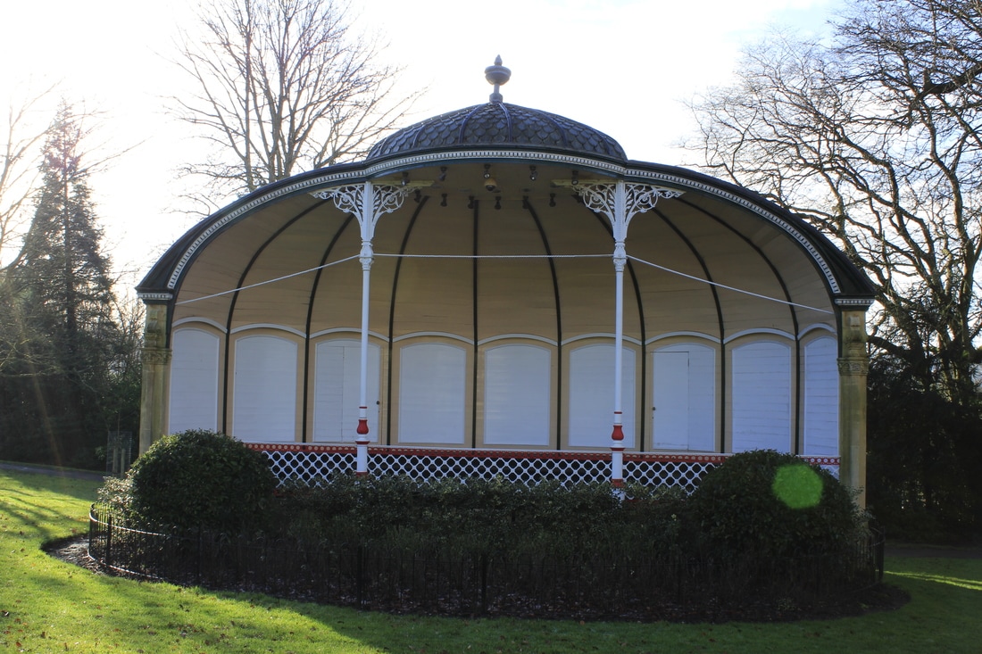
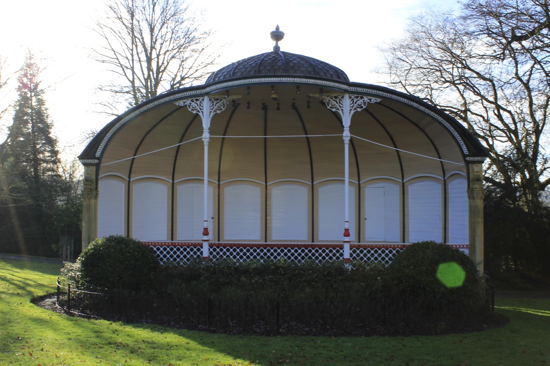
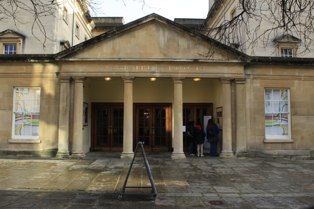
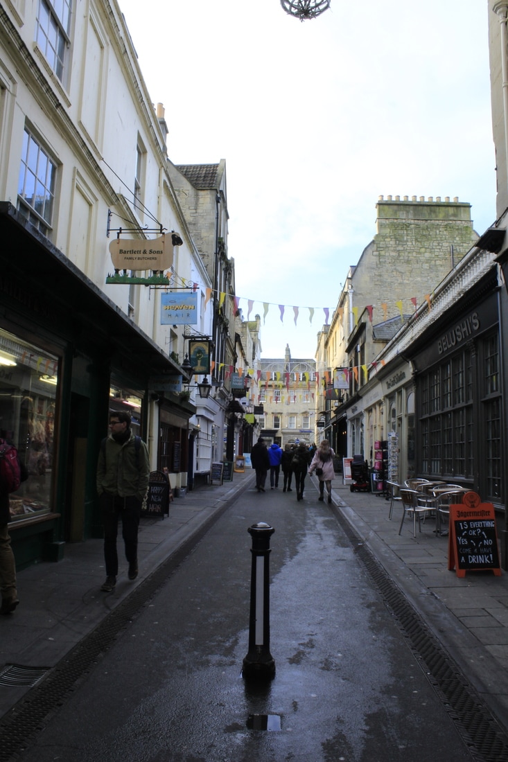
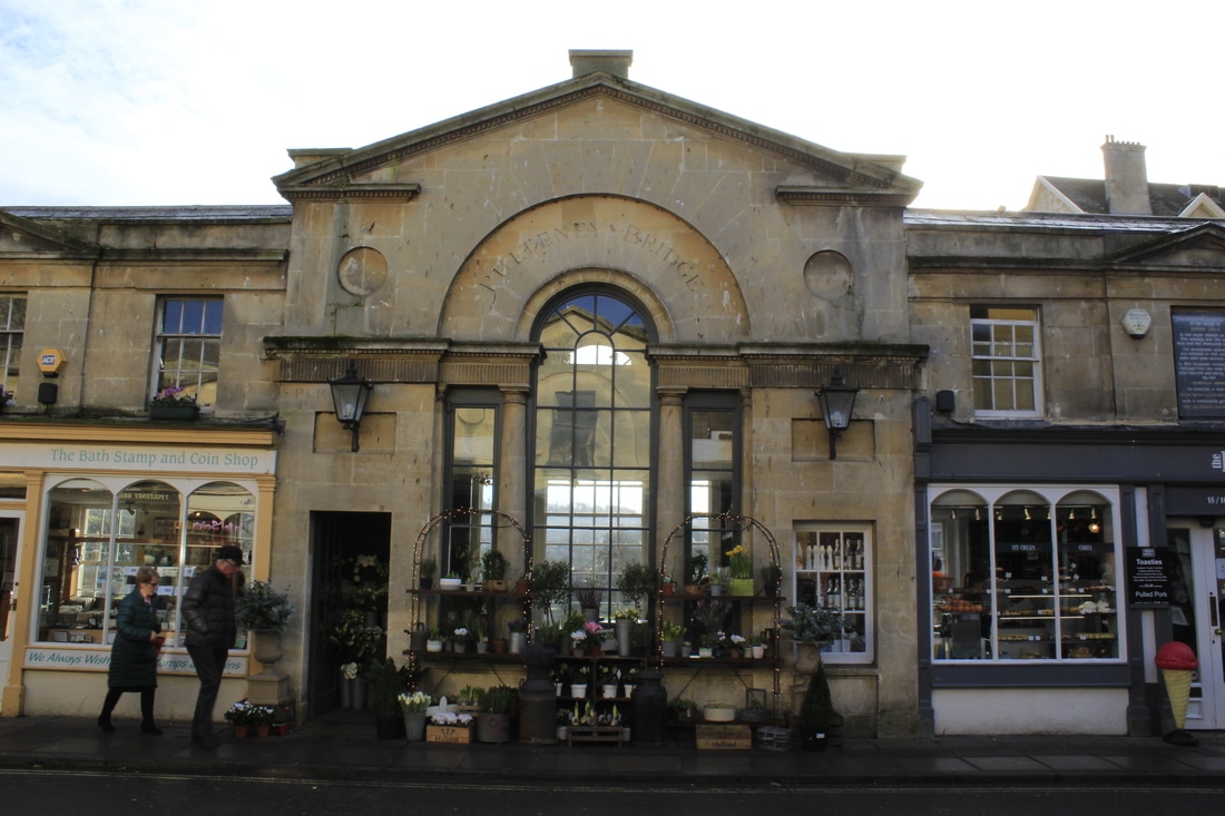
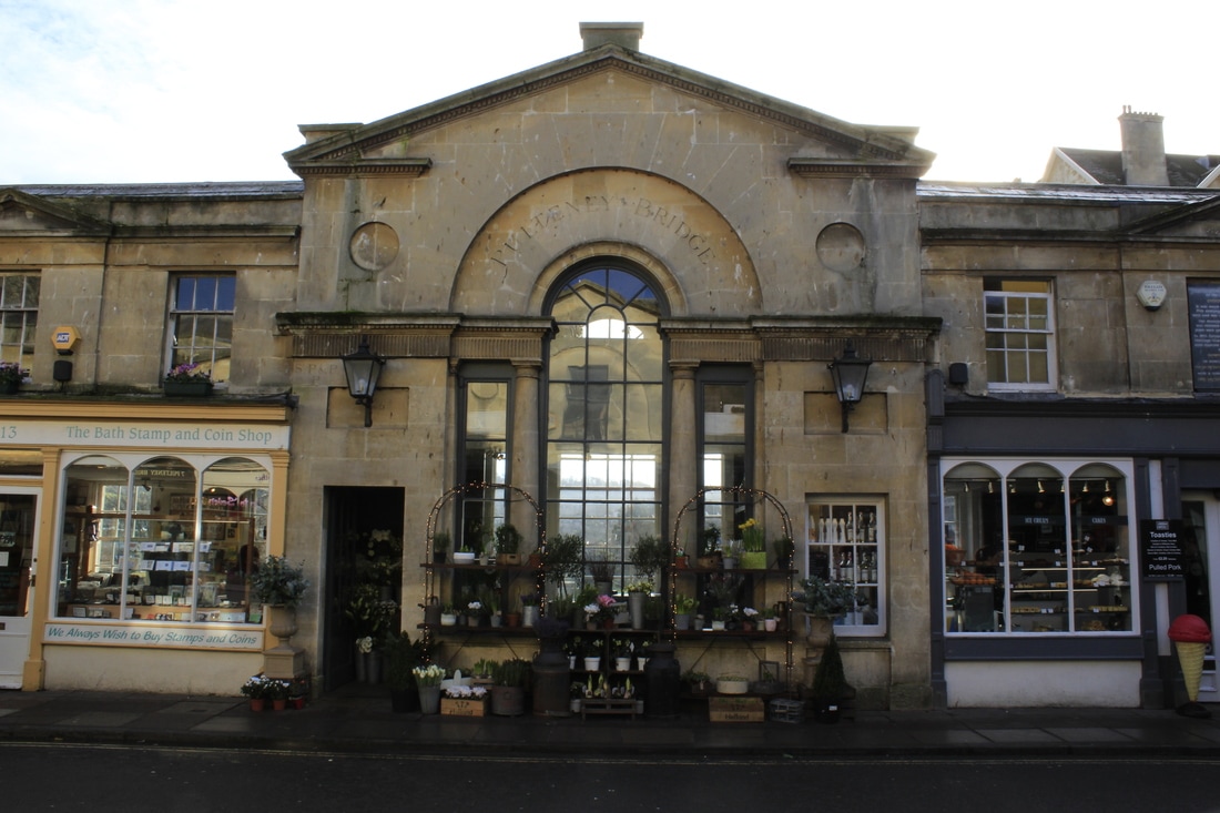
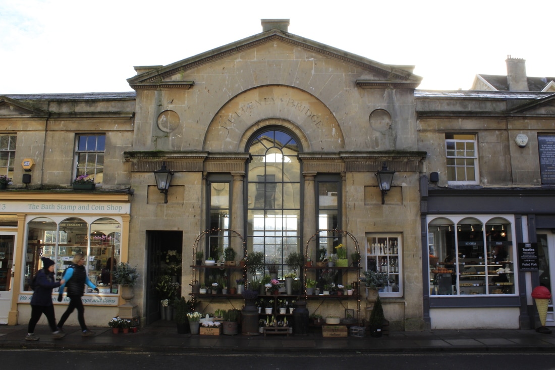
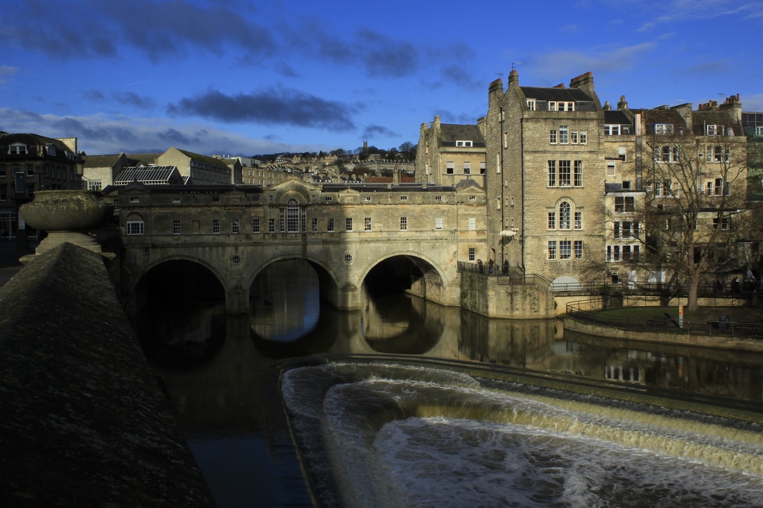
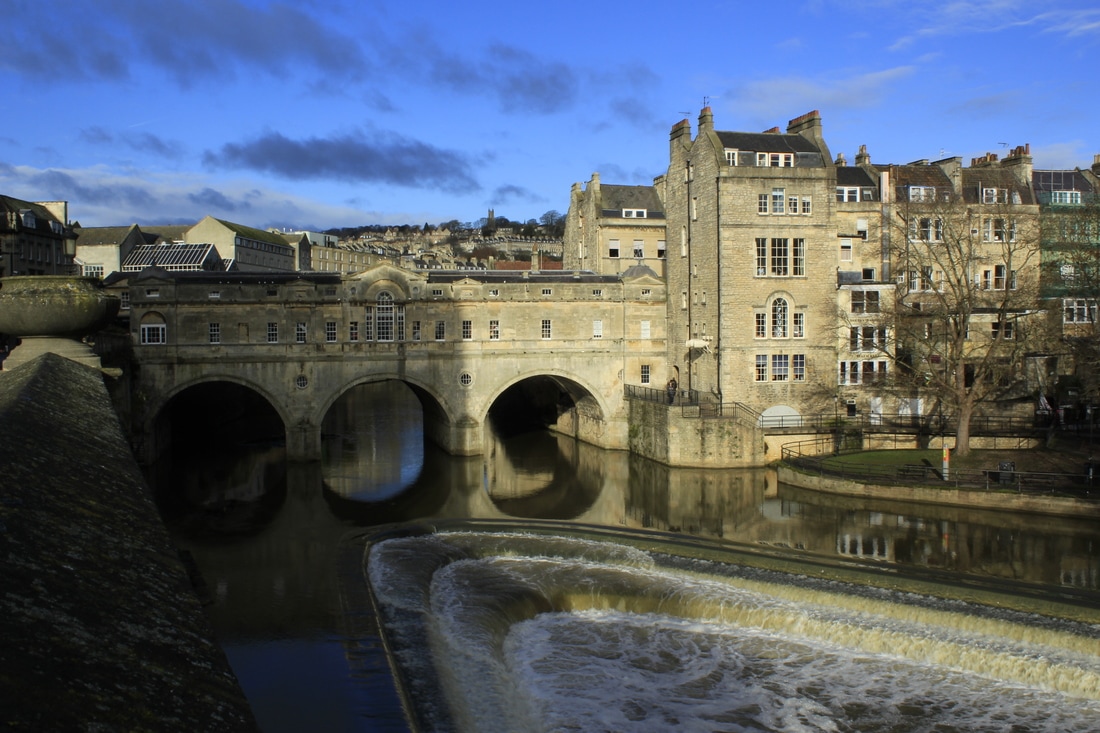
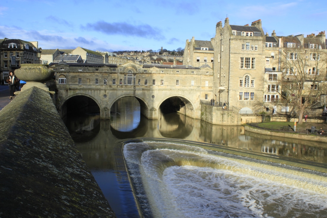
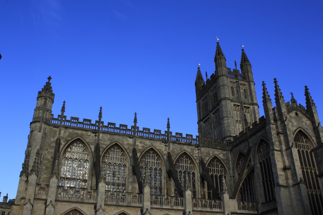
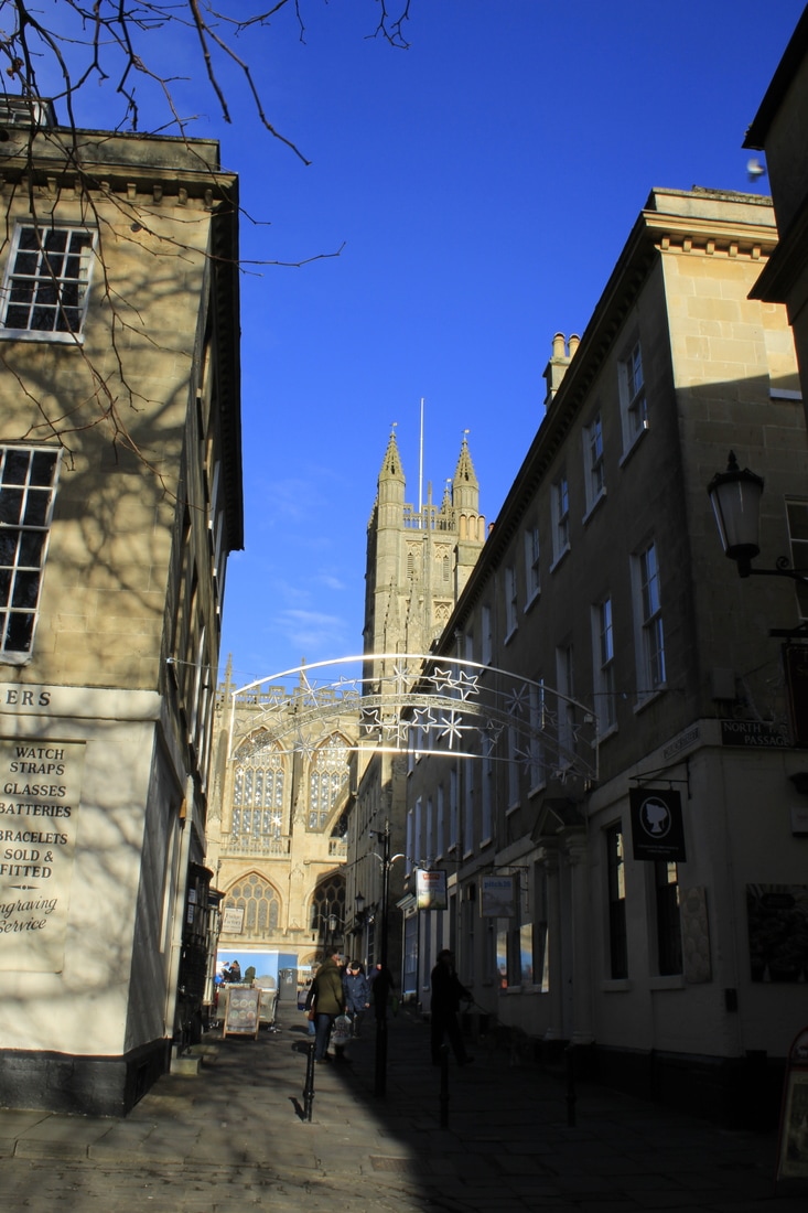
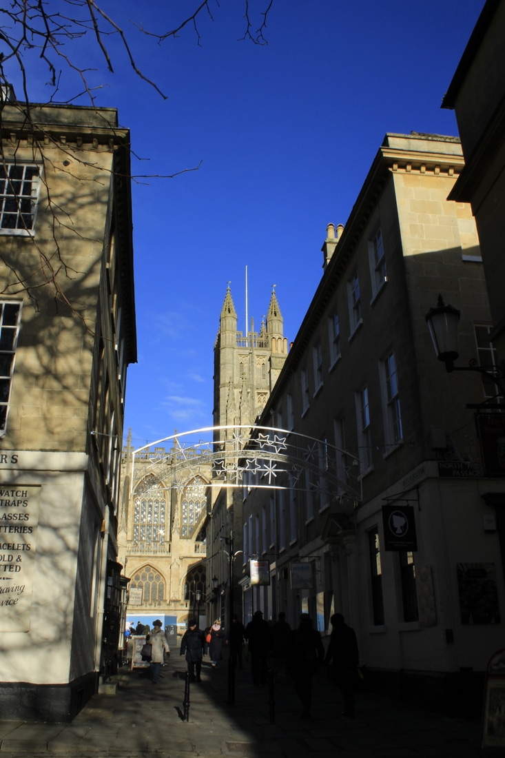
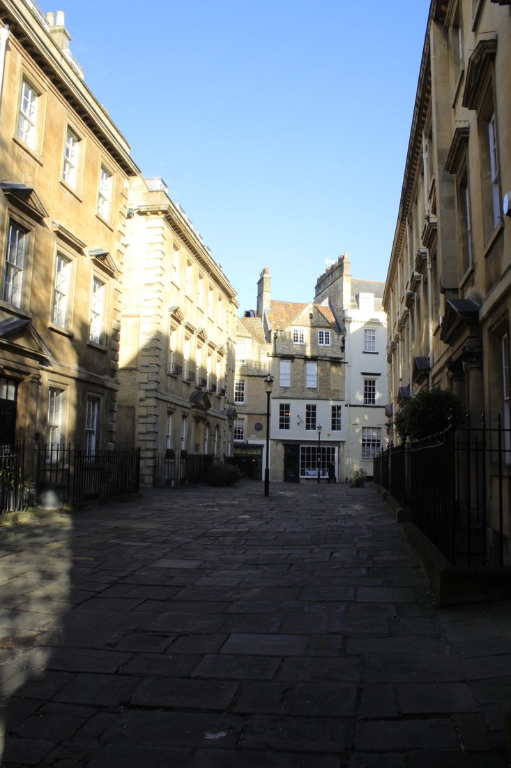
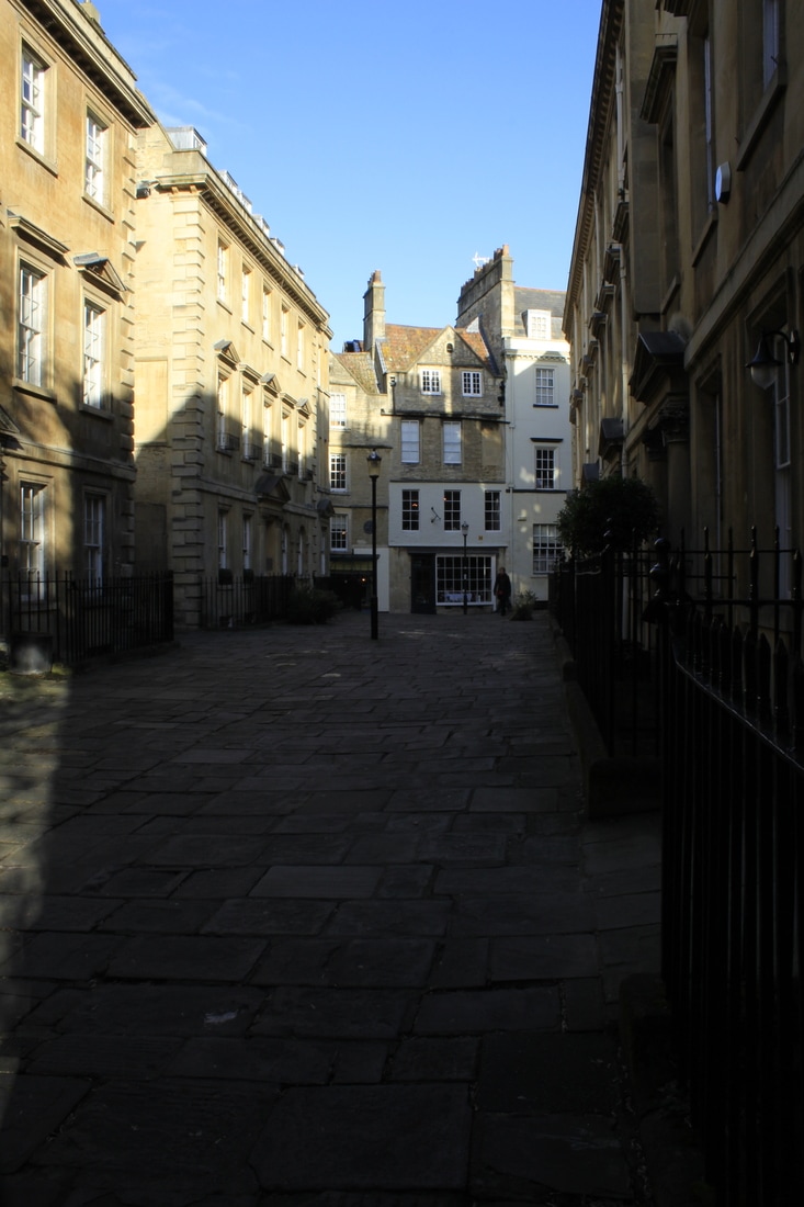
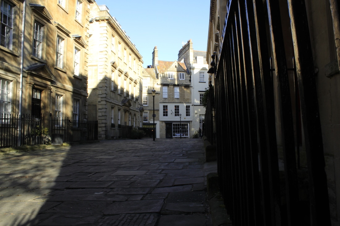
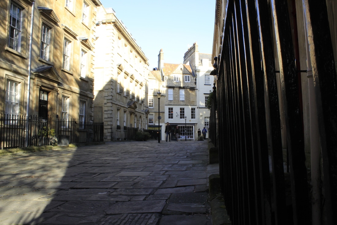
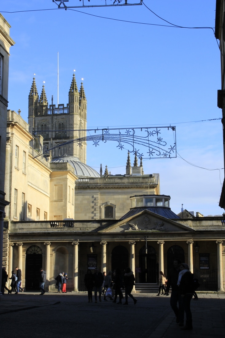
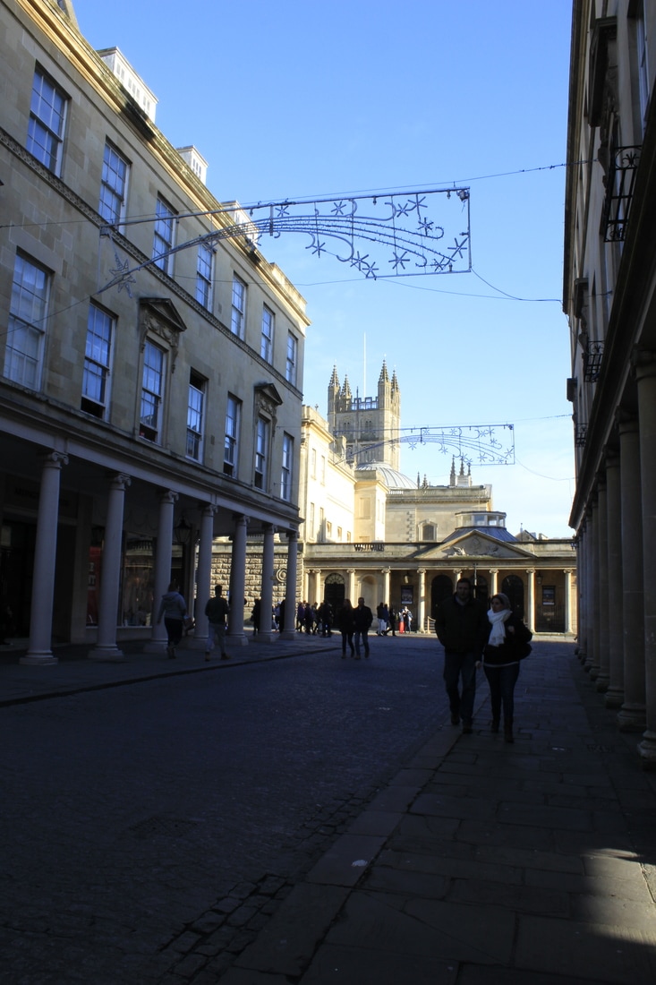
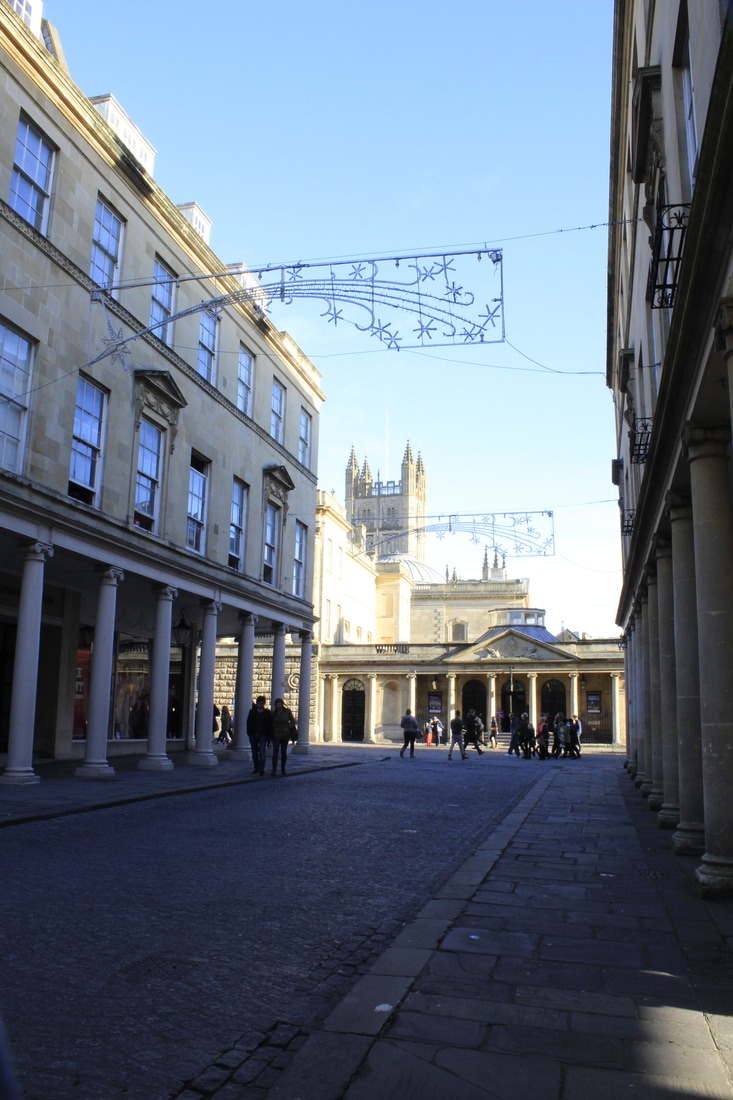
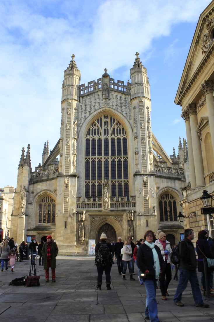
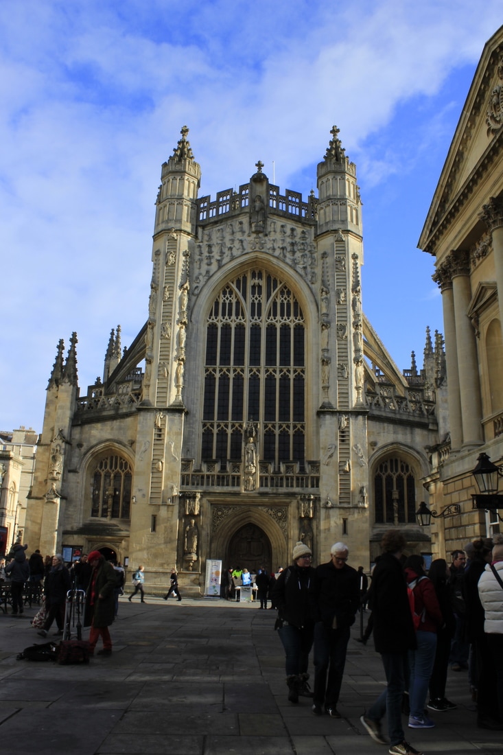
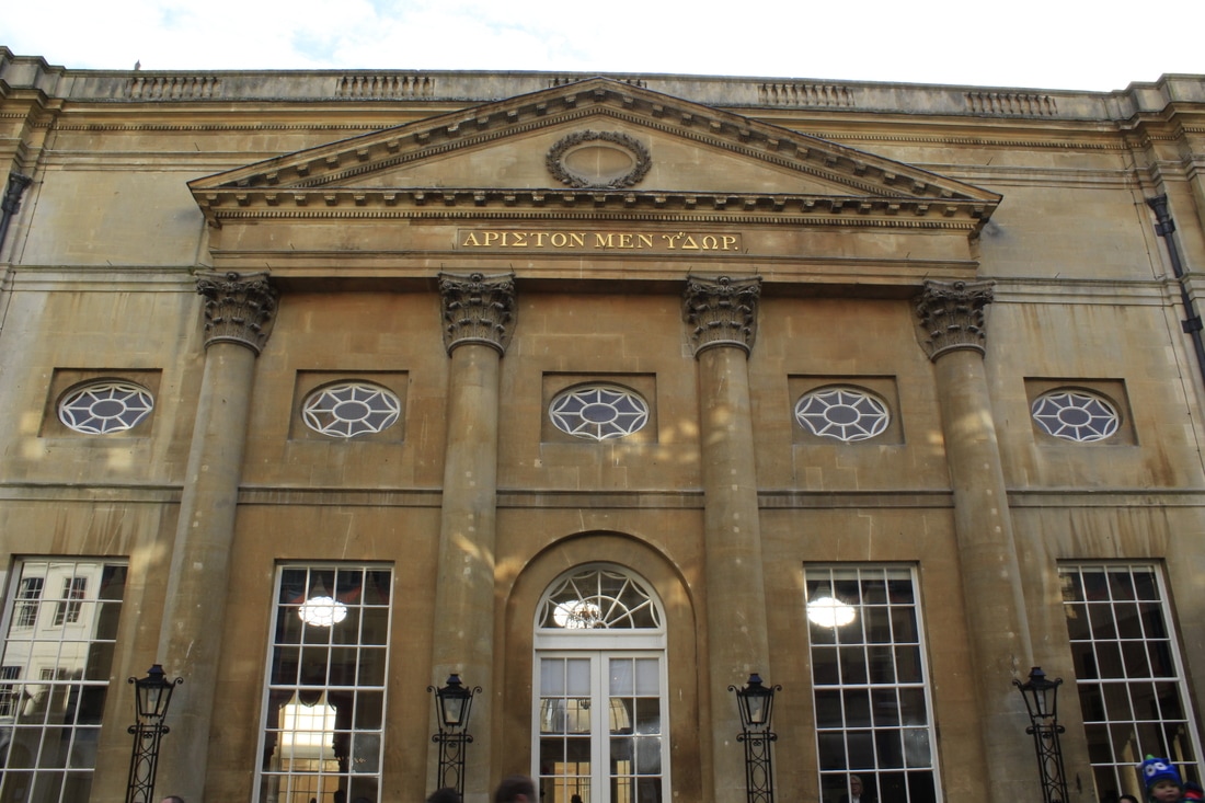
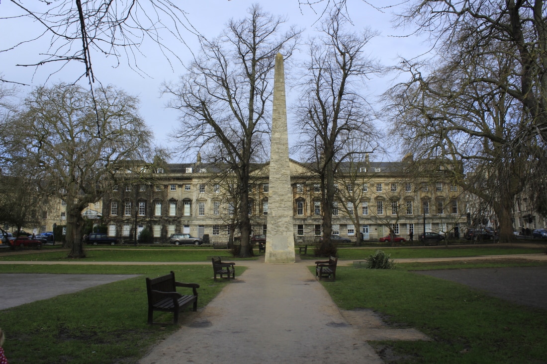
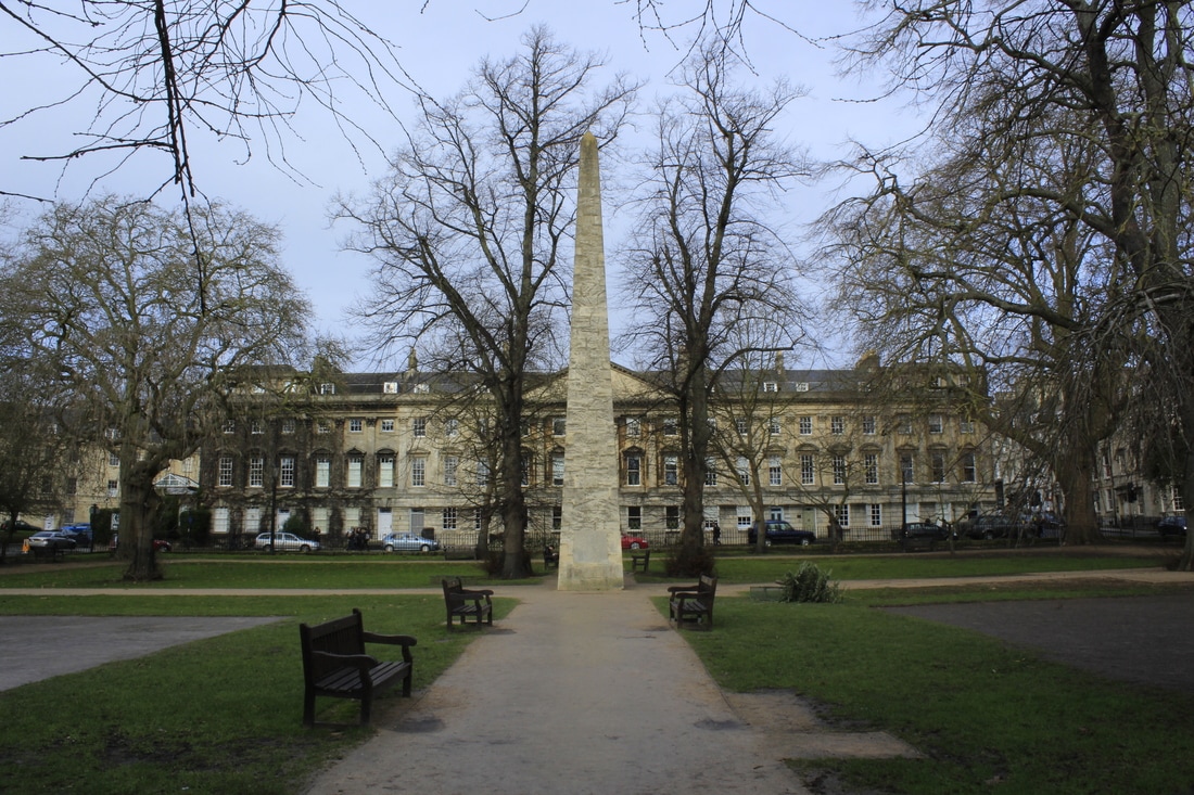
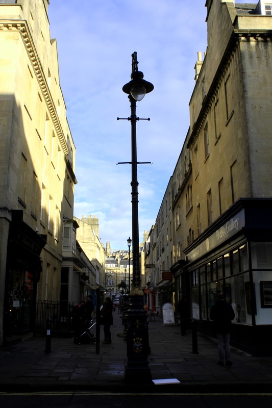
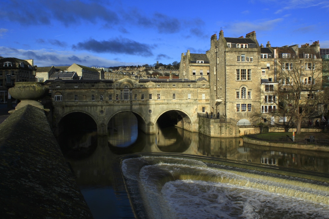
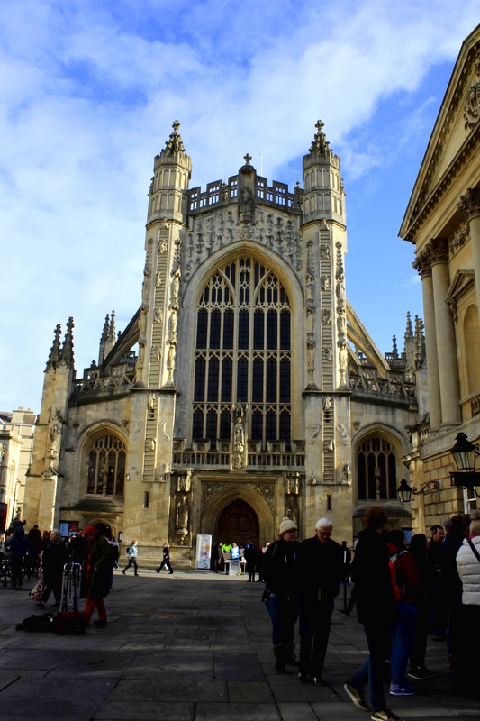
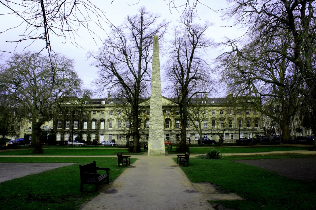
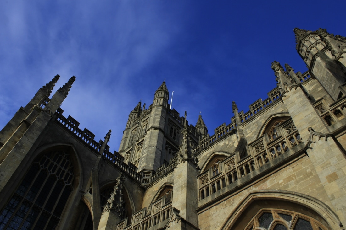
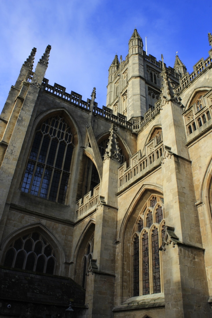
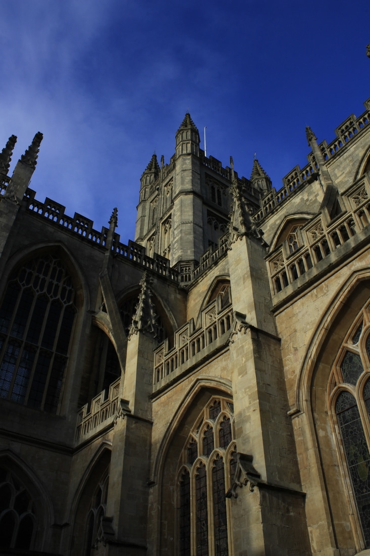
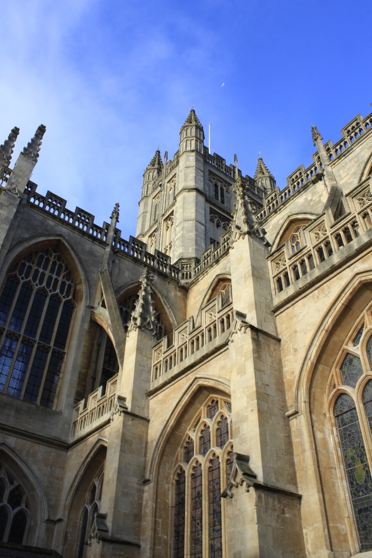
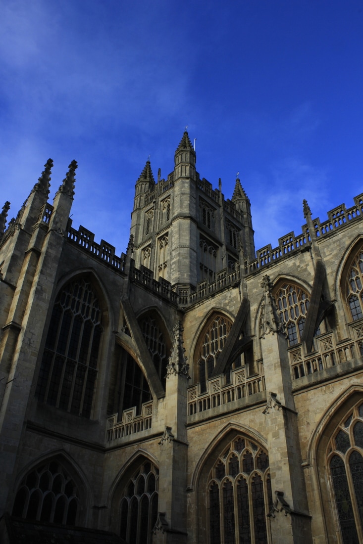
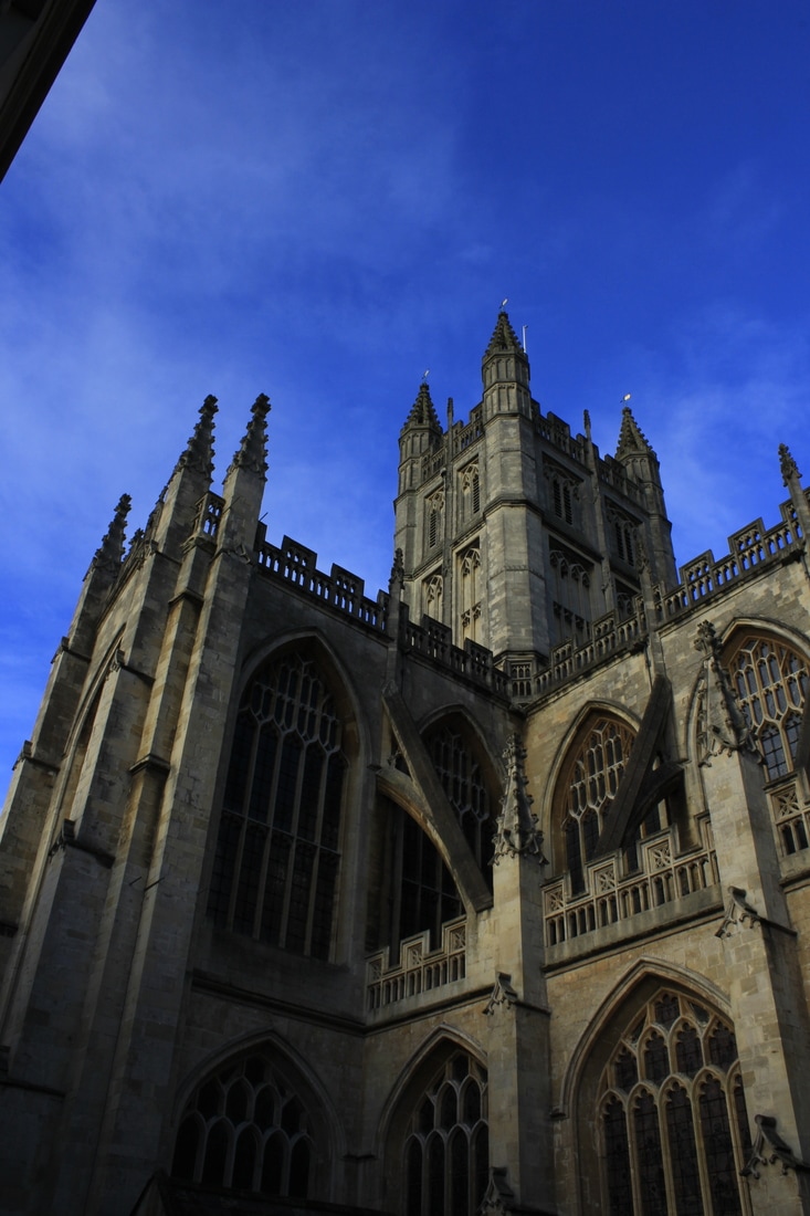
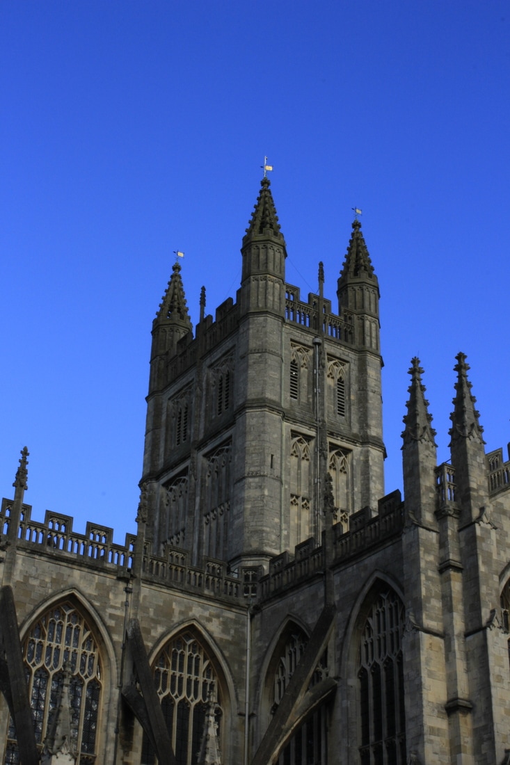
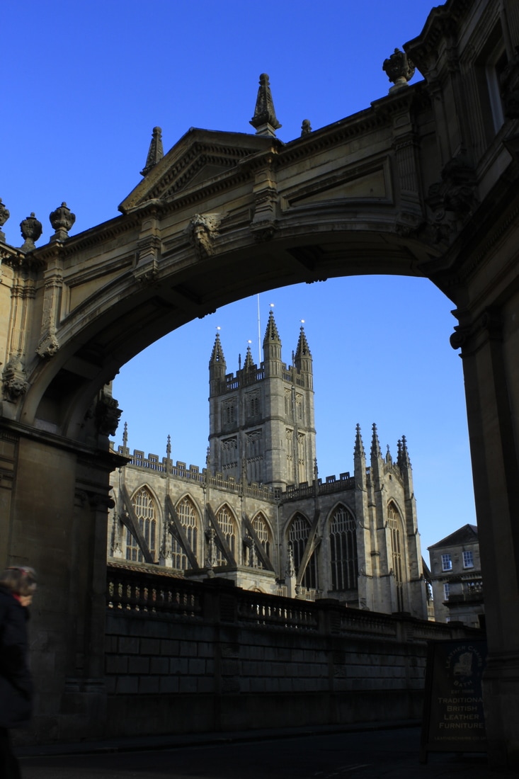
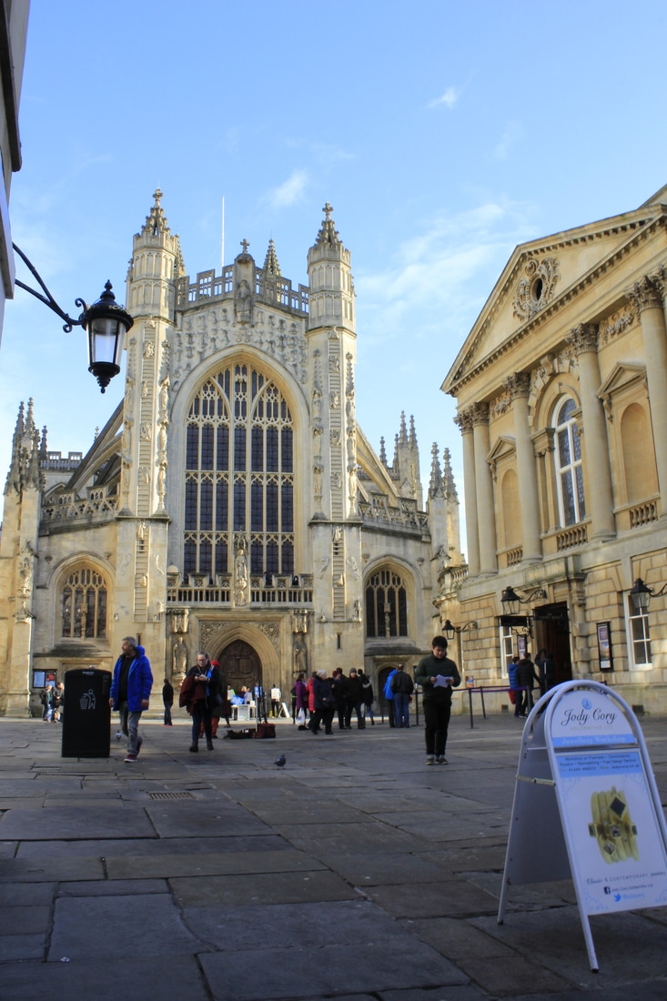
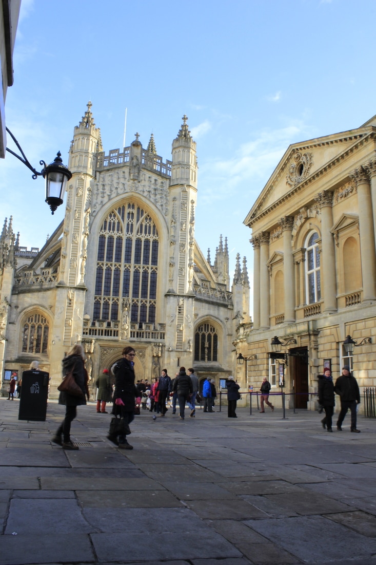
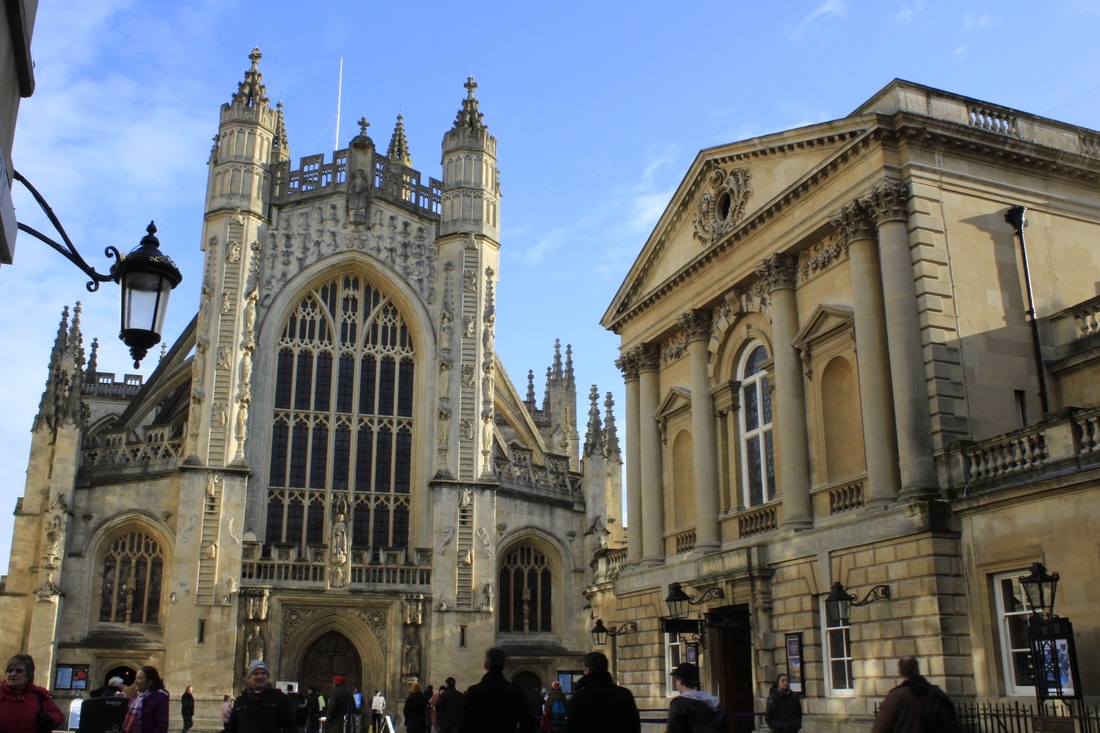
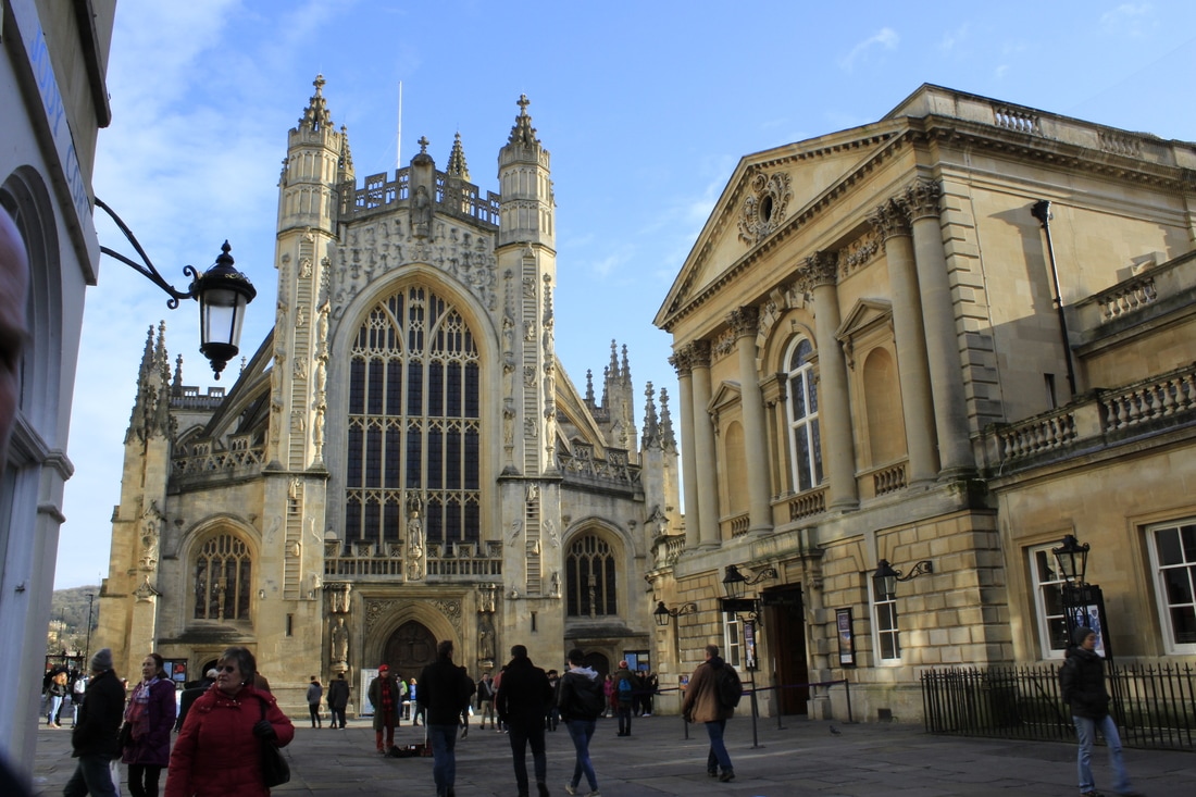
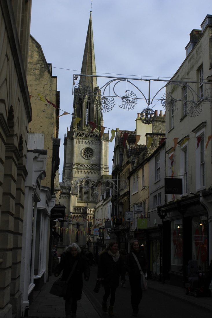
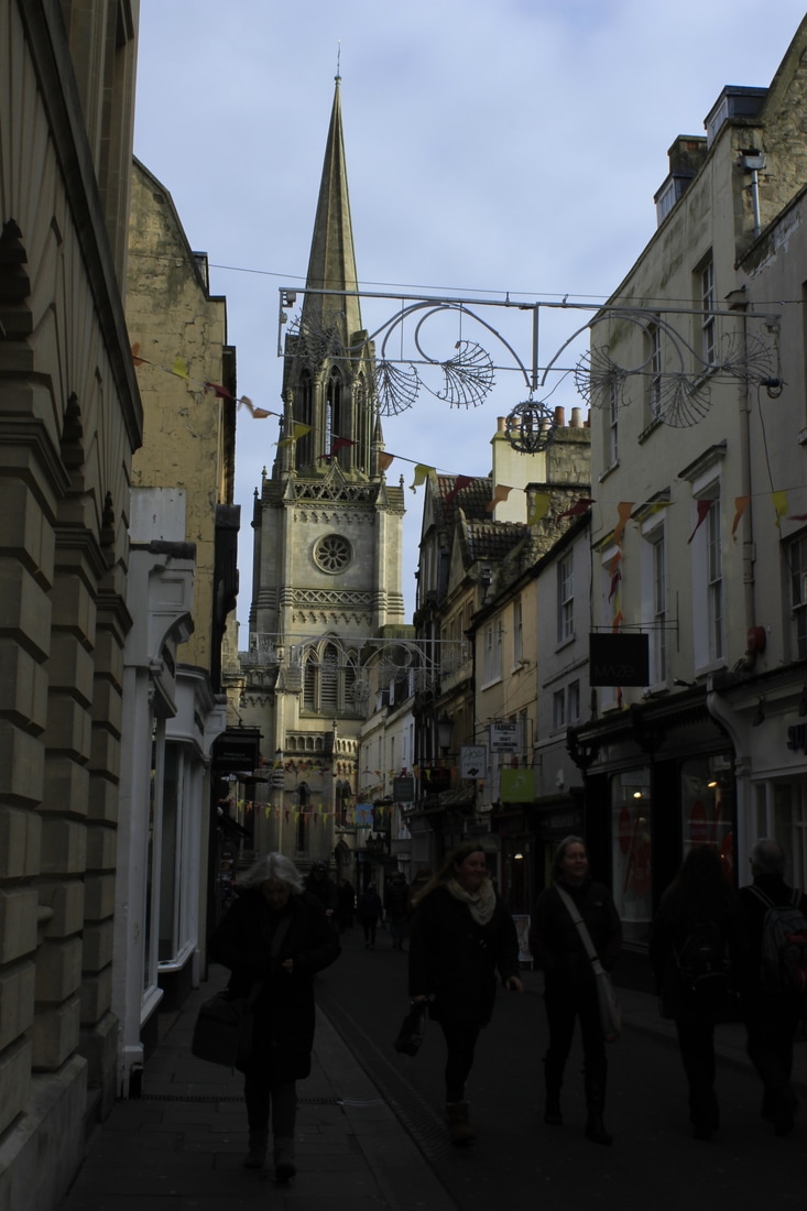
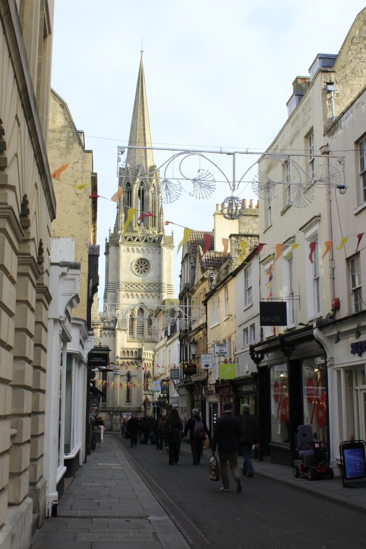
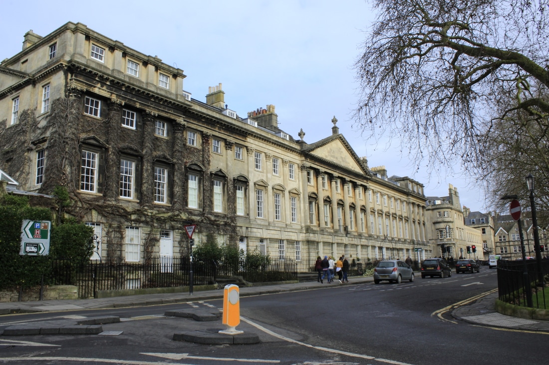
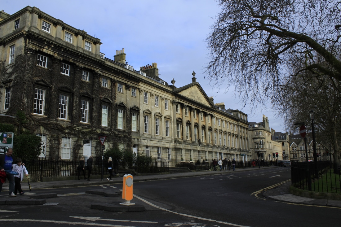
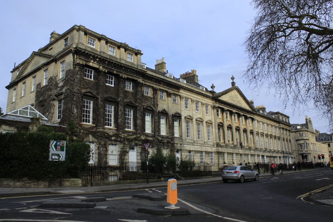
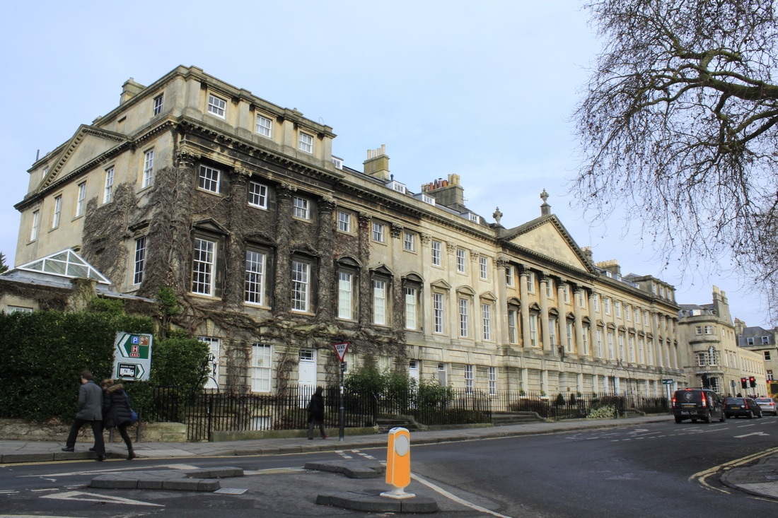
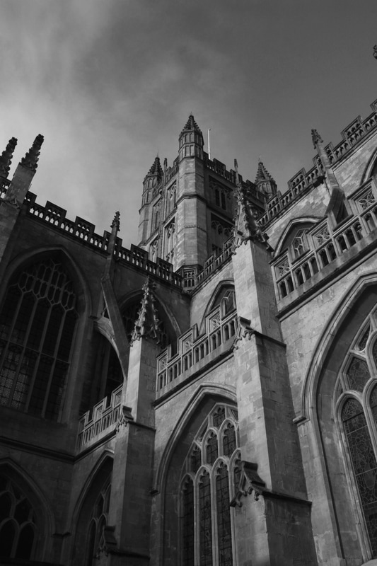
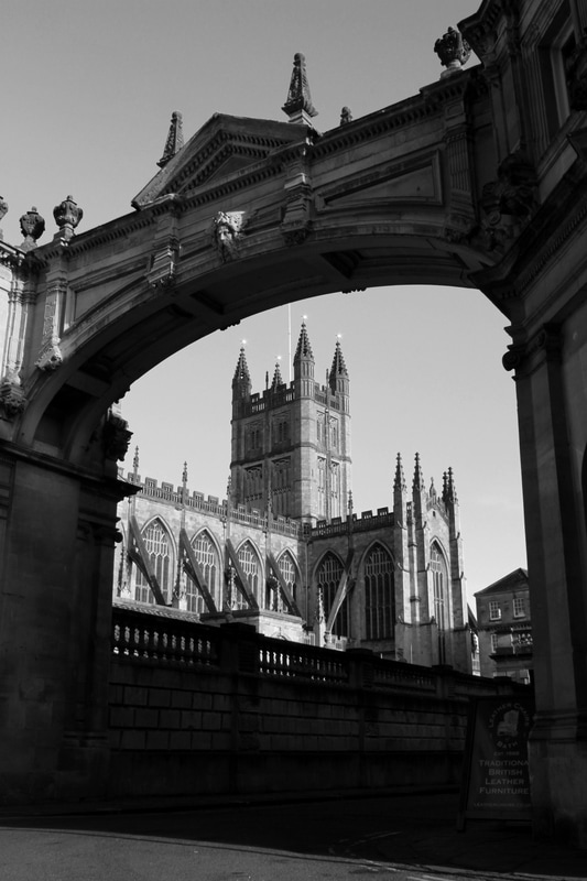
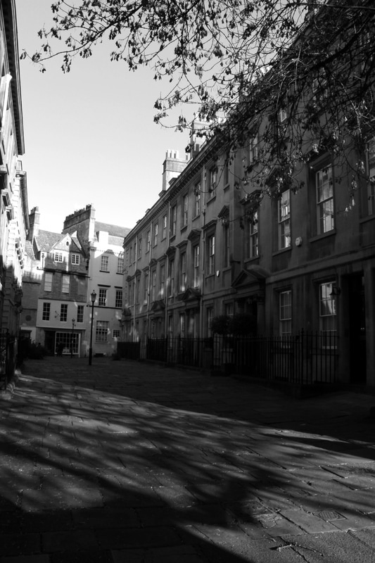
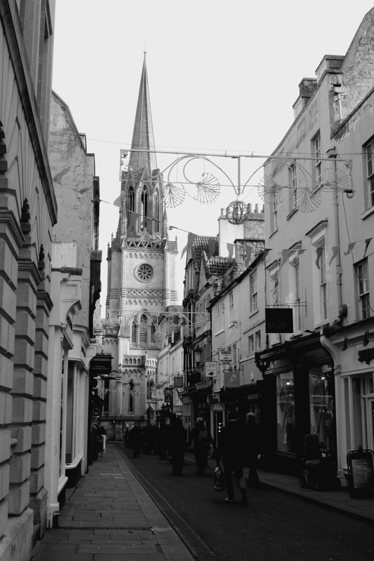
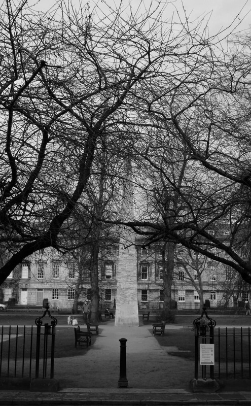
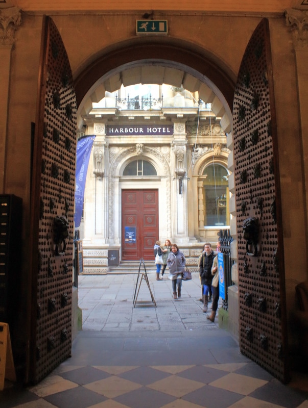
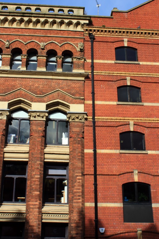
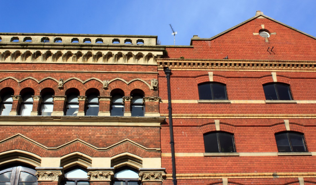
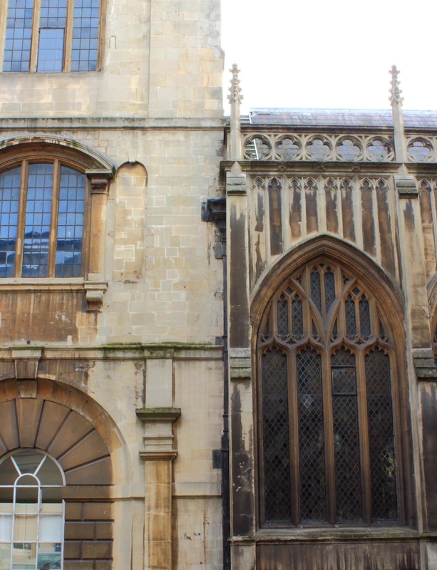
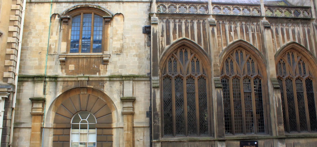
I am going to begin to explore a new location for architectural photography. I will conduct this shoot in the city of Bath and take photographs of the architecture in Bath. I want to focus on examples of interesting structure and architecture. I will need a camera.
I am going to begin to explore a new location for architectural photography. I will conduct this shoot in the city of Bath and take photographs of the architecture in Bath. I want to focus on examples of interesting structure and architecture. I will need a camera.


|
|
Critique:
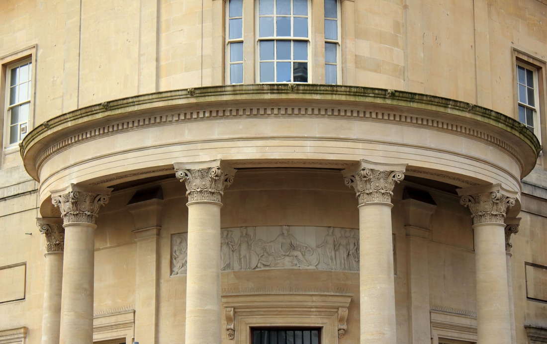
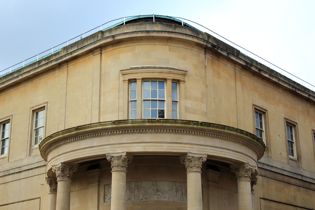
WWW: I think Bath is an interesting place to shoot images of architecture and I was pleased to find so many beautiful and interesting buildings to photograph.
EBI: I think however these images are quite boring. They are to simple and don't focus enough on interesting angles and details of the buildings. The photographs aren't interesting enough to the viewer as they are a little simple and touristy. I also think my photographs would be more effective in black and white as I think it would emphasize the features of the building.
Peer Critique:
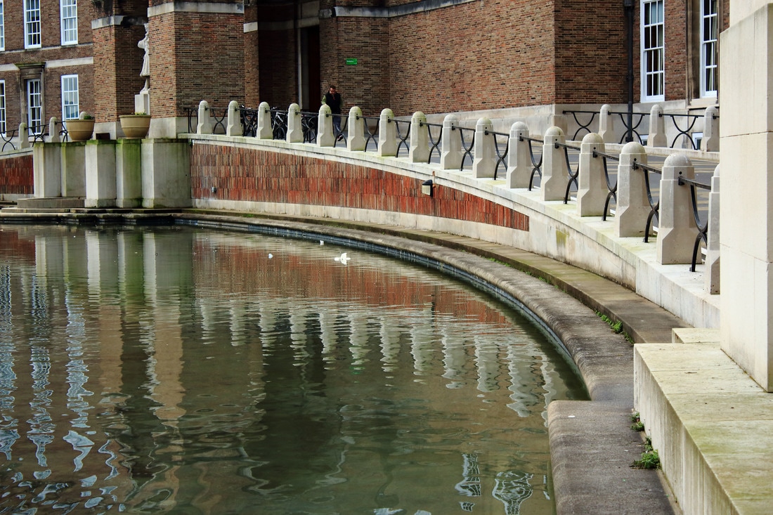
WWW:I really like that you haven't just taken photos of the buildings,i like that you have included the sky because it adds the visual element of color.In the bottom left photo i like the contrast of texture between the water and the stone buildings.Your composition in all of these photos is also very good because the buildings are right in the center of the photo so that it draws your eyes straight to the architecture.
EBI: To improve these photos i think id like to see a bit more up close detail of the buildings because at the moment you can just really see the outline.You could maybe try taking these photos from a different angles.
My Next Steps:
As a result of my own evaluations and those of my peer critique I think I need to return to Bath but focus on not producing simple straight on touristy images but instead remember my evaluations from my Paris shoots and focus on more interesting angles and detail. Therefore in my next shoot I need to experiment with different angles, perspectives and detail.
As a result of my own evaluations and those of my peer critique I think I need to return to Bath but focus on not producing simple straight on touristy images but instead remember my evaluations from my Paris shoots and focus on more interesting angles and detail. Therefore in my next shoot I need to experiment with different angles, perspectives and detail.
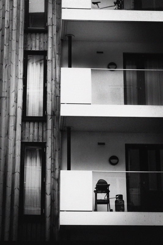
sHOOT FOUR
Plan:
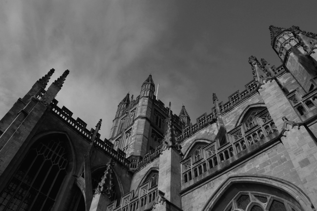
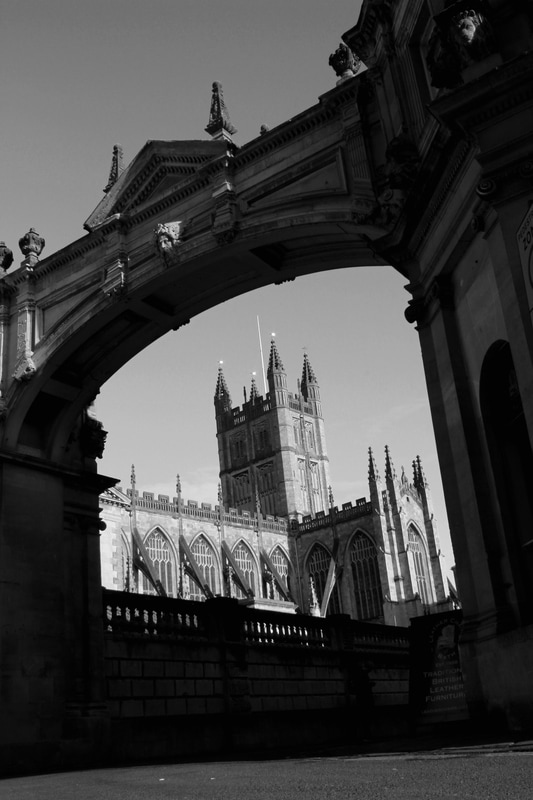
I am going to return to the city of Bath to conduct this shoot. For this shoot I want to return to take images of similar places as Shoot Three but this time I want experiment with different angles and creating more unusual and unique images. I will need a camera.
I am going to return to the city of Bath to conduct this shoot. For this shoot I want to return to take images of similar places as Shoot Three but this time I want experiment with different angles and creating more unusual and unique images. I will need a camera.
|
|
Critique:
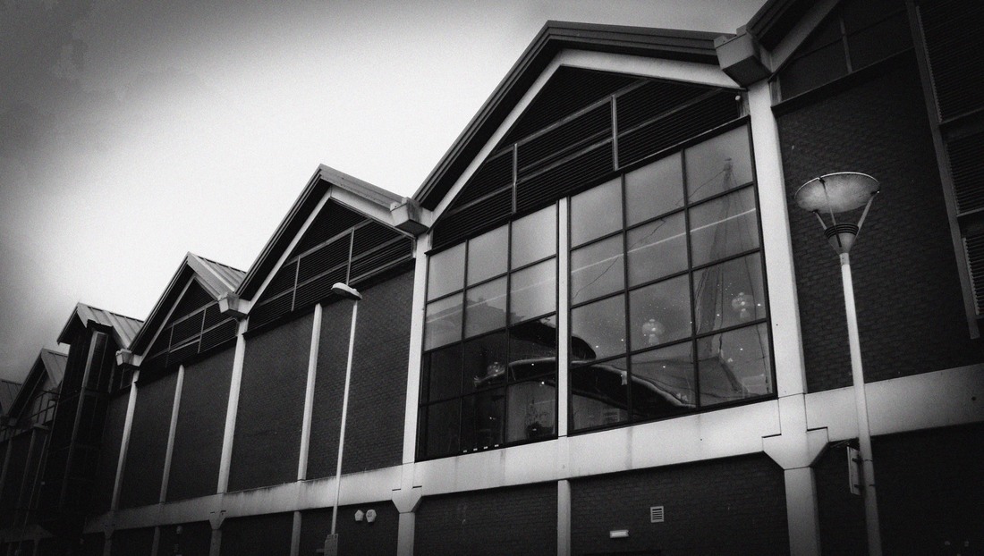
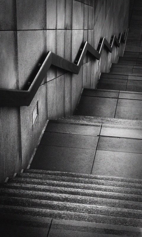
WWW: I think that I have created more effective images of Bath architecture in this shoot as I have taken them from different angles and perspectives. I also think they look more effective edited in black and white. I think the photographs where the camera is looking up at the building or is focussed on the edge of a building are the most effective as these perspectives create interesting angles and lines in the images and highlights some of the interesting detail of these buildings.
EBI: I think I could have focused more on the detail of buildings and structure. Some of the photos are still quite boring and straight on, so I need to make sure all of my further images are focussing on either an interesting camera angle, an interesting angle on the edge or structure of the building or is focussed on some interesting detail.
Peer Critique:
WWW: You used different angles in your composition which makes the photos more interesting to look at. You have edited the photos in black and white which I think was a very good decision as it adds a very Gothic airy look to the buildings.
EBI: Its great that you have used the black and white effect but i think the photos maybe need more shadowing to them you could maybe try adjusting the contrast slightly.
Next Steps: I need to focus my next shoots on the following things: Angles (either the camera/ image angle or the detail of an interesting angle in the structure of the building), different perspectives and the detail that can be found in architecture.
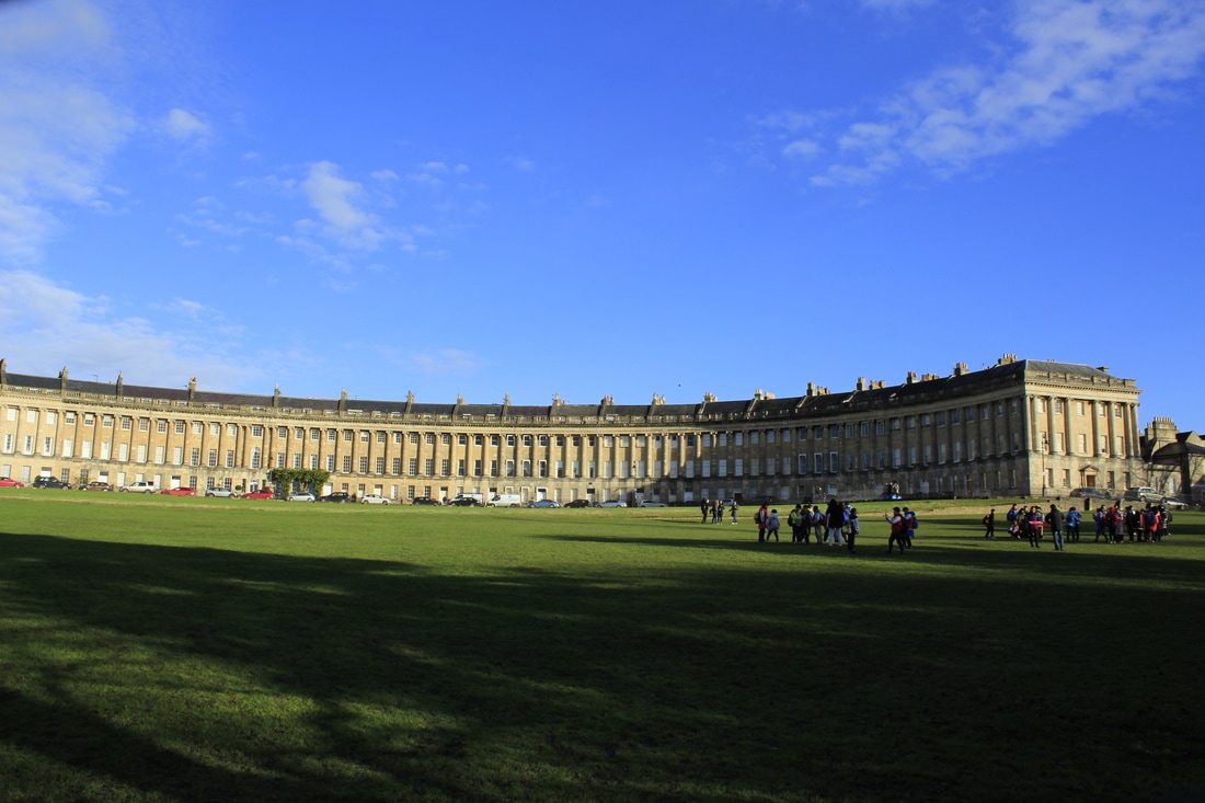
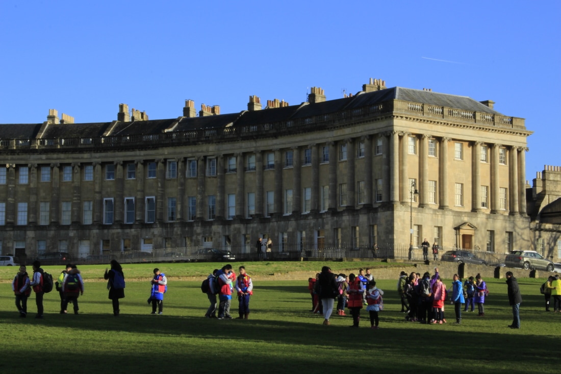
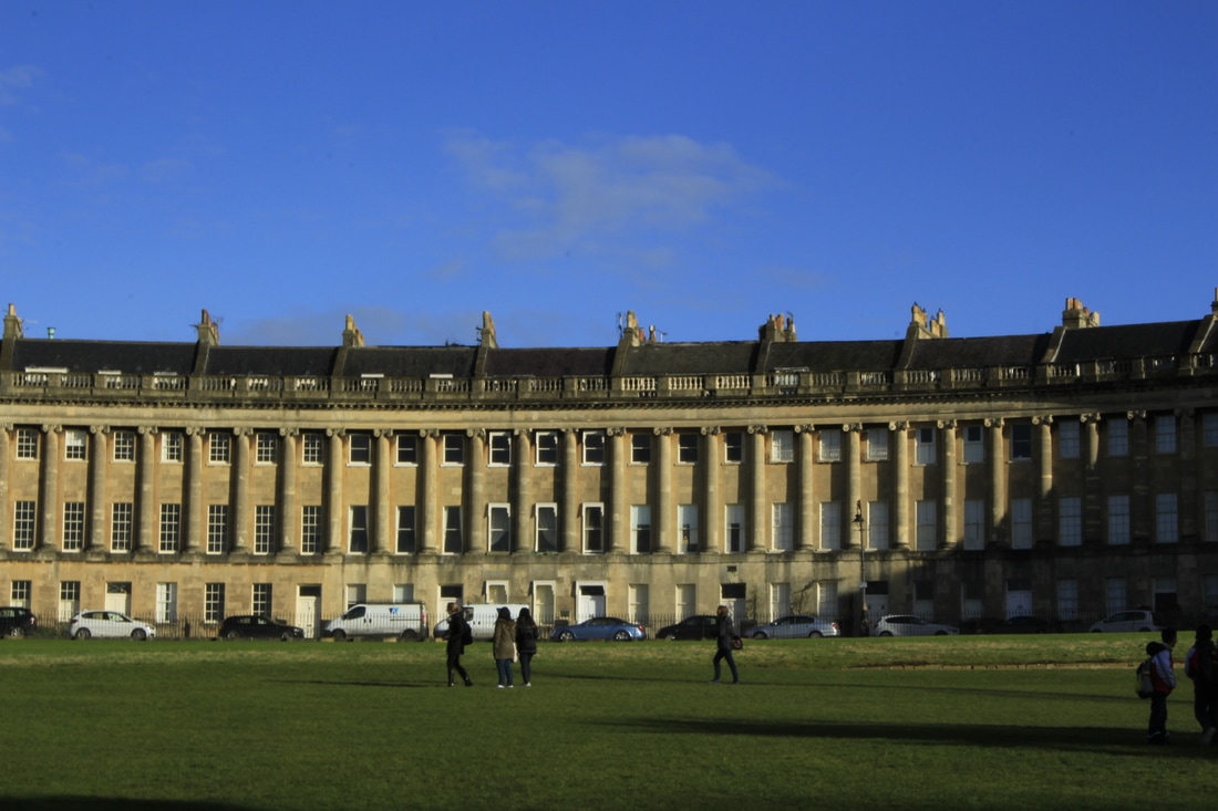
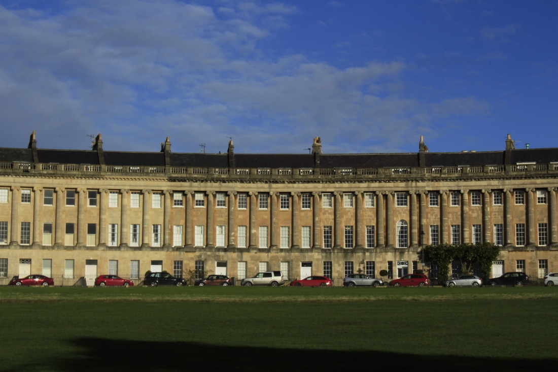
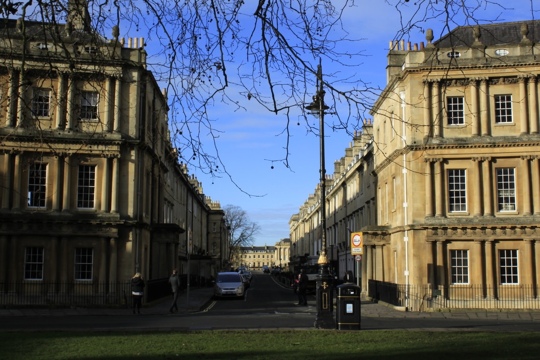
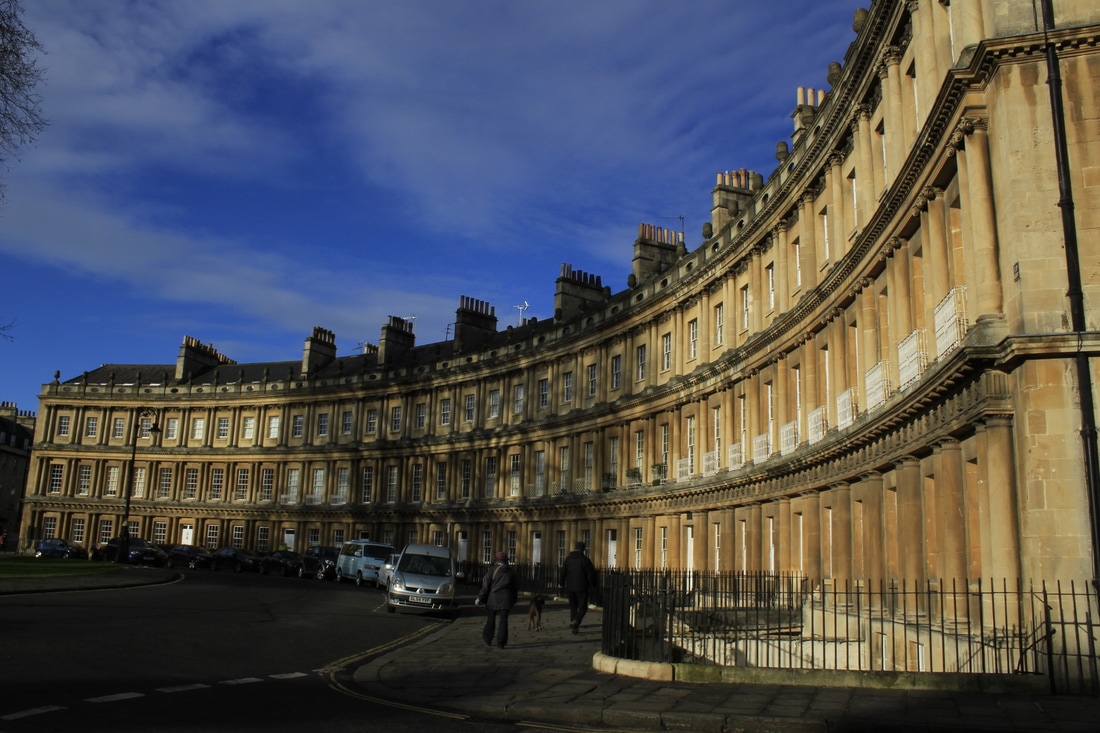
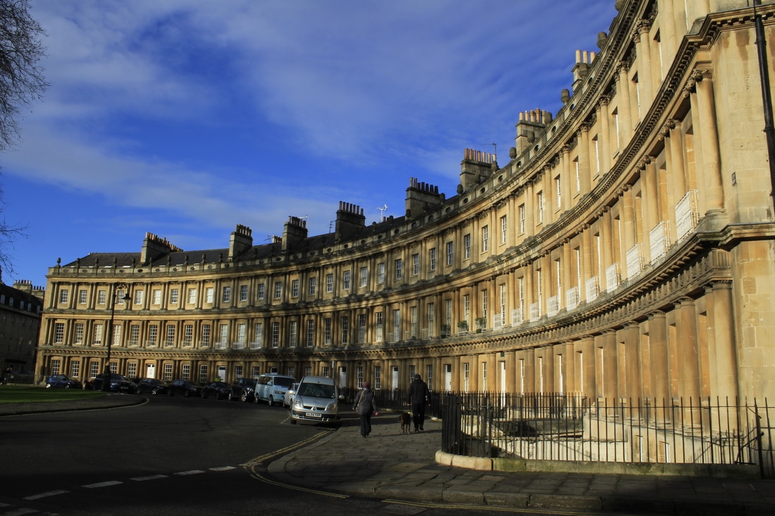
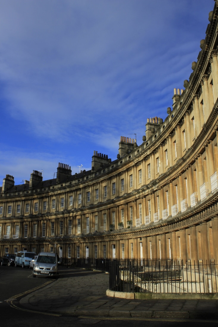
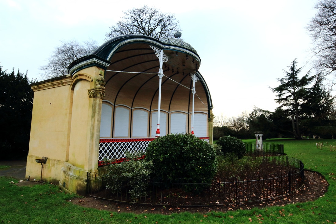
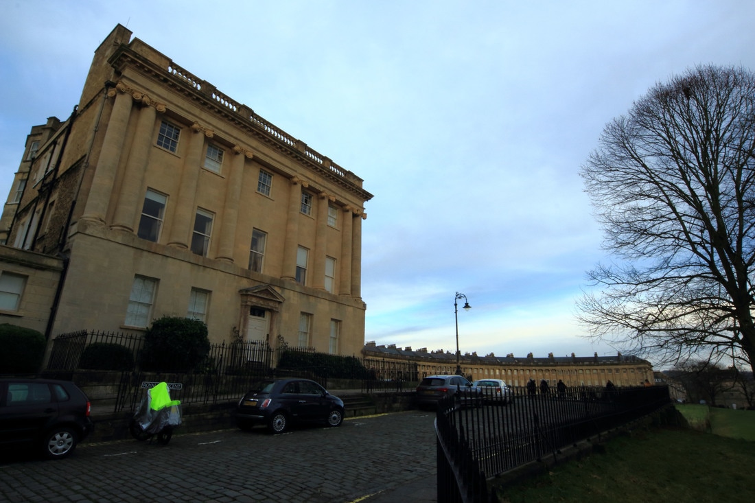
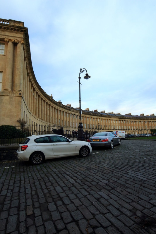
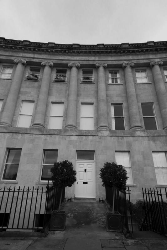
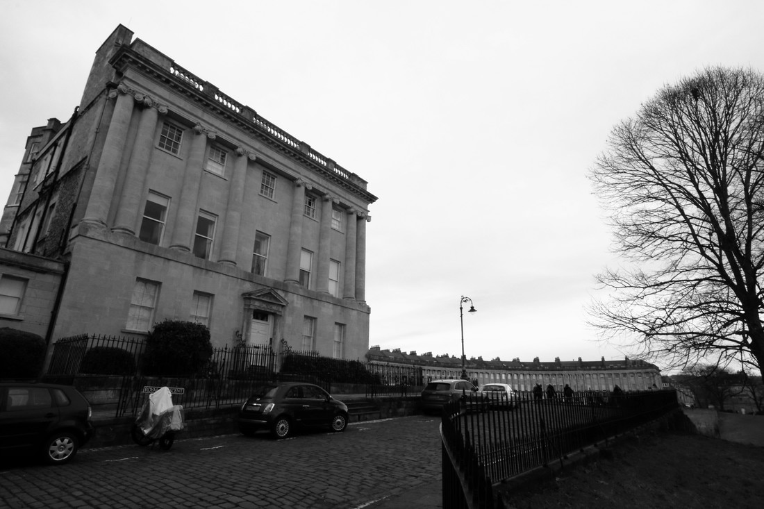
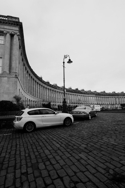
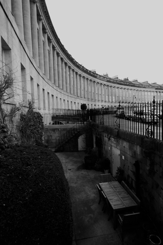
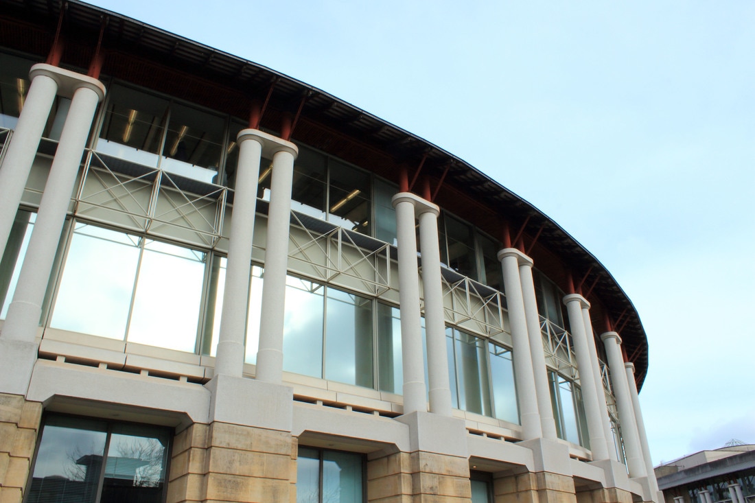
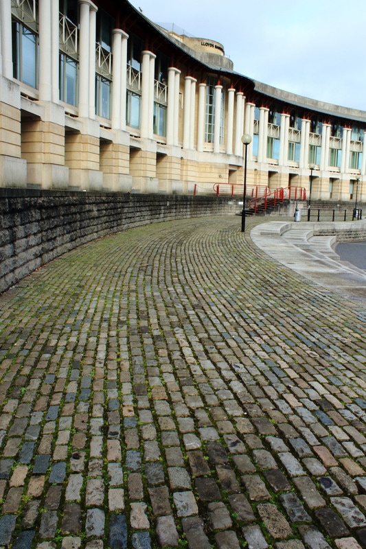
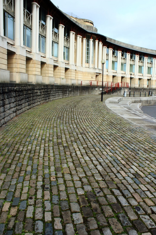
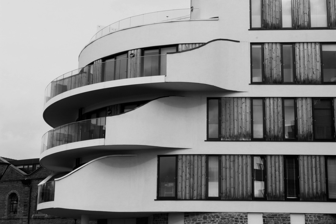
Shoot five: angles
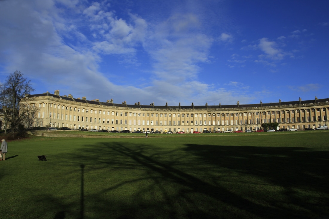
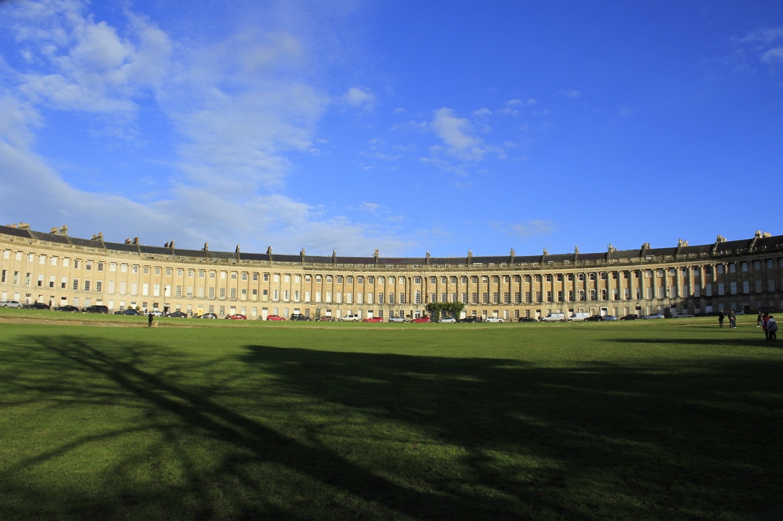
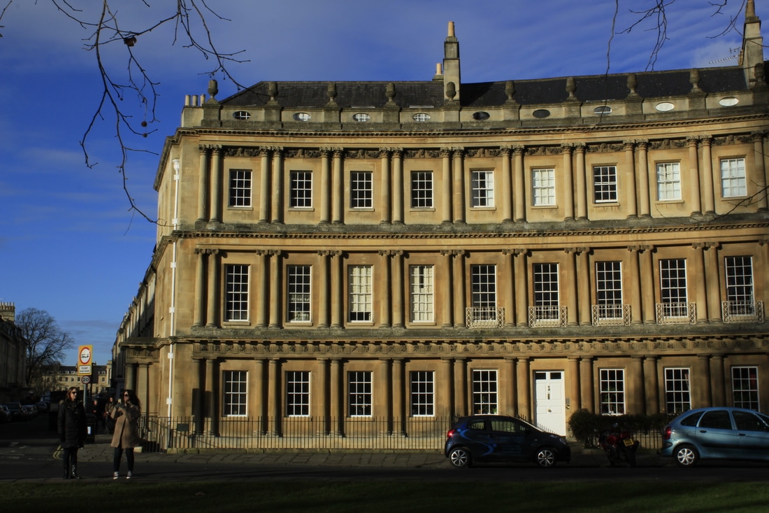
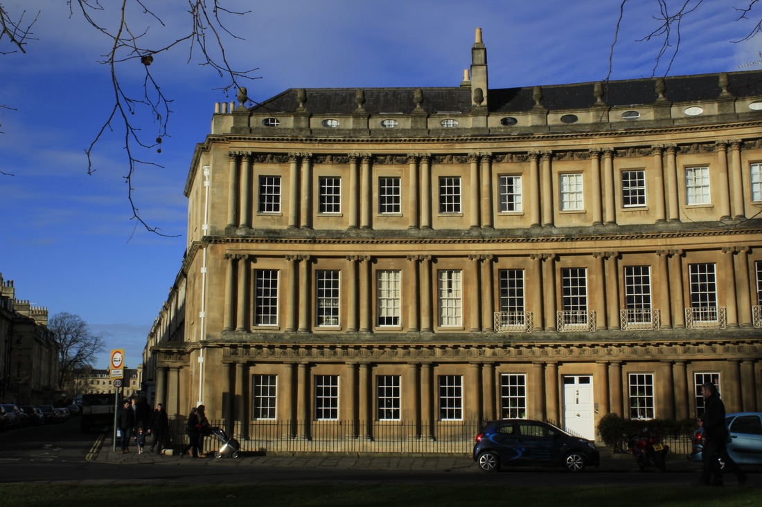
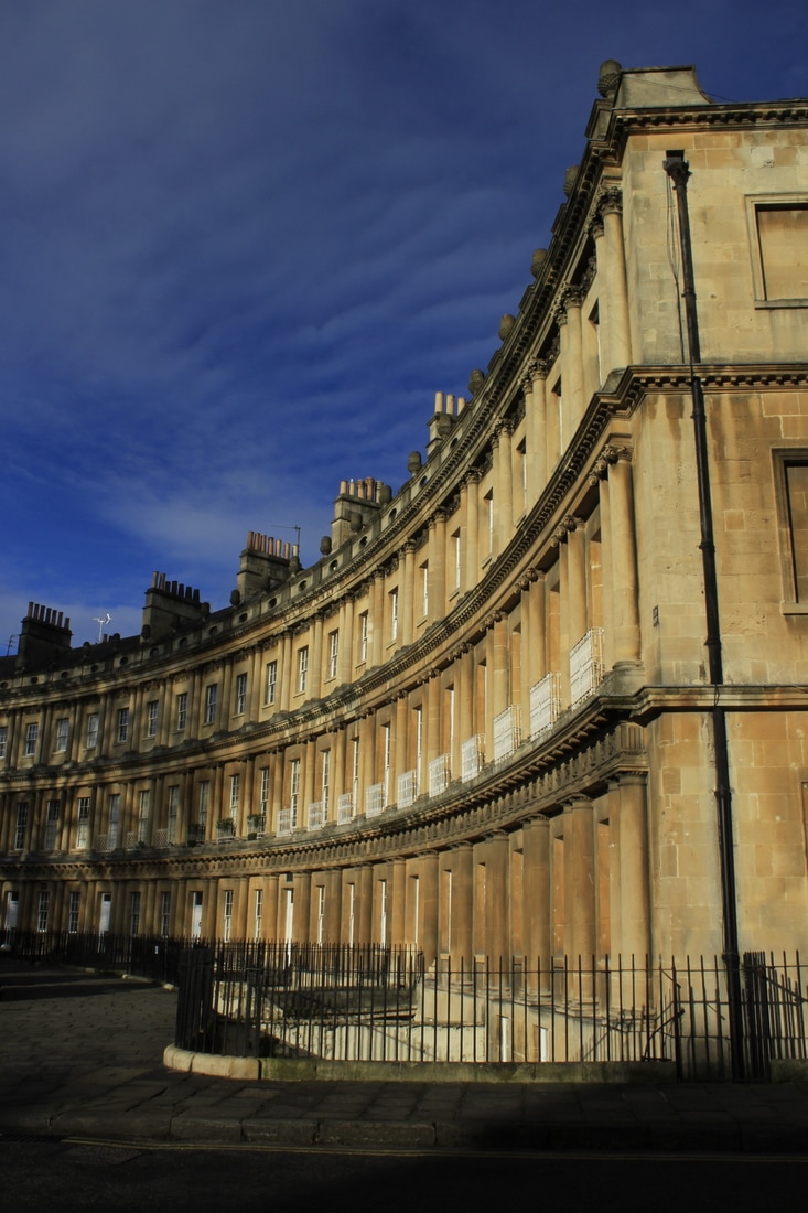
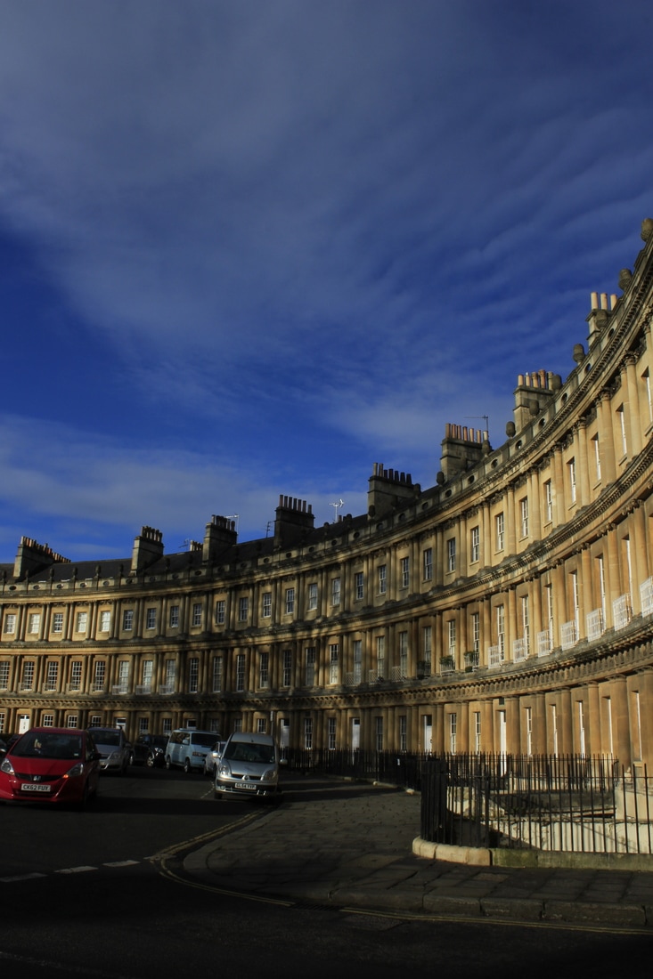
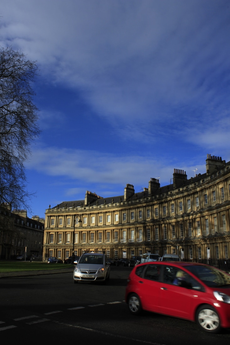
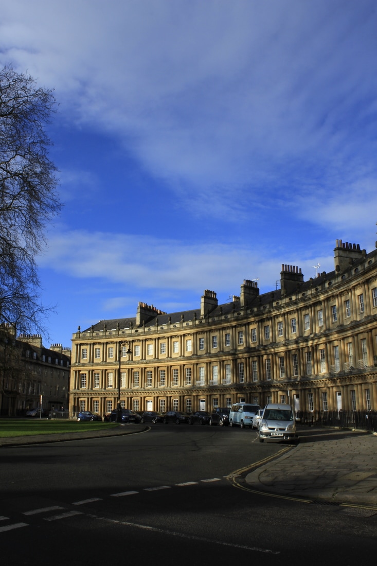
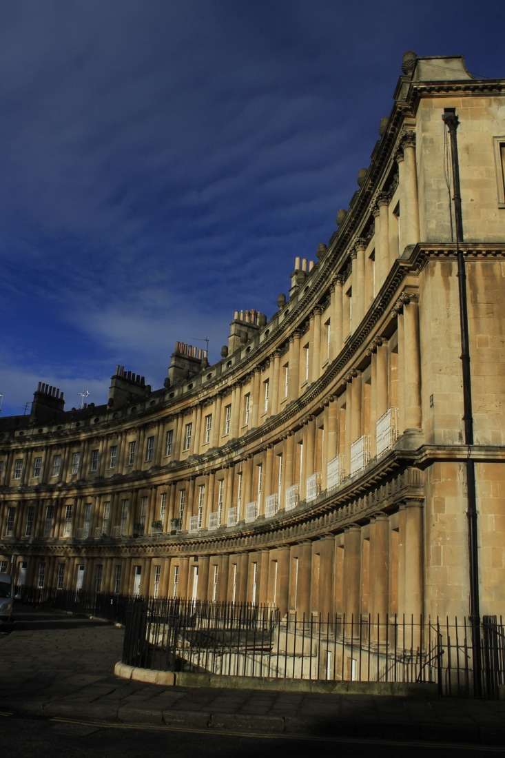
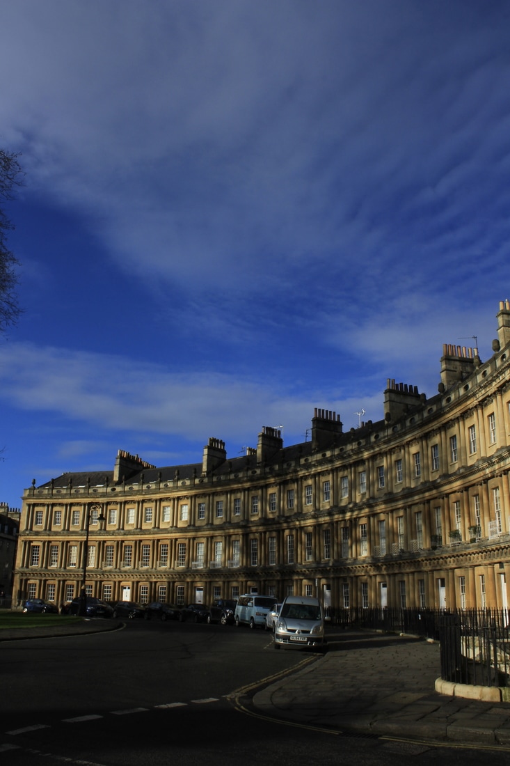
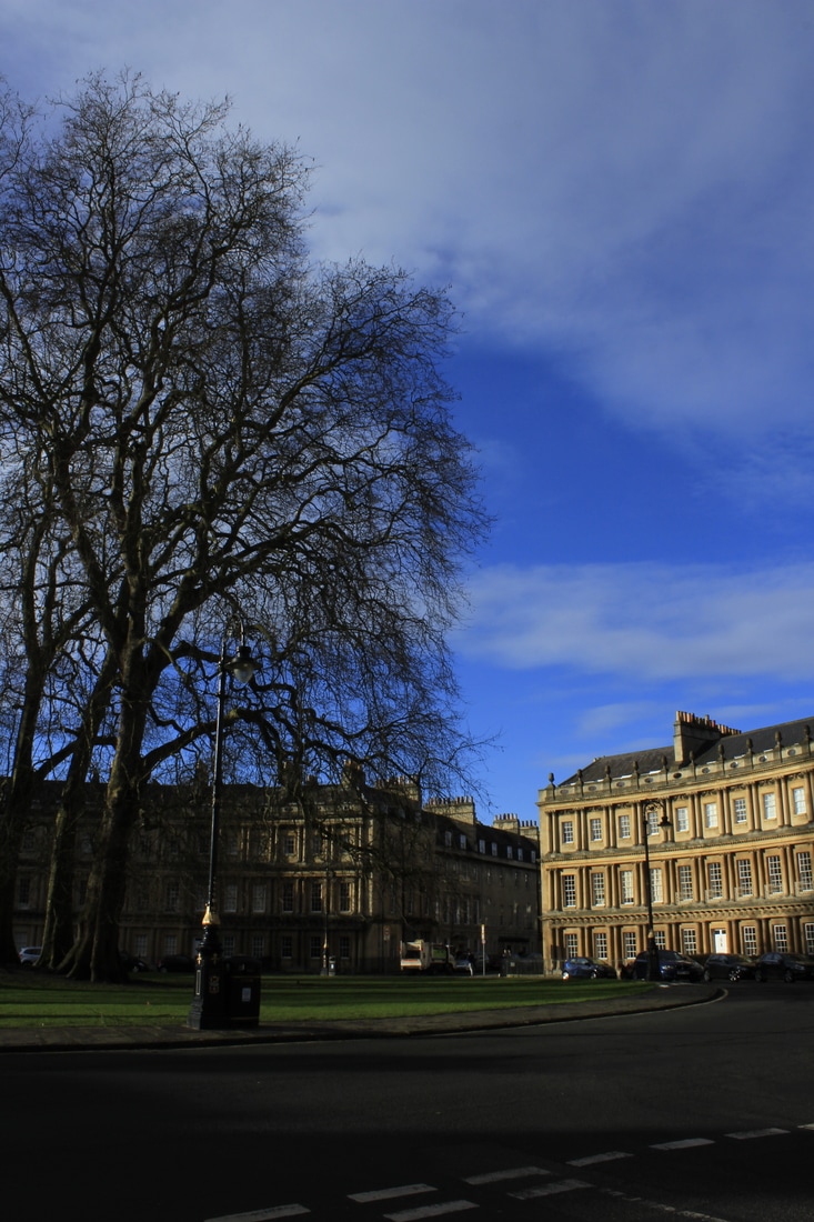
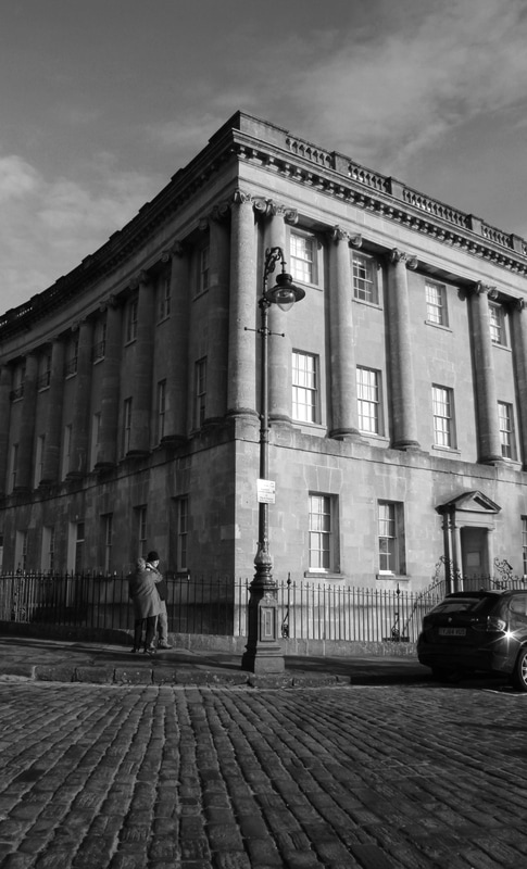
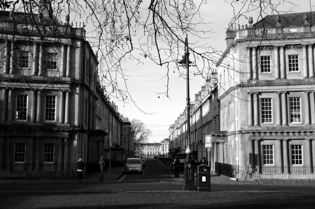
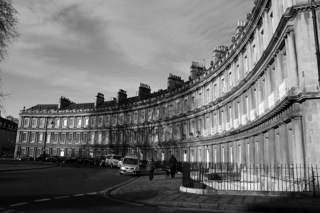
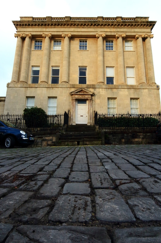
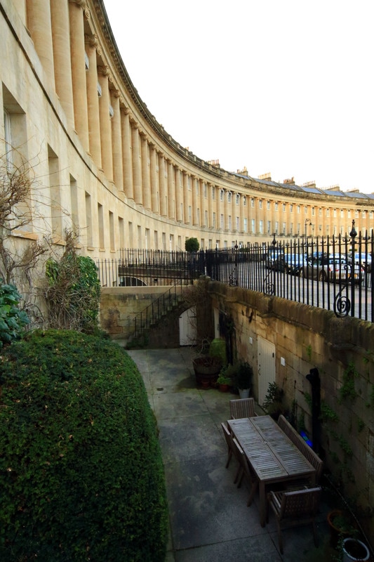
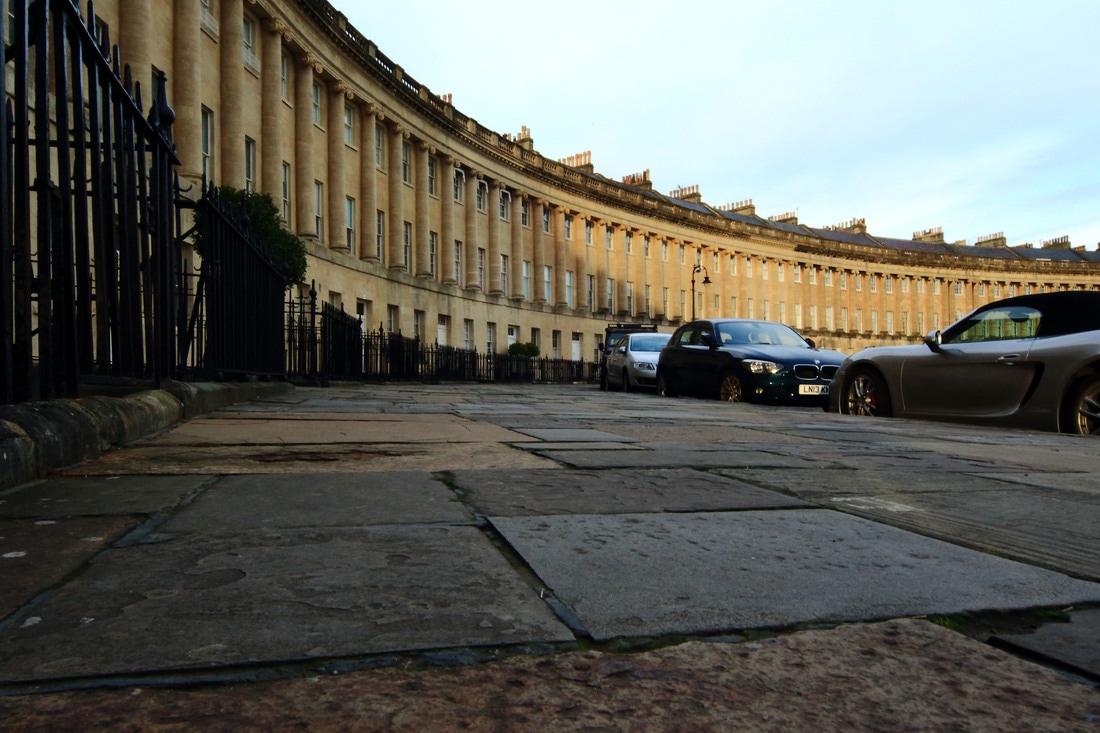
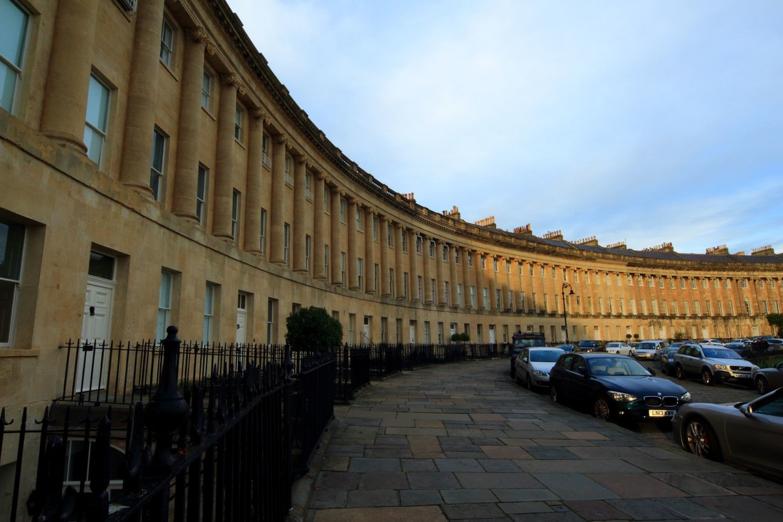
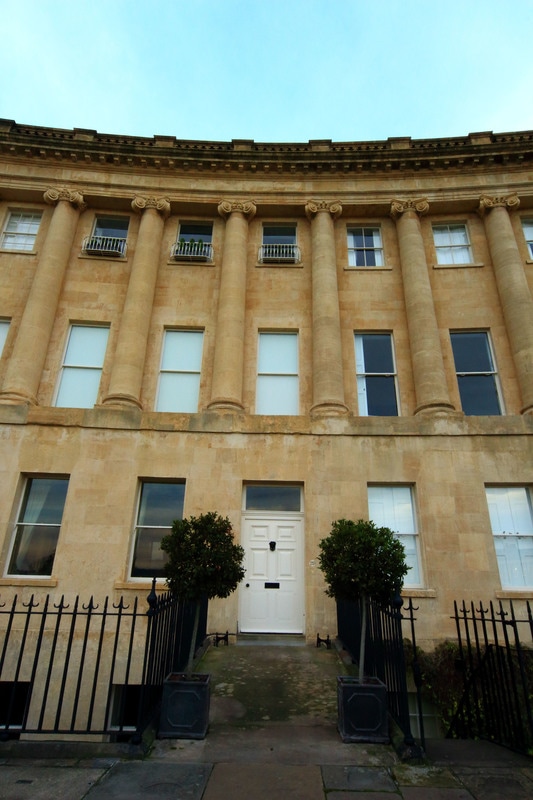
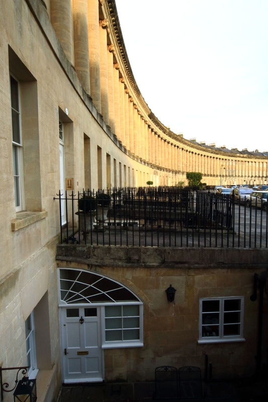
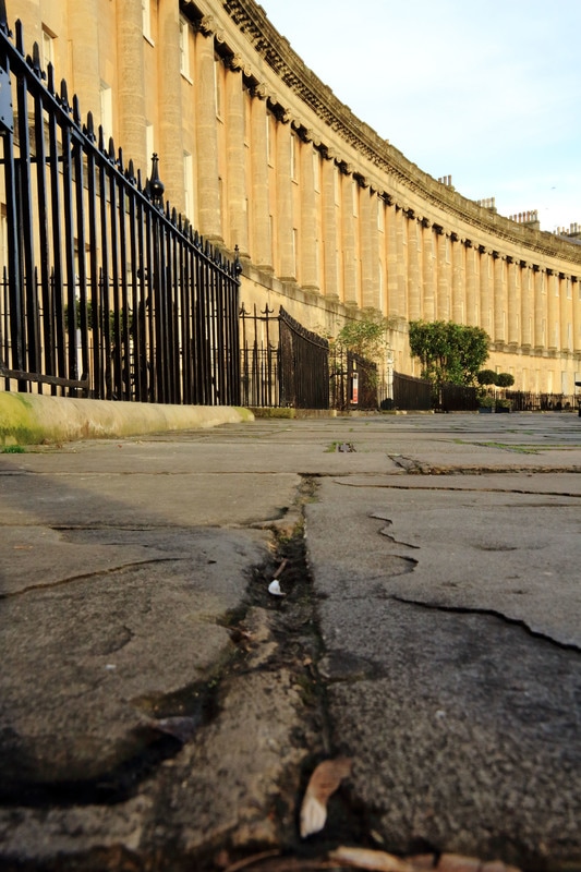
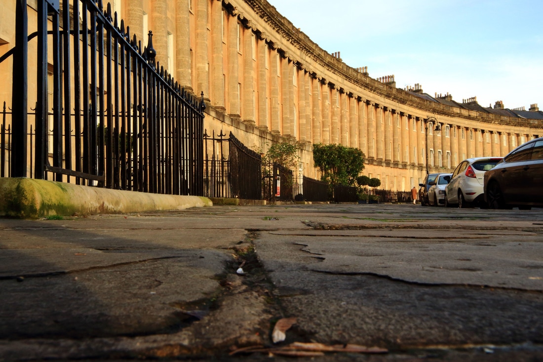
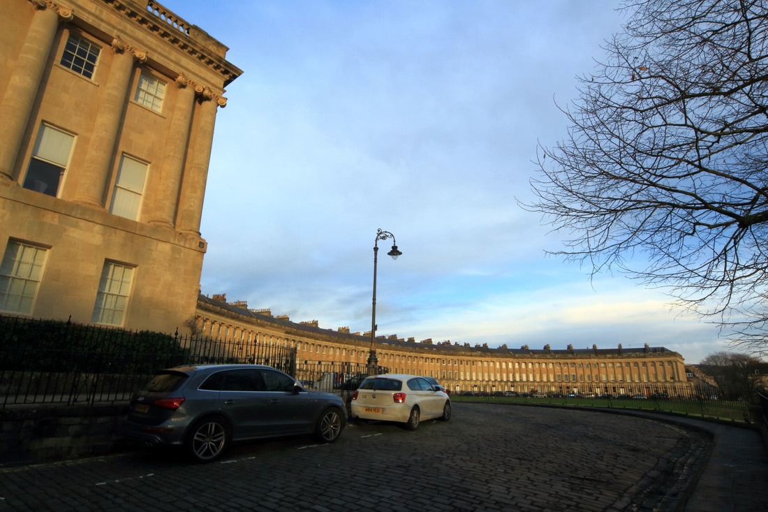
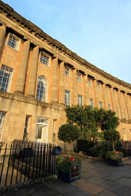
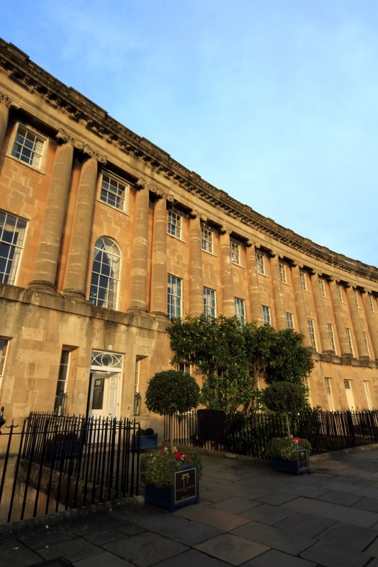
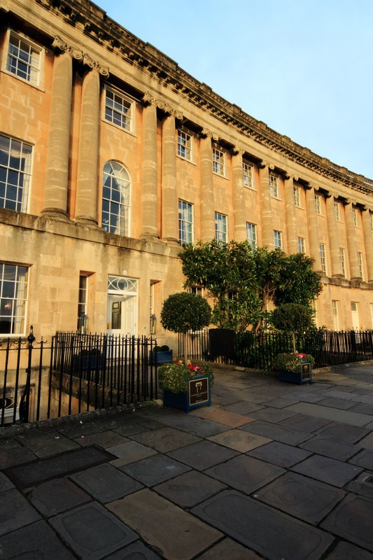
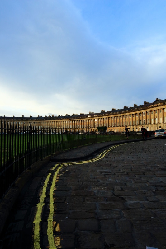
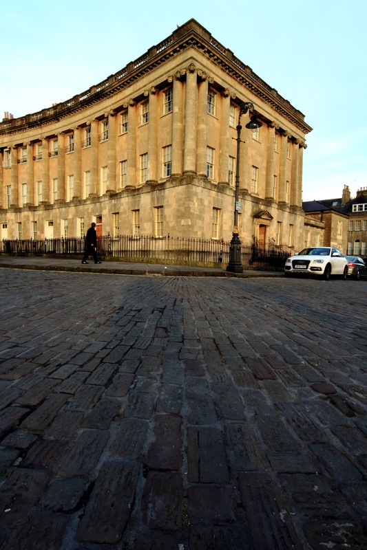
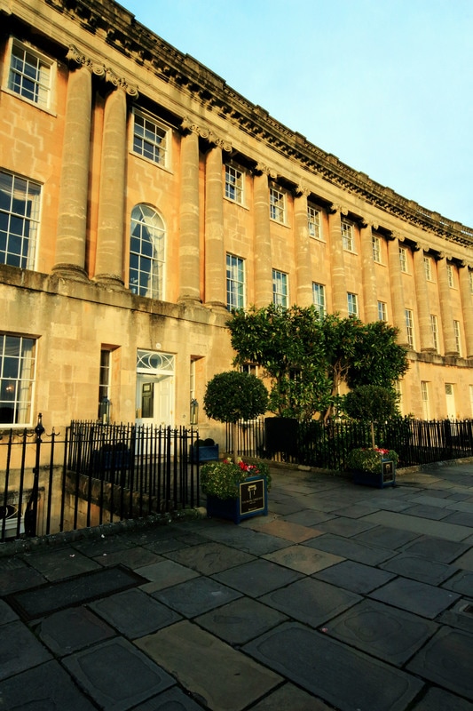
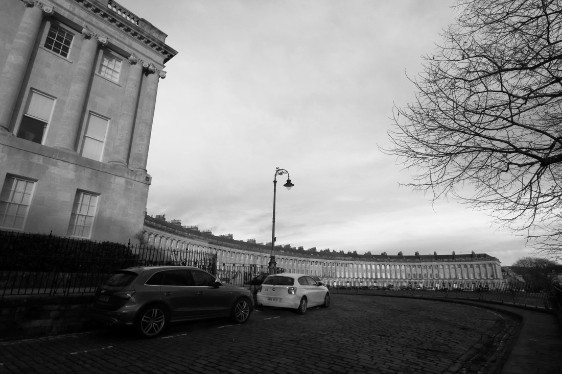
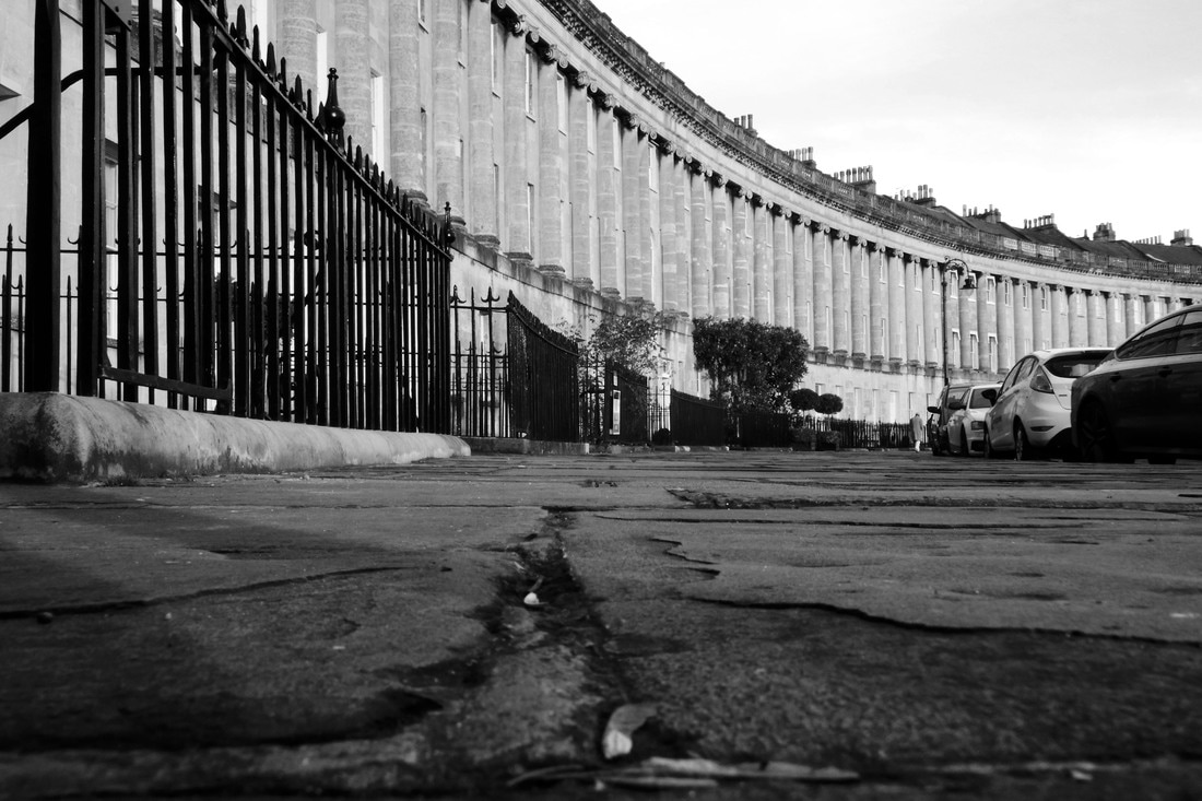
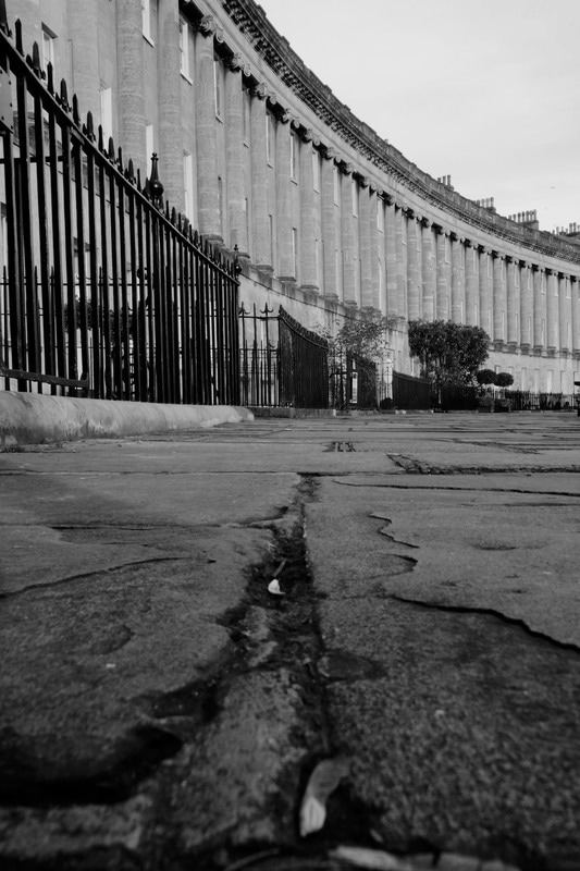
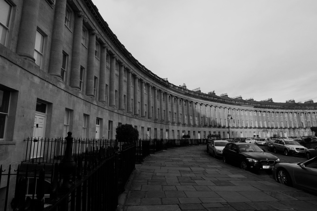
Plan: For this shoot I plan to return to the city of Bath and I want to look more closely at different angles. There are many iconic curves in the Georgian buildings and I want to explore how this can be represented in a more unusual less touristy image. I am going to photograph the curved angles of The Circus and The Crescent more closely in Bath. I am going to need a camera.
|
|

|
|

|
|
|
|

Critique:
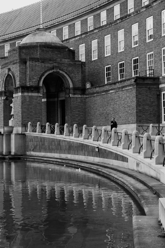
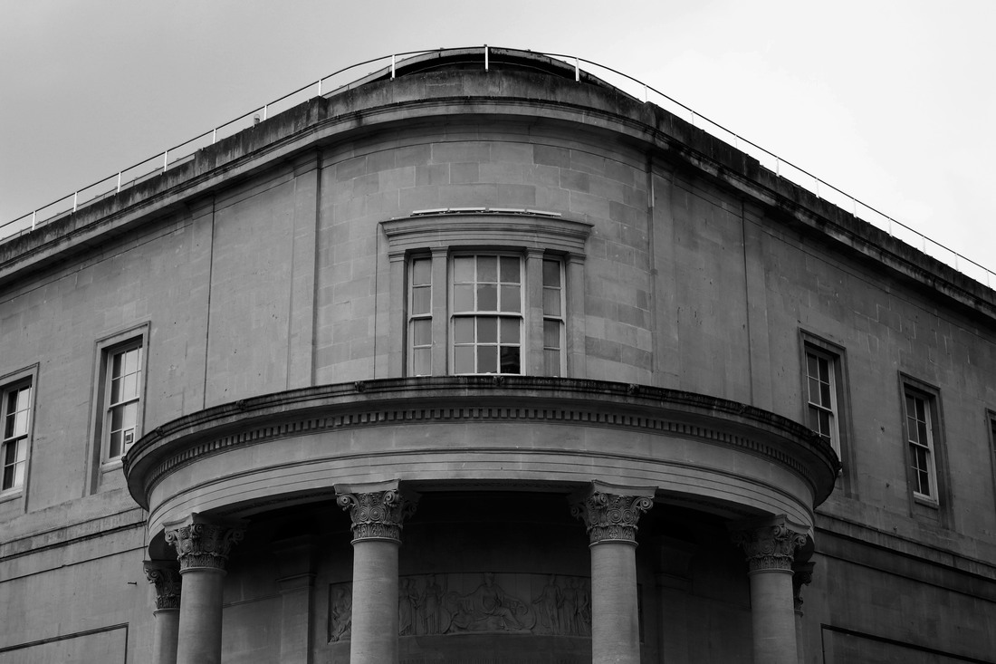
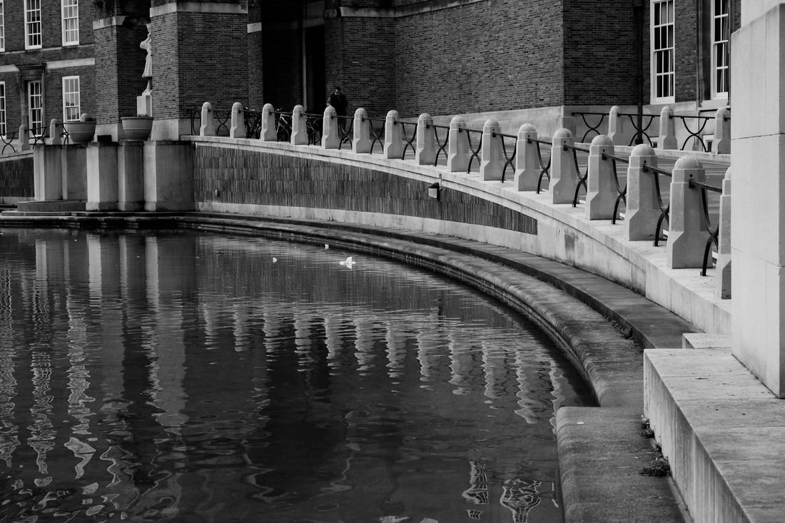
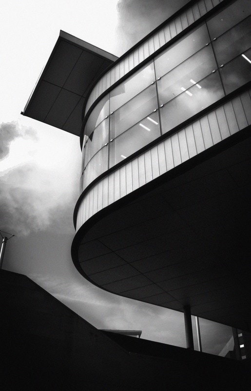
WWW: I was pleased that I was able to clearly focus on angles/curves in this shoot. I was pleased that whilst these images are of the iconic Circus and Royal Crescent they are not typical touristy images. I was particularly pleased with images three and four as I feel the sharp angle at the end of the building contrasts beautifully with the curve of the roof line of the buildings. Again In image nine I like the way the curve of the roof line contrasts this time with the strong vertical lines in the columns on the building and the railings. The crack in the pavement also create a strong perpendicular with the vertical column and railing line which sharpens the contrast with the curved roof line. Image twelve also creates some striking contrasts. The roof line and the basement window creates a fantastic contrast of convex and concave curve lines whilst the horizontal line between the basement and street level creates a good contrast to the vertical lines in the buildings columns. It is a great image of contrasts as this more unusual black and white basement level view of the crescent contrasts with the typical colour tourist images of this iconic architecture. I also think this image demonstrates well the aspects I admired in Frederick H Evans photograph. Like Frederick H Evans I think I have effectively used black and white imagery to emphasise the contrasting lines found in architecture.
EBI: Whilst I feel I have clearly kept to my plan of focussing on curves in architecture, I have only focussed on one type of curve, i.e. the one created by buildings built in either a circle or curved design. I think I could have explored curves in architecture in more detail by looking at more different ways in which curves can be created in architecture, for example in arches. This shoot also only focuses on curves in external architecture and I think I could have explored the theme of curves in internal architecture as well.
Next Steps: I would like to focus on the different ways in which curves are created in architecture, remembering to focus on both internal and external architecture.
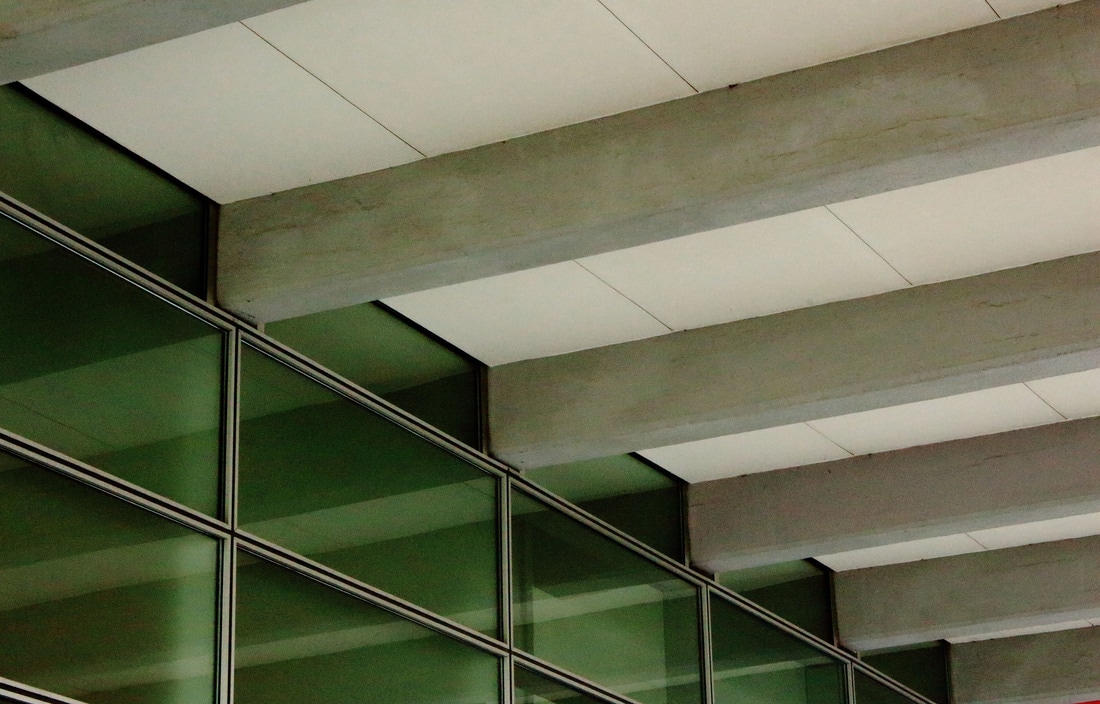
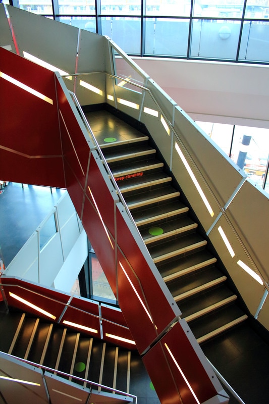
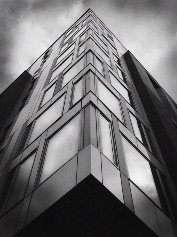
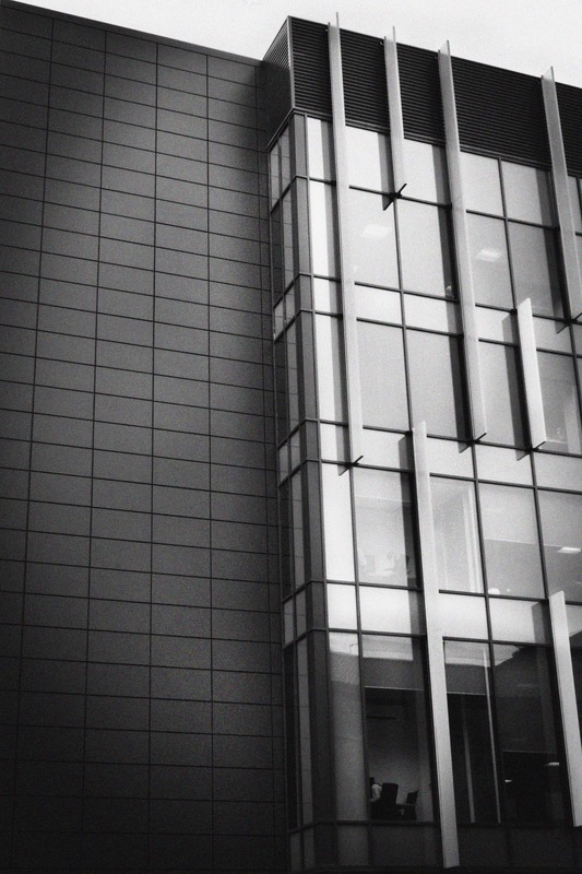
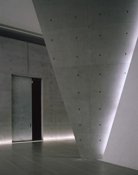
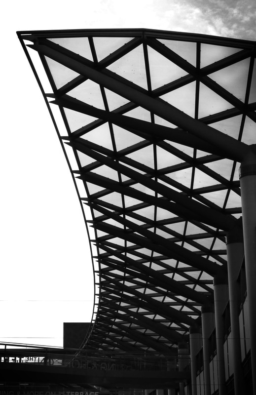
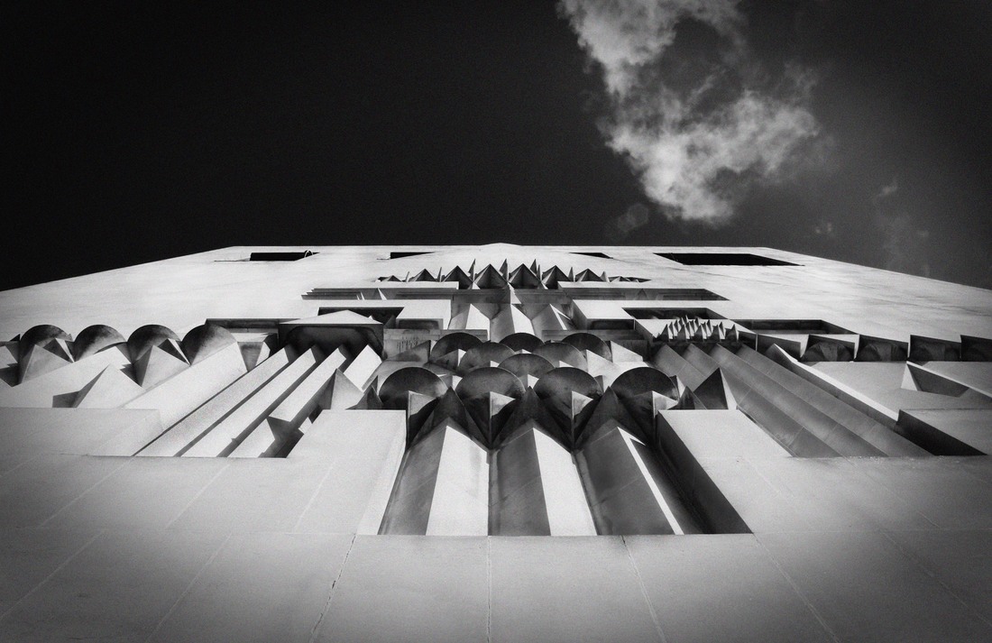
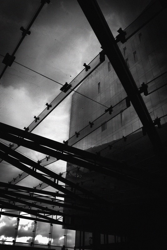
ezra stoller: critical analysis
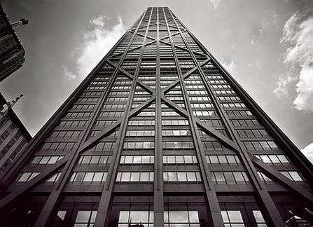
This photograph was taken by Ezra Stollen. Its of the John Hancock Center, Chicago and was taken along side a group of photos of the John Hancock building.
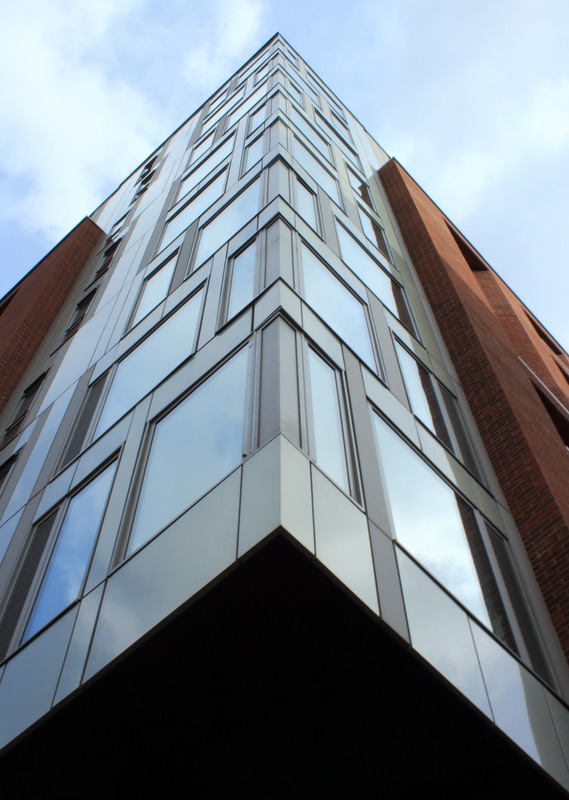
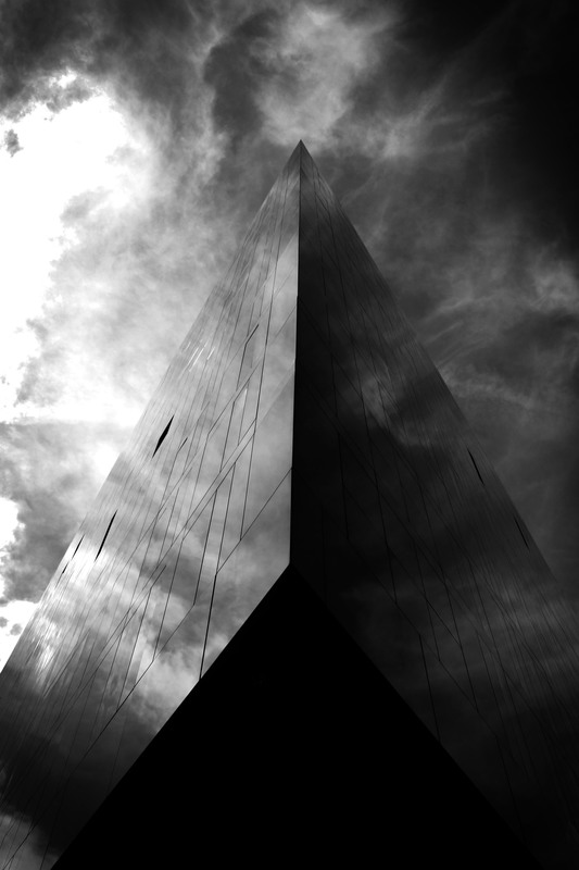
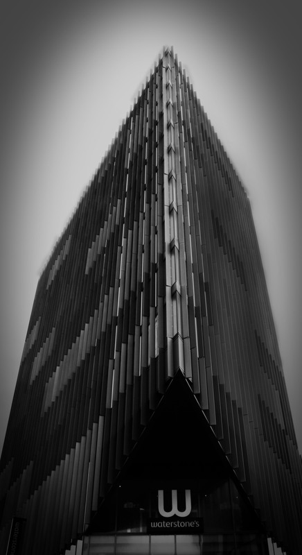
There are many aspects of this photo that I like and think are really effective. The unusual camera angle creates a very dramatic image. Focussing the camera looking up the building emphasises the line and height of the building and creates a striking visual perspective of converging lines. This visual perspective also emphasises the lines and patterns created by the external diagonal lines on the building. This creates a much more interesting image than one taken on straight on. The use of black and white also works very effectively to draw attention to the line and perspective as the dark outer lines of the building contrast sharply with the lighter sky behind.
I would like to try to incorporate some of these ideas in my work. I would like to continue to explore using black and white to emphasise lines, curves and angles in my images. I also want to explore how interesting camera angles and perspectives can be used to emphasise interesting shapes, lines and angles in the existing architecture.
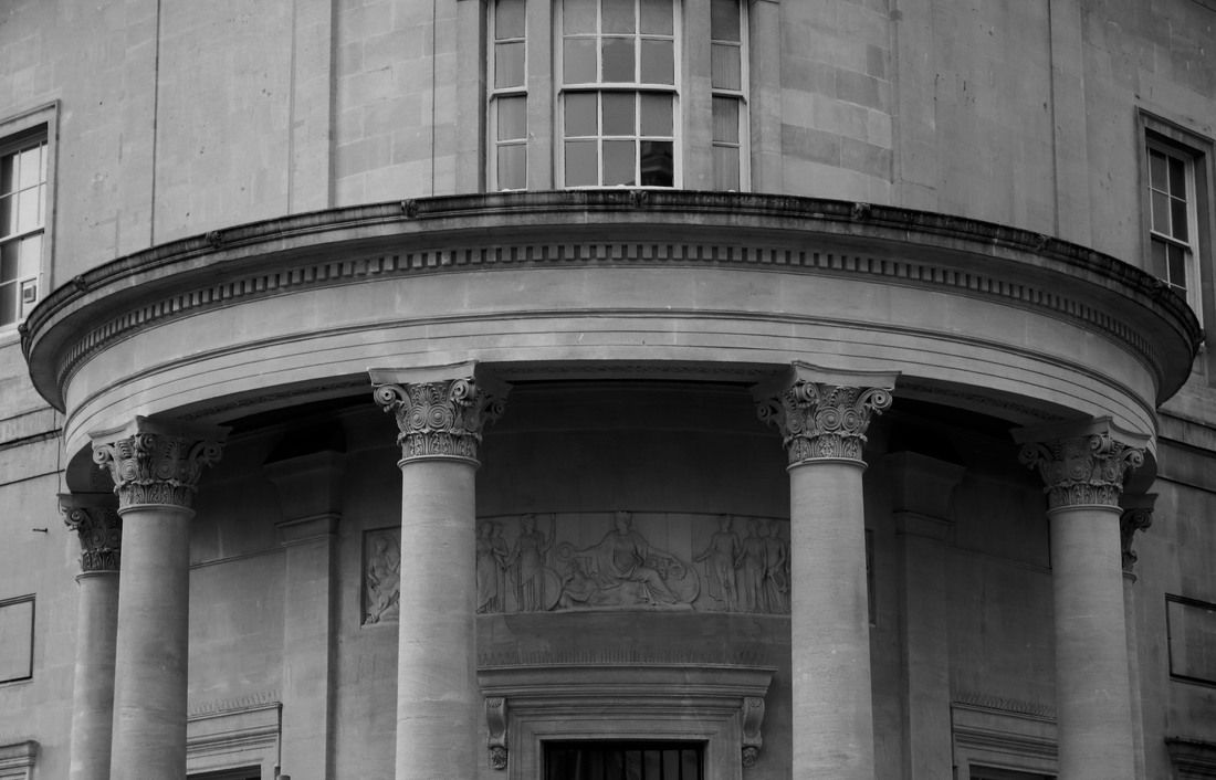
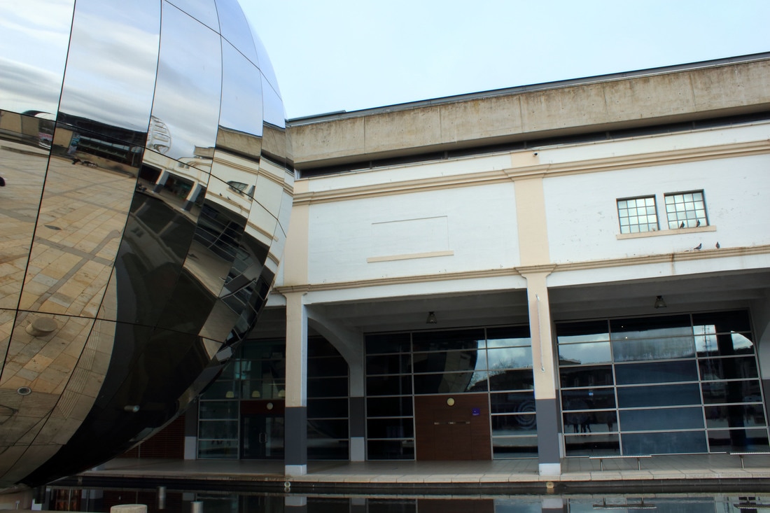
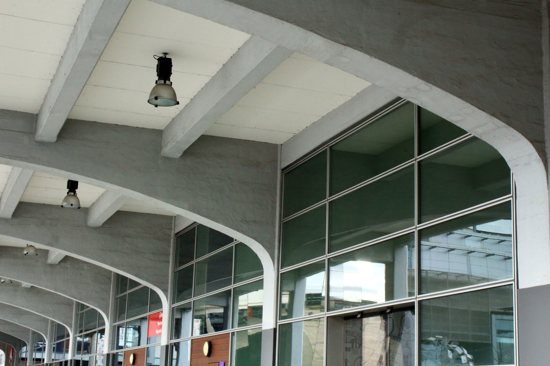
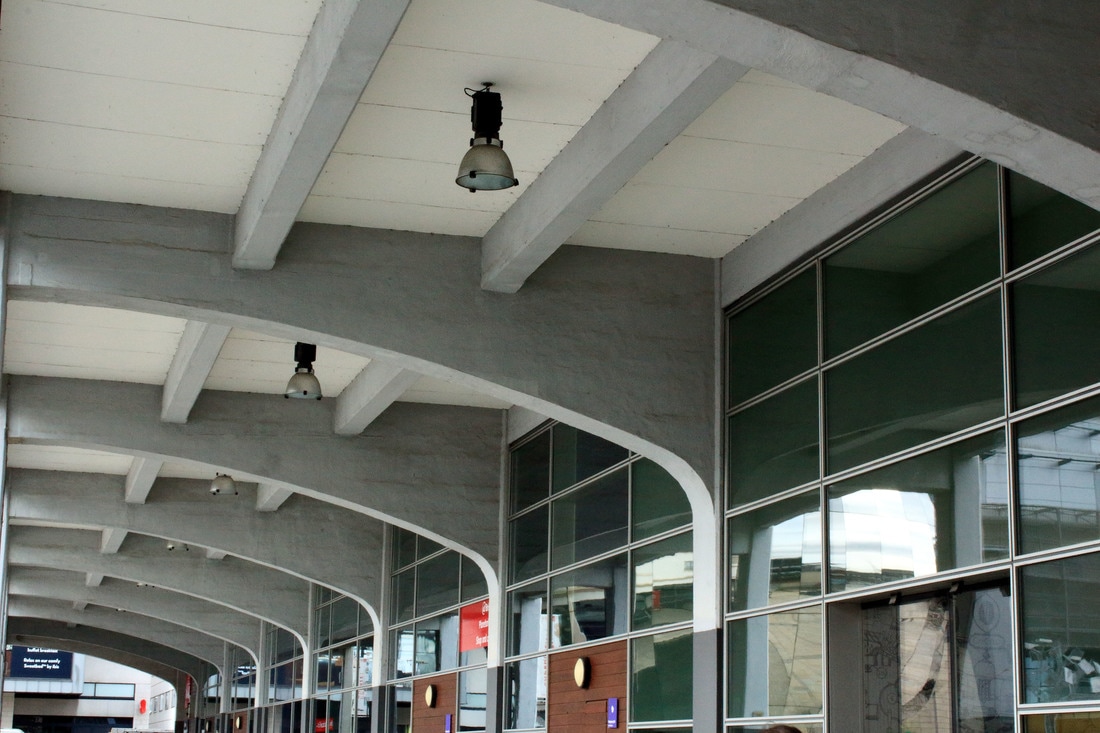
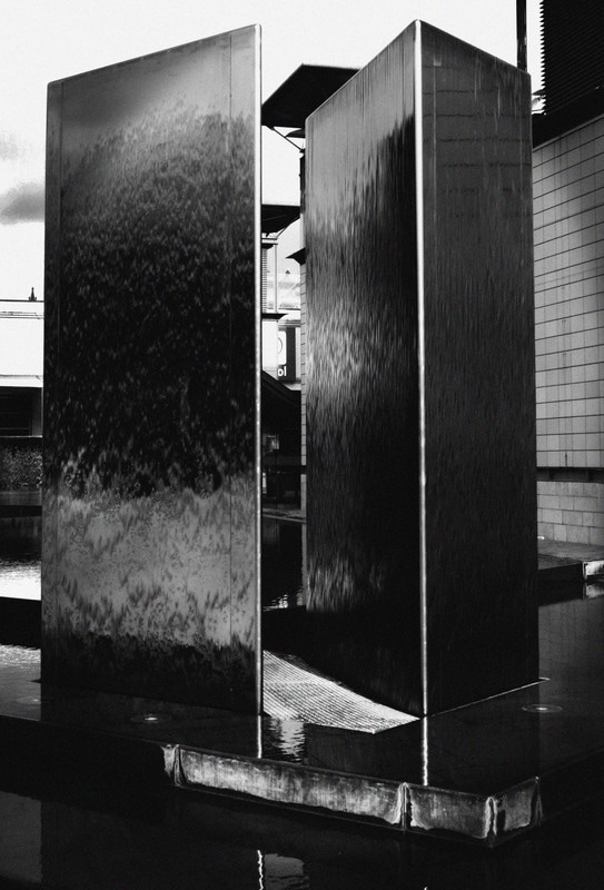
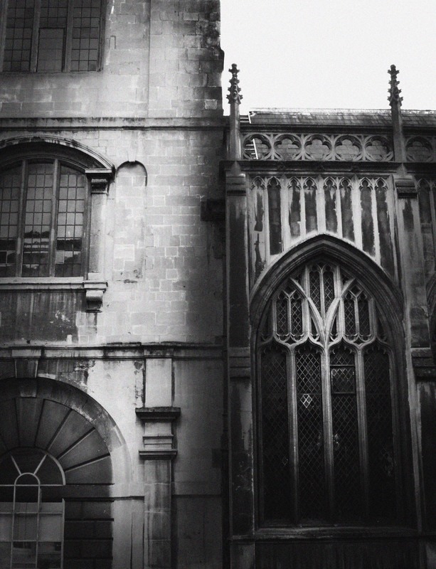
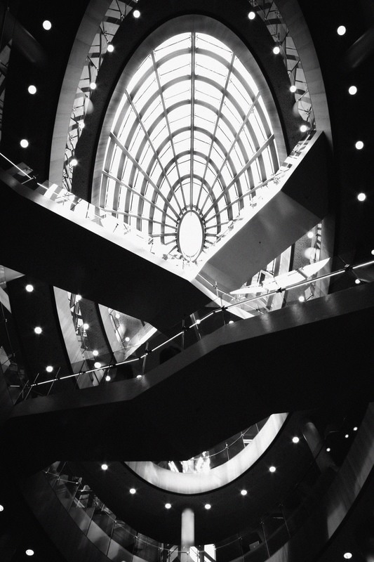
shoot six: CRESCENTS, curves + arches
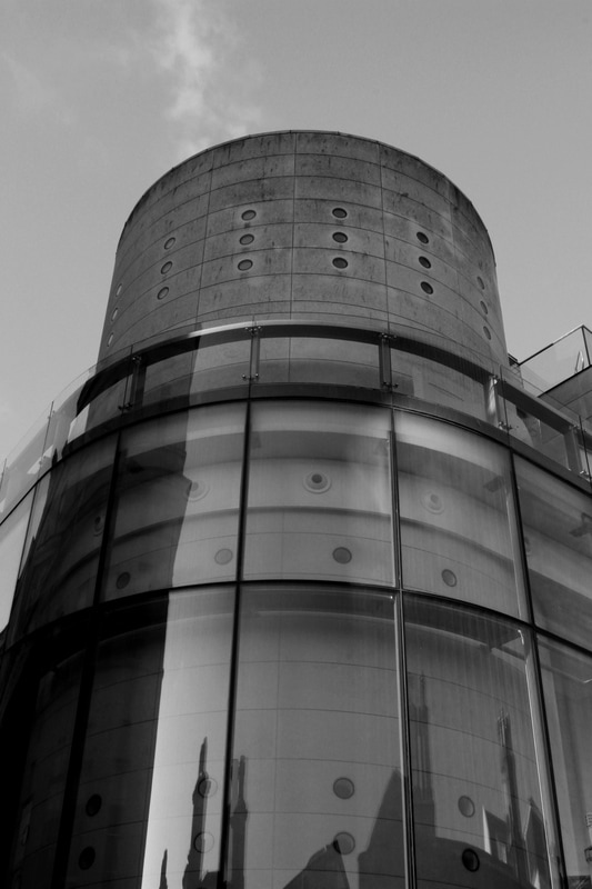
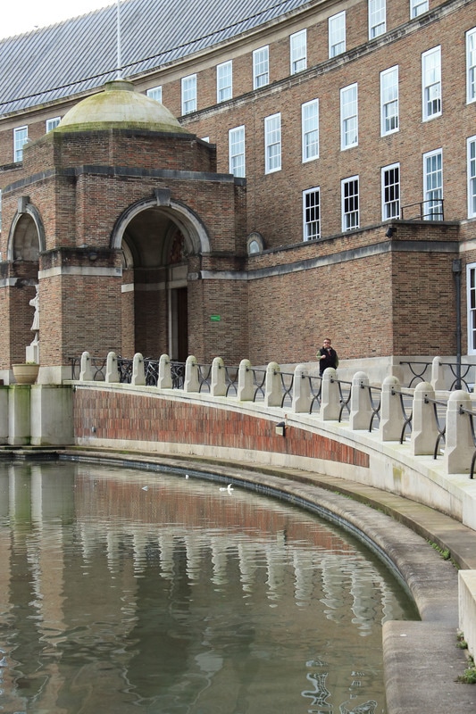
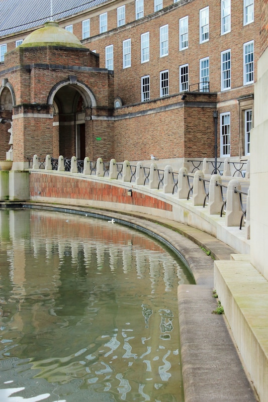
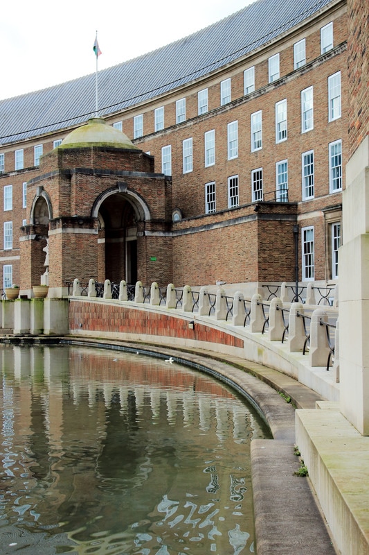
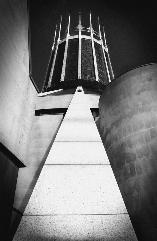
Plan: For this shoot I want to refine my photographs even further and look at more specific crescents, curves and arches in different architecture, modern and old, internal and external. I am going to conduct this shoot in Bristol in the area around the docks, College Green and Bristol Cathedral; I am hoping that this will provide me with opportunities to photograph curves in modern, old, internal and external architecture. For this shoot I will need a camera. I want to incorporate the ideas of camera angle to emphasise architectural features from Ezra Stoller and to continue to develop the use of black and white imagery from both Fredrick H Evans and Ezra Stoller.

These images were then edited in black and white to emphasise the curves and lines thus reflecting the work of both Frederick H Evans and Ezra Stollen.
|
|
Critique:
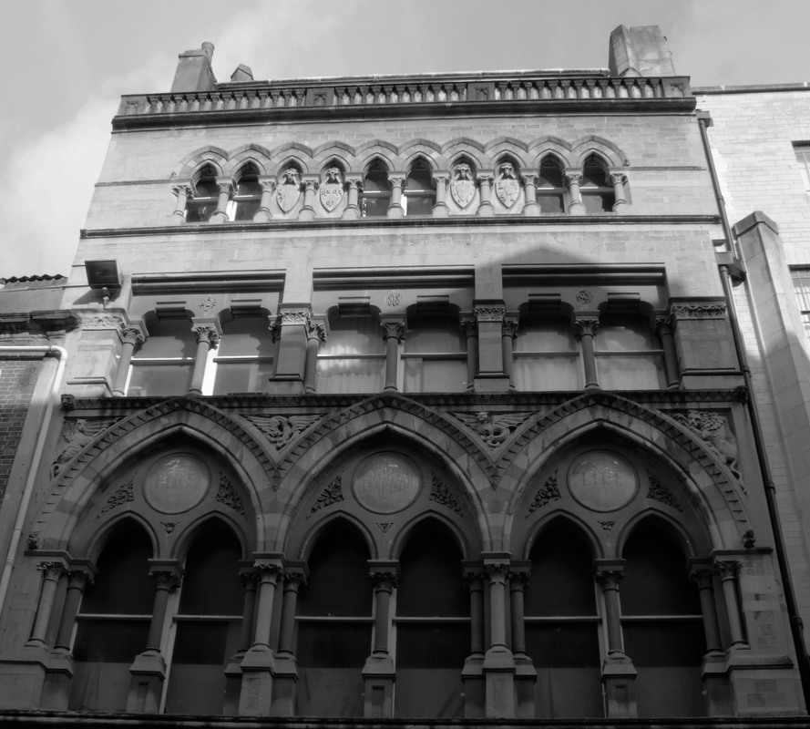
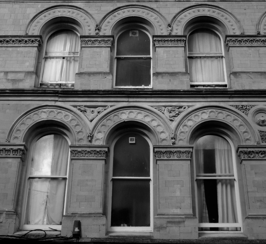
WWW: I am pleased that I was able capture images of modern, old, internal and external architecture that demonstrate dramatic use of line and curve. I am also pleased that my editing of these images in black and white has begun to emphasise this. I am pleased with how the first three internal images capture contrasting lines in black and white in Bristol Cathedral in a similar way to how Frederick H Evans demonstrated this in Wells Cathedral. I was really pleased with how the unusual end of building photograph in image seven emphasises both the curve of the roof line and that of the entrance roof and also reflects my interest in more unusual camera angles as demonstrated by Ezra Stollen. I am also very pleased with the way the brick lines emphasise the curve in images in twelve and thirteen and I think the use of black and white emphasises this.
EBI: I think I could improve my editing skills. I think I could have cropped my images and added more texture to the photographs to better reflect the work of Ezra Stollen. I think the modern buildings could have been more effective at reflecting the work of Ezra Stollen but I didn't find as many opportunities to photograph these as I would have liked.
Next Steps: In my next shoot I want to experiment with looking at different ways off editing my photographs, and editing them in the style of Ezra Stoller. I also want to take more photographs of the internal and external architecture of modern buildings.
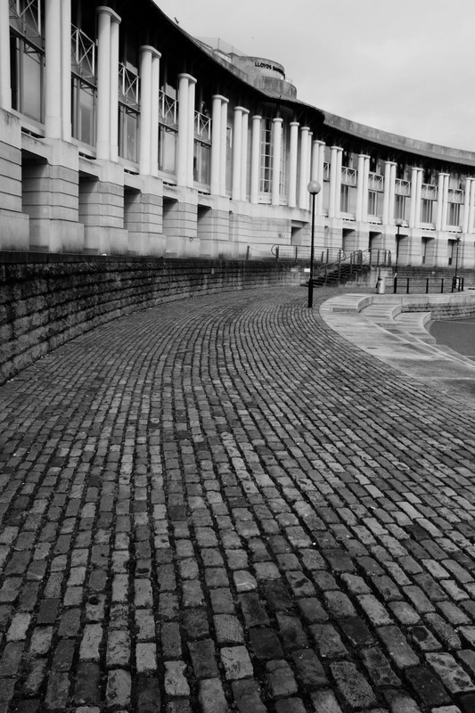
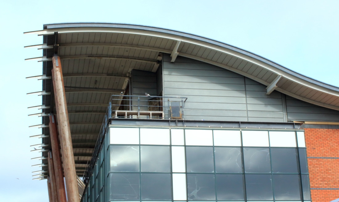
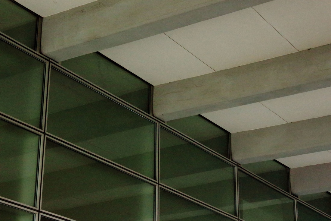
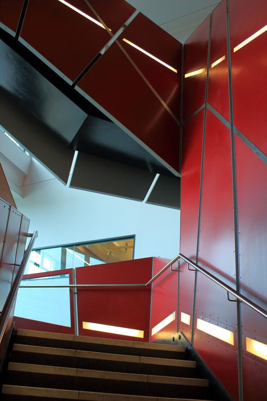
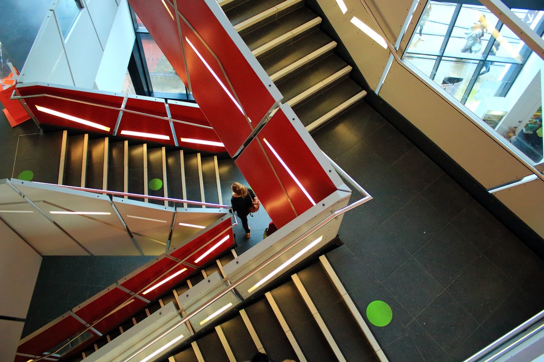
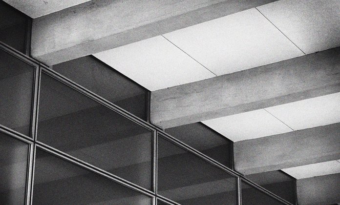
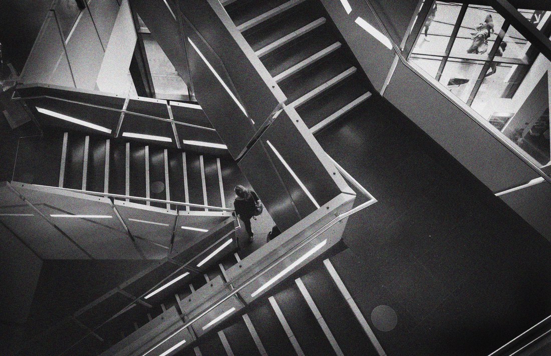
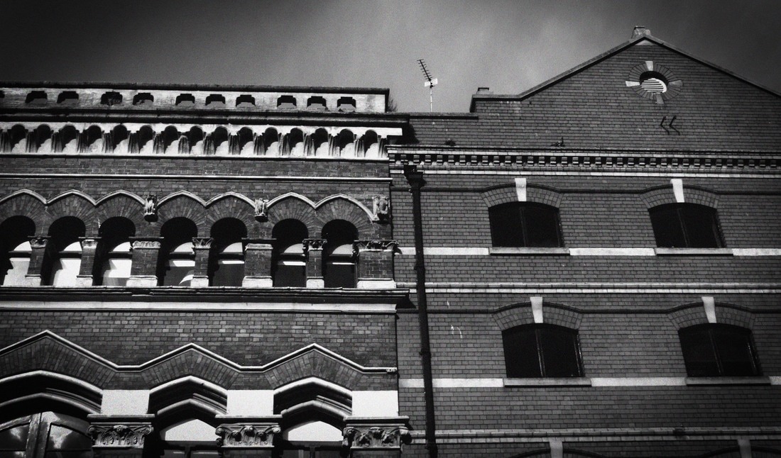
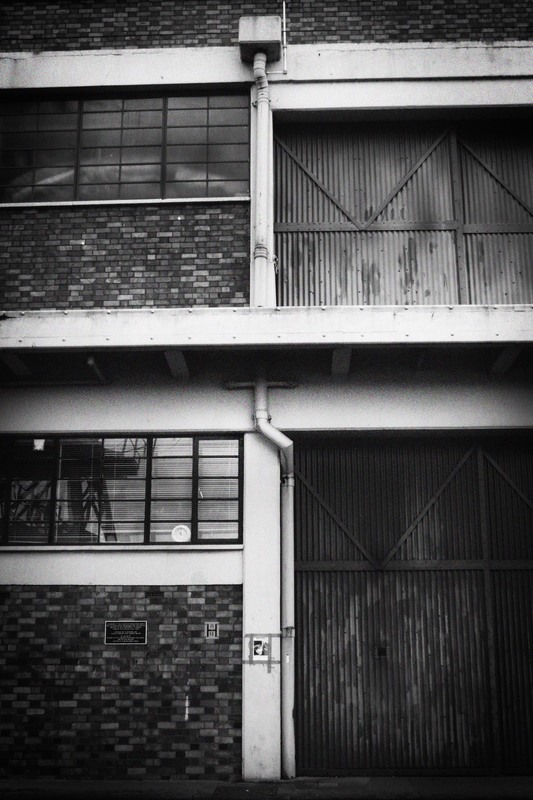
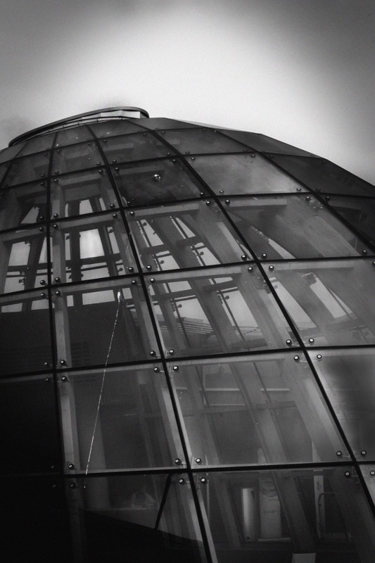
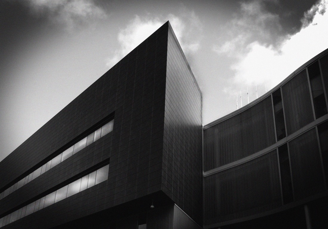
shoot seven: lines, shapes and angles
Plan: For this shoot I am going to look and focus more on modern buildings. I am also going to focus more on the editing process to make them look more like the style of Ezra Stoller. My inspiration for this shoot is Ezra Stoller. I am going to conduct this shoot in Bristol and I will need a camera.
|
|
|
|
My Editing Process
My aim was to edit my photographs in the style of Ezra Stoller.
My aim was to edit my photographs in the style of Ezra Stoller.
Critique:
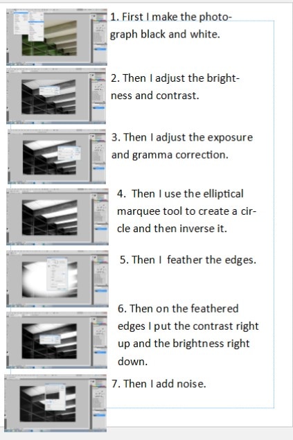
WWW: This shoot was successful as I was able to shoot both internal and external modern architecture. I also I feel improved my editing my skills with this shoot. As well as continuing to edit my images using black and white, I also edited and changed the contrast, brightness and exposure of the images. I added vignette to the edges and added noise and texture to the photos. I also cropped the photos to emphasise the use of camera angles and the contrasting lines within the images. I think this has been particularly effective in image four and clearly emphasises the effect of Ezra Stollen's work on my images.
EBI: Whilst I was happy with the modern buildings I found for this shoot I was sometimes frustrated with trying to take images where old and modern buildings are positioned closely together. Instead of being restricted by this I feel it would be good to explore how the juxtaposition of these buildings could be further used to add interest to images and emphasise line, curve and angle.
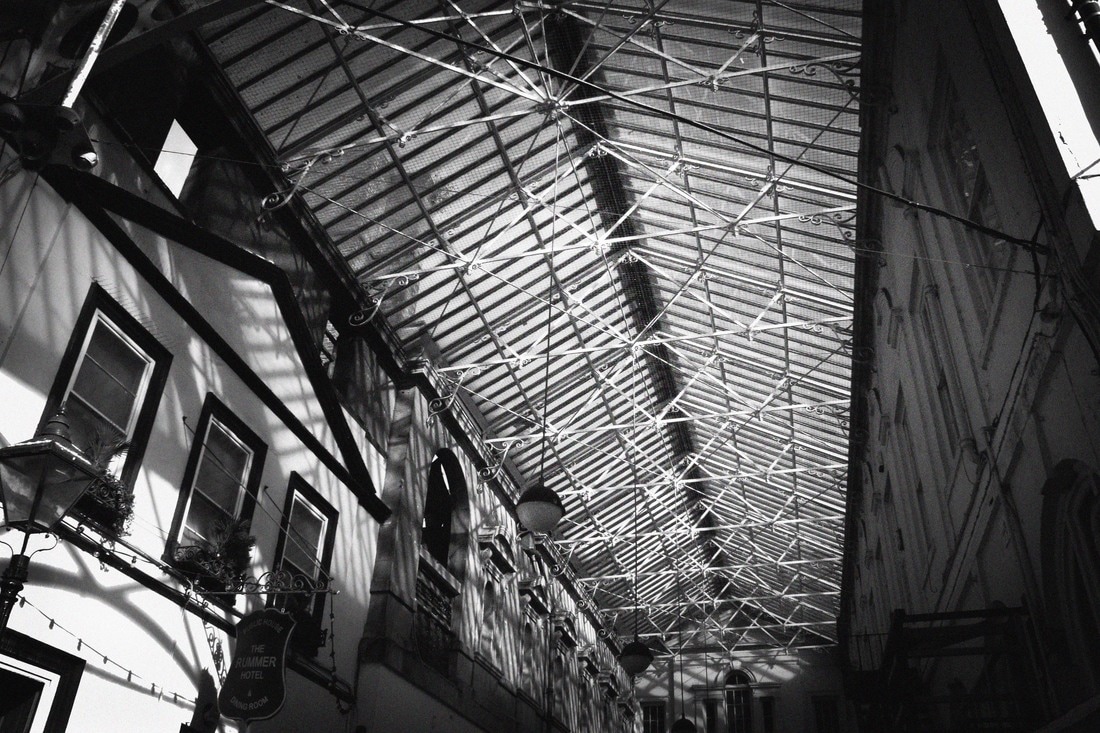
richard bryant: critical analysis
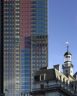
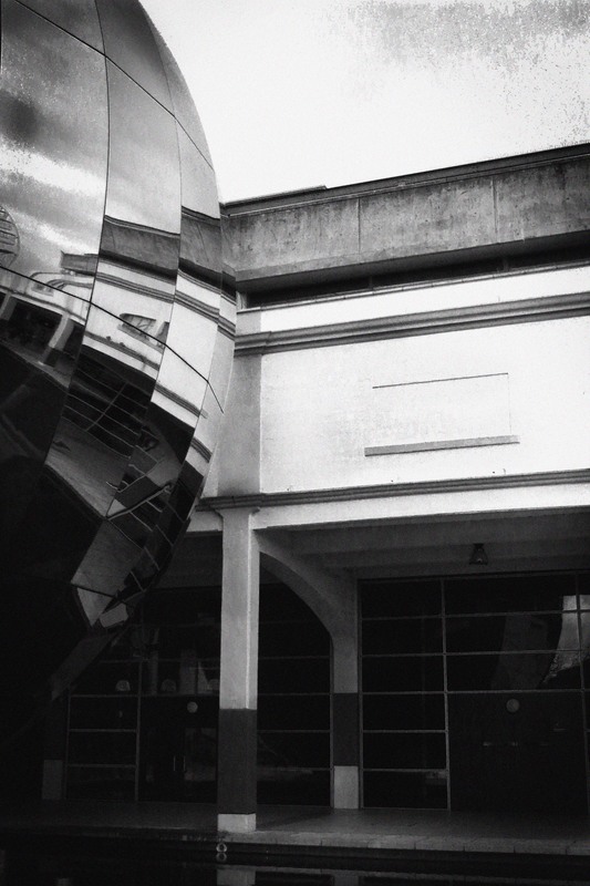
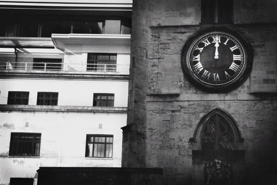
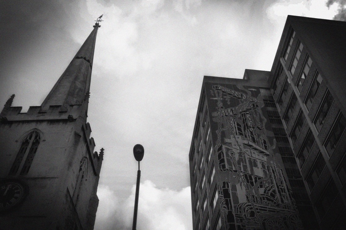
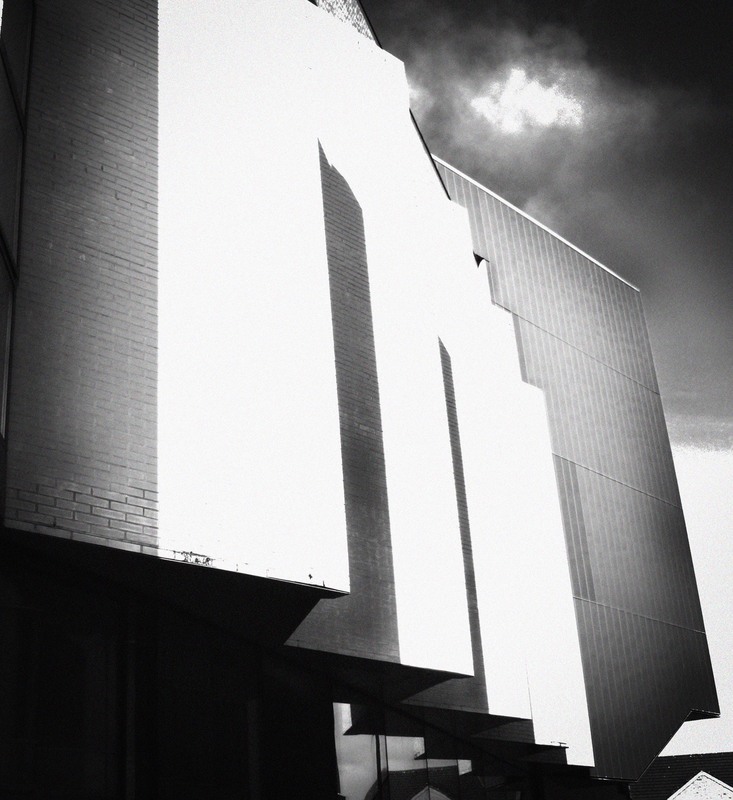
This photograph was taken by Richard Bryant and it's an architectural image taken in London. This image is dramatic as it demonstrates a sharp contrast between old and modern buildings. Both images clearly show how line can be used dramatically in architectural images but having both an old and modern image in the same photograph emphasise the contrast between this use of line. The lines of the modern building whilst being vertical and horizontal are also very sleek and fluid. In contrast to this the older building includes a greater array of different lines, curves, arches and angles.
When carrying out photo shoots in the city of Bristol I observed many old and modern buildings sitting beside each other and I think it would be interesting to explore how these opportunities could be used to create images similar to Richard Bryant.
When carrying out photo shoots in the city of Bristol I observed many old and modern buildings sitting beside each other and I think it would be interesting to explore how these opportunities could be used to create images similar to Richard Bryant.
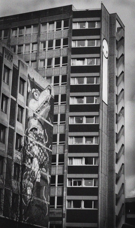
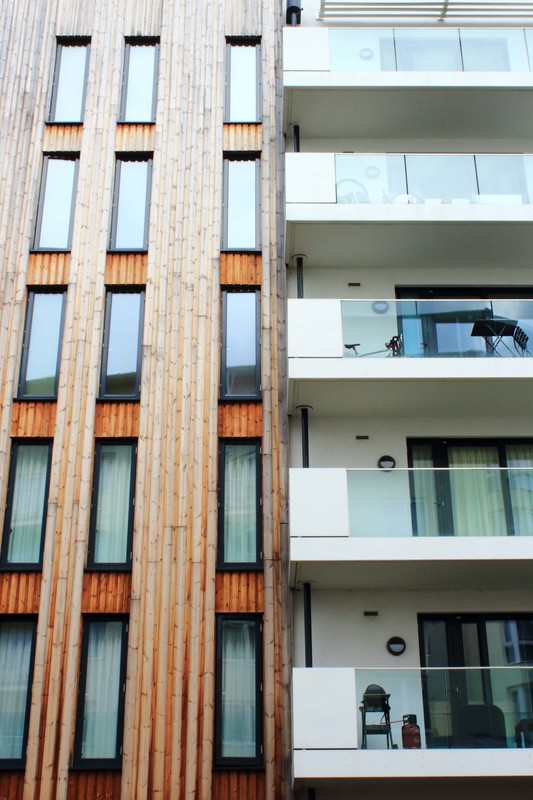
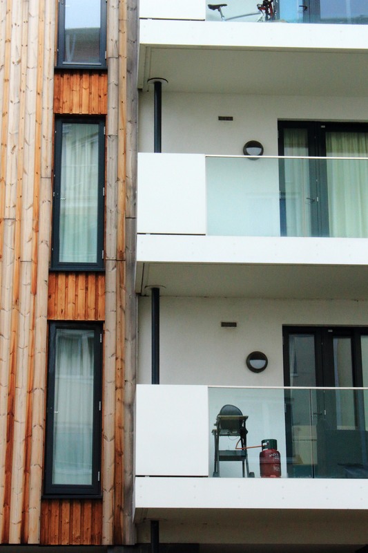
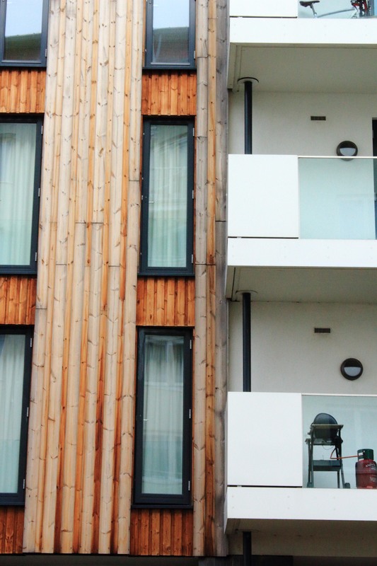
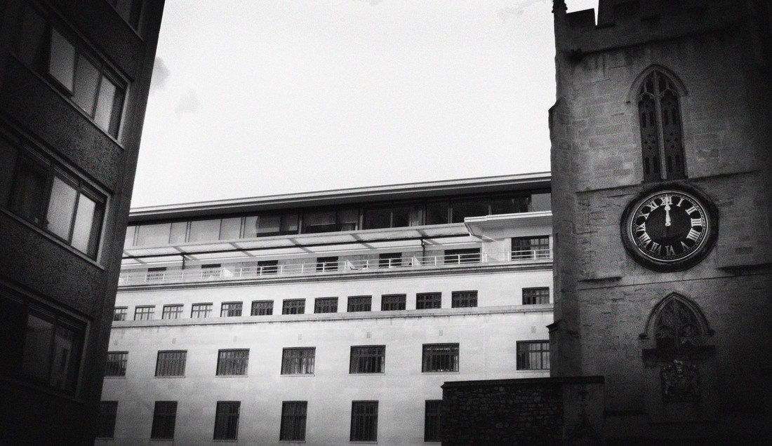
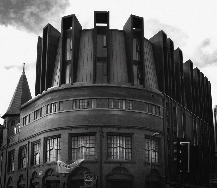
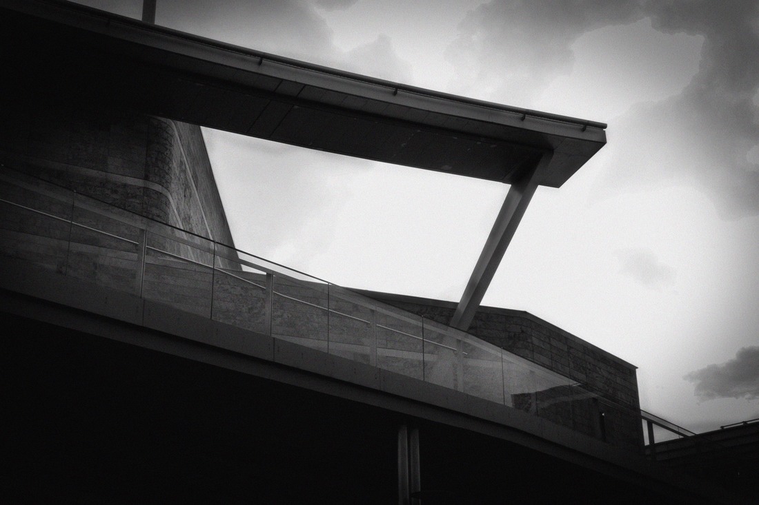
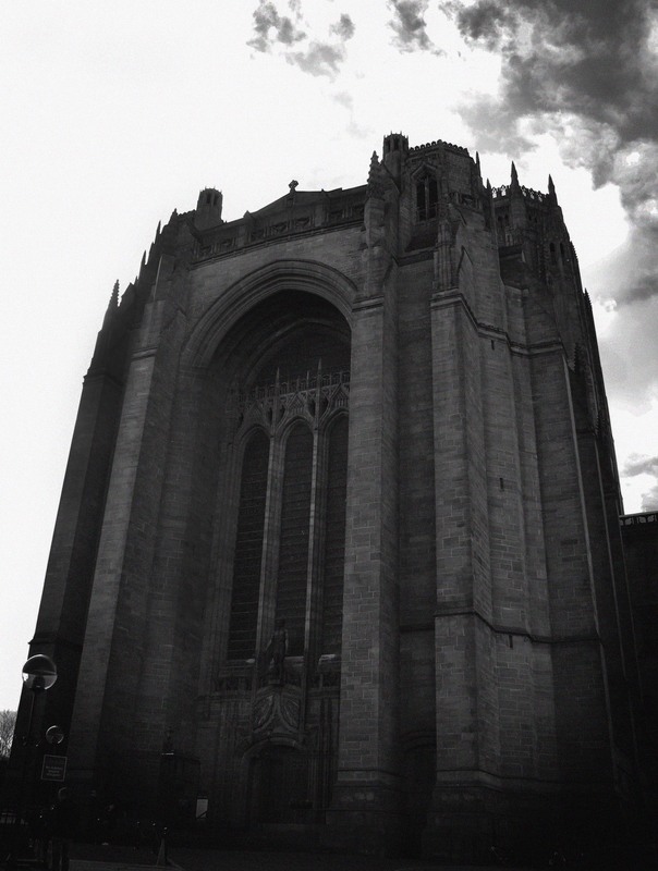
shoot eight: contrast
Plan: I plan to carry this shoot out in the cities of Bristol and Liverpool. I wish to revisit some locations where old and modern buildings were situated close to each other. I wish to try and include them in a single image to emphasise the use of line, curve, angle and arches in architectural photography. My influence for this work was the work of Richard Bryant. I will need a camera.


|
|
|
|
Critique:
WWW: I was really pleased that I was able to find locations where old and modern buildings were situated close together. I was also pleased that many of these buildings were able to reflect a single theme such as line. I think image eight does this particularly effectively as the lines in both the church and tower block are strong and reach up through the image to reach the sky however the architecture of the buildings is in sharp contrast.
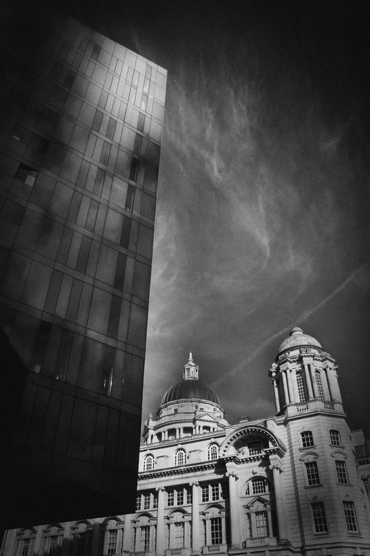
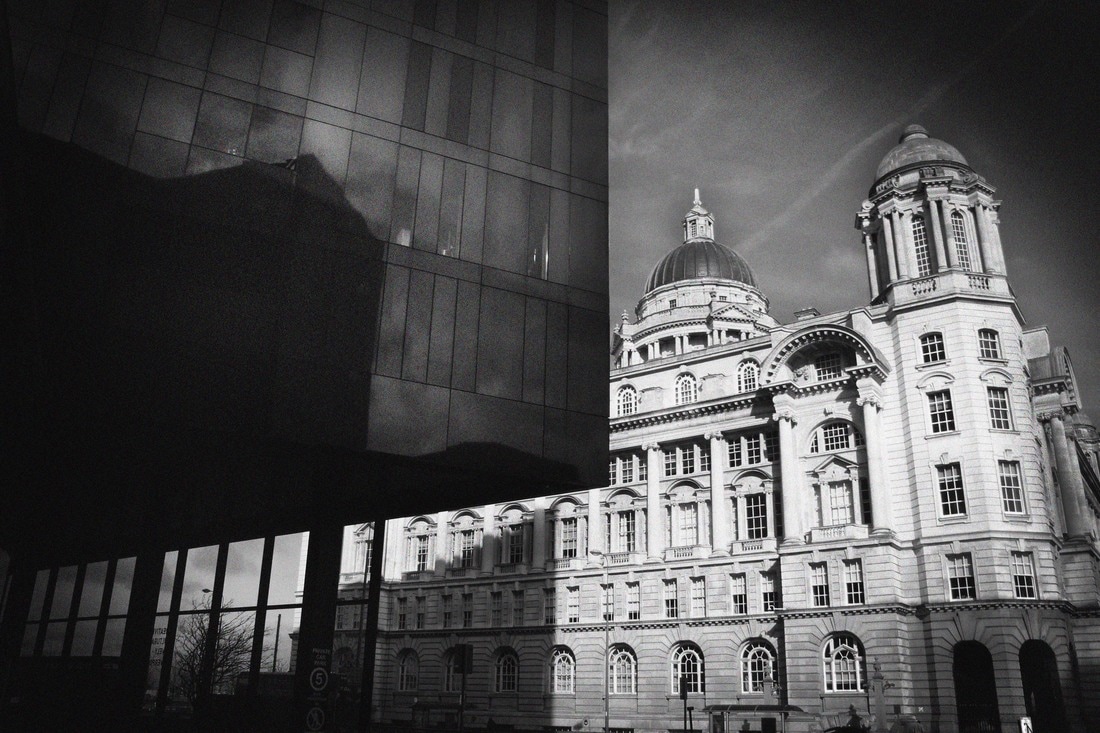
I was also especially pleased with images nine and ten from the Pier head in Liverpool as I think the contrast of old and new creates a powerful and strong image. The curves, arches and domes in the old building contrasts strongly with the sharp lines and angles in the modern building. The colour also creates contrast as the whites and pale greys in the old modern is in sharp contrast to the blacks and dark greys of the modern buildings. I also think the sky in this image further supports the use of colour as the wispy clouds create light lines in contrast to the darker clear sky behind. I think this image really reflects my exploration of the image by Richard Bryant and really reflects my interest in his work and style.
EBI: Whilst I was able to find situations and locations where old and modern buildings were positioned near each other, I still felt limited by the physical locations of these buildings. I would like to create images where a greater number of buildings fill the image however I realise that this will not be possible in the physical environment.
Next Steps: I want to explore ways in which I can manipulate my existing images either using Photoshop or by physically changing them. In order to do this I need to explore some mixed media artists for further inspiration.
WWW: I was really pleased that I was able to find locations where old and modern buildings were situated close together. I was also pleased that many of these buildings were able to reflect a single theme such as line. I think image eight does this particularly effectively as the lines in both the church and tower block are strong and reach up through the image to reach the sky however the architecture of the buildings is in sharp contrast.
I was also especially pleased with images nine and ten from the Pier head in Liverpool as I think the contrast of old and new creates a powerful and strong image. The curves, arches and domes in the old building contrasts strongly with the sharp lines and angles in the modern building. The colour also creates contrast as the whites and pale greys in the old modern is in sharp contrast to the blacks and dark greys of the modern buildings. I also think the sky in this image further supports the use of colour as the wispy clouds create light lines in contrast to the darker clear sky behind. I think this image really reflects my exploration of the image by Richard Bryant and really reflects my interest in his work and style.
EBI: Whilst I was able to find situations and locations where old and modern buildings were positioned near each other, I still felt limited by the physical locations of these buildings. I would like to create images where a greater number of buildings fill the image however I realise that this will not be possible in the physical environment.
Next Steps: I want to explore ways in which I can manipulate my existing images either using Photoshop or by physically changing them. In order to do this I need to explore some mixed media artists for further inspiration.
Mixed media artists and experimentation
As discussed earlier I am keen to move away from classic touristy images of architecture. I feel that my experimentation with lines, curves, angles, arches, monochrome and old/new contrasting buildings has helped me to do this, however I want to explore some different ways of presenting these images. I also feel that I need to experiment with ways of incorporating more examples of architecture within one image. Therefore for my next steps I am going to experiment with mixed media. I want to look at, analyse and experiment with different ways of changing, manipulating and presenting my photographs, for example painting, sewing, cutting up, montages, collages, etc.
Victoria Rick: Critical Analysis
I really like the way Victoria Rick uses collages in her photography work. I think the way she uses this technique to montage buildings together is really effective. I think her use of monochrome is really effective as it helps the images to blend and work together to create an image where all the parts work well together. This is an effect I would like to try and replicate using some of my architectural images.
I really like the way Victoria Rick uses collages in her photography work. I think the way she uses this technique to montage buildings together is really effective. I think her use of monochrome is really effective as it helps the images to blend and work together to create an image where all the parts work well together. This is an effect I would like to try and replicate using some of my architectural images.
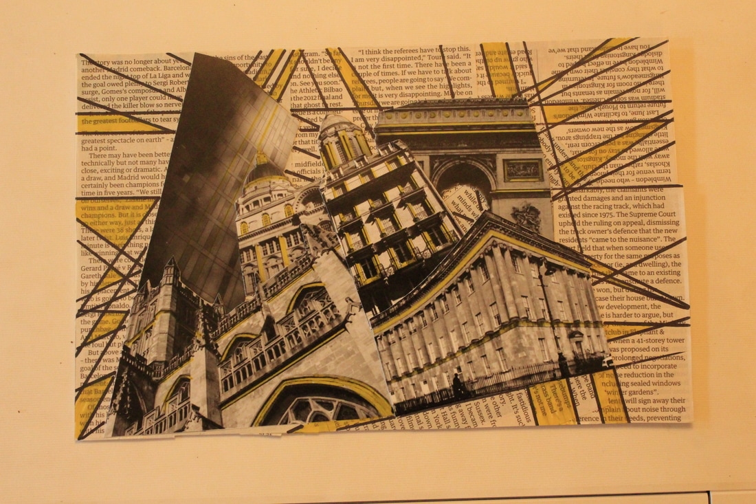
Azalea Tsunamy: Critical Analysis
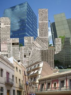
Azalea Tsunamy a Pintrest artist also uses collaging to create and present her work but she also uses mixed media pieces like newspaper. This photograph is a good example of her use of newspaper and photos together to create a collage. Newspapers can be thought of as quite urban and I like the way the artist uses newspaper with urban images, I think this is very effective. I would like to experiment with using newspaper with monochrome images, as I think the greys and blacks in the newspaper print will compliment the monochrome images.
Azalea Tsunamy a Pintrest artist also uses collaging to create and present her work but she also uses mixed media pieces like newspaper. This photograph is a good example of her use of newspaper and photos together to create a collage. Newspapers can be thought of as quite urban and I like the way the artist uses newspaper with urban images, I think this is very effective. I would like to experiment with using newspaper with monochrome images, as I think the greys and blacks in the newspaper print will compliment the monochrome images.
Photoshop Collages
I experimented with using a layering technique using Photoshop to create the following images.
I experimented with using a layering technique using Photoshop to create the following images.
Photoshop Collages Critical Analysis
I was really pleased with the success of using layering techniques to create these collages. I think the use of monochrome is very effective as it helps the images to work well together and create a good overall effect.
I think my first collage was my least effective. I did focus on one theme and I think the image reflects this as it appears disjointed and doesn't blend well to create a single overall piece. I realised this after my first collage so after that I tried to focus on a theme for each collage. In my second collage I focused on lines and angles and think was much more effective and created a much clearer and dramatic completed collage. In my third collage I focused on curves and arches and again I think this technique was very effective. In my final collage I focused on one building instead of a theme and used a collection of my images of Bath Abbey to create a non touristy collage image of Bath Abbey. I was particularly pleased with this collage as i think it fulfills my wish to create non touristy images of famous architecture.
These collages fulfilled my aim of wishing to use collage to present my architectural images and I am really pleased with them, however I do wish to explore further ways such as drawing and painting to further alter my images.
CUBISM
The collages I have begun to explore create images that are similar in some ways to those represented by cubism. These examples of cubism contain the same kind of dramatic lines and angles that I am trying to achieve in my architectural collages.
Jeff Ray: Critical Analysis
This photo was taken by Jeff Ray in 2015 and its of Saint Mary's Cathedral in San Francisco. This photograph is a mixed media piece where he used, photography, collages, painting, pen work and also wool and string (sewing). He wanted to create a "multi sensory" piece, he even composed a piece of music for the photograph. I like the way the mix media has added for texture to the photograph and its not just the basic texture of modern buildings. The texture adds more interest to the photo, the photo without the mix media could be very basic and possibly boring and maybe very similar to many other images of this building. The way the color has been added to the almost back and white photograph is effective as it gives a pop of color and makes it standout, especially the lines, contrast and edges. I like the mixed media in this artists work and want to incorporate it into my work. I want to experiment with adding black extended lines onto my photographs and also using colored paint on black and white photos like Jeff Ray.
This photo was taken by Jeff Ray in 2015 and its of Saint Mary's Cathedral in San Francisco. This photograph is a mixed media piece where he used, photography, collages, painting, pen work and also wool and string (sewing). He wanted to create a "multi sensory" piece, he even composed a piece of music for the photograph. I like the way the mix media has added for texture to the photograph and its not just the basic texture of modern buildings. The texture adds more interest to the photo, the photo without the mix media could be very basic and possibly boring and maybe very similar to many other images of this building. The way the color has been added to the almost back and white photograph is effective as it gives a pop of color and makes it standout, especially the lines, contrast and edges. I like the mixed media in this artists work and want to incorporate it into my work. I want to experiment with adding black extended lines onto my photographs and also using colored paint on black and white photos like Jeff Ray.
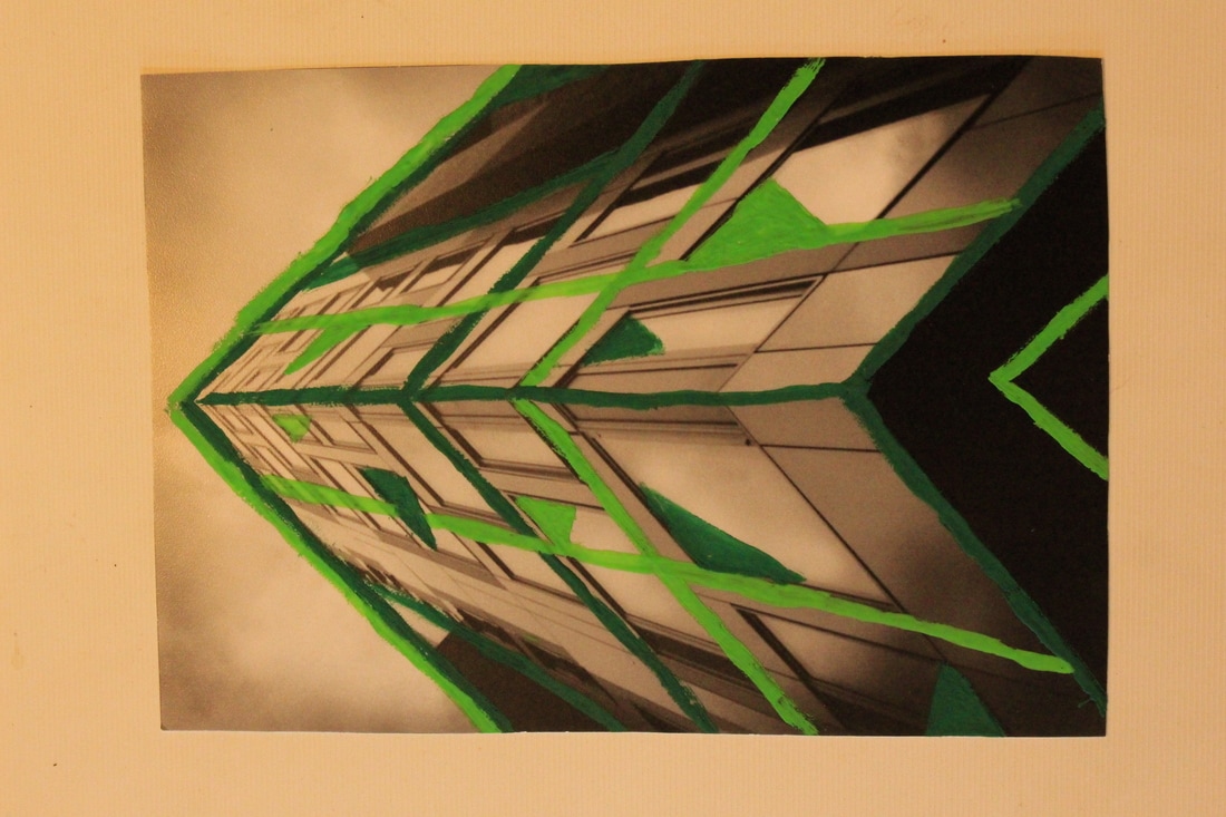
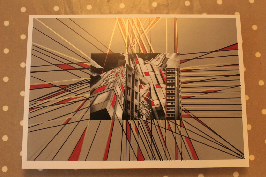
Here are some further mixed media explorations that experiment with ideas linked to Jeff Ray, Azalea Tsumnay, Victoria Rick and cubism. I printed off my Photoshop collages and a selection of single images from my shoots. I have added line, angles, curves and colour to my Photoshop images. I have used my selection of single images to create physical collages. I cut up the images and arranged them in a collage before securing them, I then added lines, angles, curves and a single pop of colour to these handmade collages.
|
|
Critical Analyses of Mixed Media Experiments
WWW: Overall I am pleased with these experimentations as they have successfully allowed me to present my architectural images in a more unusual way that reflects my interest in the work of Victoria Rick, Jeff Ray and cubism.
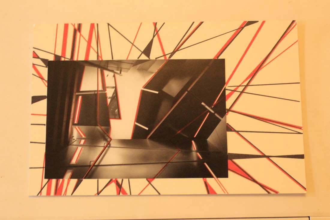
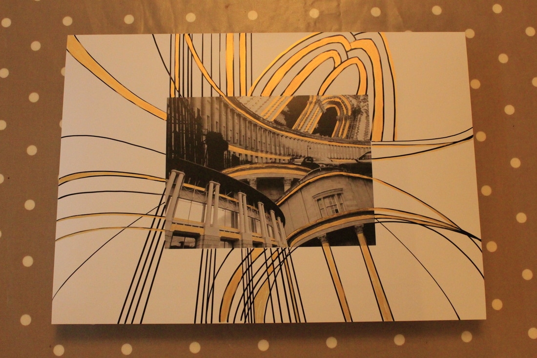
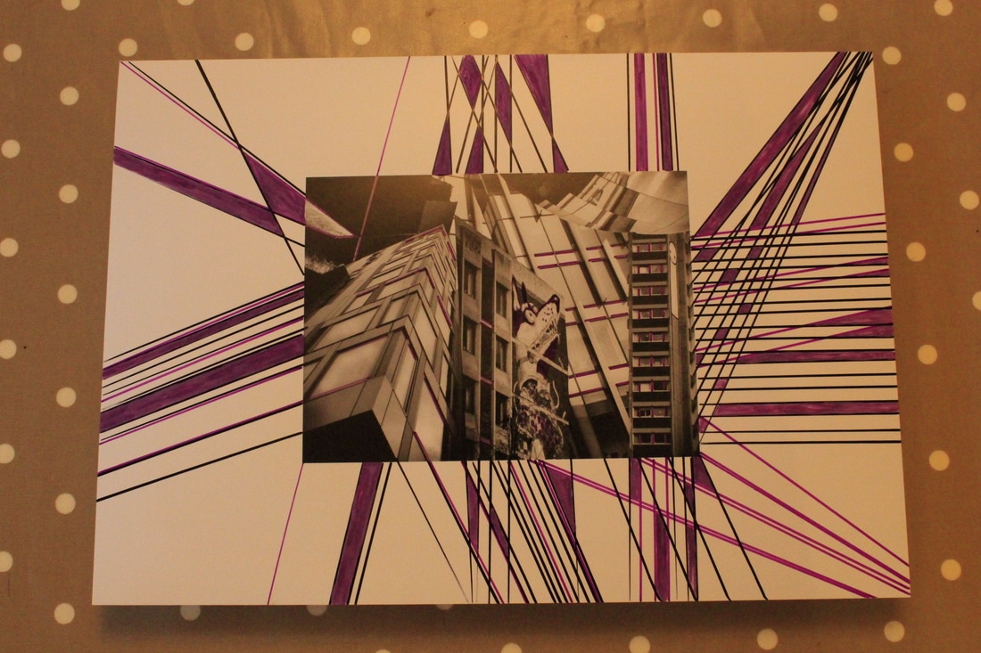
I was pleased with the way I was able to extend the lines beyond the original collage images ( see images 5 and 6) as the extension of these lines naturally draws attention to lines and angles within the images. The crossing of these lines also creates more lines and angles that compliment the lines and angles within the photographic images. I was also pleased with the way I was able to use these created shapes to add colour to the collage image as I felt this really reflected the work of Jeff Ray. I was also pleased that I was successfully able to add colour with either paint or pen. This technique also worked successfully on single images to emphasise the line and angles within an image. This worked particularly successfully with image 3 of a modern stairwell. I was less pleased with the harsh line around the edges of these collages as I feel it didn't help the extended lines, angle and use of colour to blend with the original collage image. For this reason I wanted to try making a collage with a softer less harsh edge.
I therefore decided to print several different images from my collection of architectural images and cut them up to make a physical handmade collage (see images 1 and 2). I preferred the less harsh line around these collages and I was pleased that I was still able to successfully extend the lines beyond the edge of the collage to make more lines, shapes and colours.
EBI: Although I was happy with the collages which focused on curves and arches it was much harder to successfully and neatly extend the lines beyond the collages as curved lines were much harder to draw freehand. I feel the collages which focused on lines and angles were easier to draw neatly and effectively.
I was also unsure about a harsh white background around the collages for the line extension as I felt this was in too much of a contrast to the shades of grey within the monochrome collages.
Next Steps: I feel I need to explore ways of creating a different background which better reflects the grey tones within the monochrome collages. I also think I need to explore this with both Photoshop and handmade collages. As I think I will focus on lines and angles within my final collage I also need to collect more architectural images which reflect this theme.
WWW: Overall I am pleased with these experimentations as they have successfully allowed me to present my architectural images in a more unusual way that reflects my interest in the work of Victoria Rick, Jeff Ray and cubism.
I was pleased with the way I was able to extend the lines beyond the original collage images ( see images 5 and 6) as the extension of these lines naturally draws attention to lines and angles within the images. The crossing of these lines also creates more lines and angles that compliment the lines and angles within the photographic images. I was also pleased with the way I was able to use these created shapes to add colour to the collage image as I felt this really reflected the work of Jeff Ray. I was also pleased that I was successfully able to add colour with either paint or pen. This technique also worked successfully on single images to emphasise the line and angles within an image. This worked particularly successfully with image 3 of a modern stairwell. I was less pleased with the harsh line around the edges of these collages as I feel it didn't help the extended lines, angle and use of colour to blend with the original collage image. For this reason I wanted to try making a collage with a softer less harsh edge.
I therefore decided to print several different images from my collection of architectural images and cut them up to make a physical handmade collage (see images 1 and 2). I preferred the less harsh line around these collages and I was pleased that I was still able to successfully extend the lines beyond the edge of the collage to make more lines, shapes and colours.
EBI: Although I was happy with the collages which focused on curves and arches it was much harder to successfully and neatly extend the lines beyond the collages as curved lines were much harder to draw freehand. I feel the collages which focused on lines and angles were easier to draw neatly and effectively.
I was also unsure about a harsh white background around the collages for the line extension as I felt this was in too much of a contrast to the shades of grey within the monochrome collages.
Next Steps: I feel I need to explore ways of creating a different background which better reflects the grey tones within the monochrome collages. I also think I need to explore this with both Photoshop and handmade collages. As I think I will focus on lines and angles within my final collage I also need to collect more architectural images which reflect this theme.
shoot nine
Plan: I wish to create a collage for my final image but feel that I need further examples of images reflecting my focuses for this project if I am going to be able to create a rich dense collage. Therefore I need to shoot more images of line, angle and curve in architecture which reflect both old and modern buildings. I don't wish to repeat images of buildings I have previously shot so I need to find a new location.
I am planning to visit Liverpool and hope to use this opportunity to shoot new images that I can blend with my previous successful images to create more collages which I can then work on further by adding further newspaper collage, pen, paint and colour work. I therefore need to find images that will compliment the images I have already collected.
Here are the images I shot in Liverpool.
|
|
Critical Analysis:
I was very pleased with the variety of locations I was able to find and the images I was able to take during my Liverpool shoot. I feel that this shoot gave me the opportunity to find many more images that work well to emphasise line and angle in monochrome images. I also feel that the monochrome editing of these images has helped to emphasise the dramatic lines and angles in these images.
Next Steps:
Now that I have a greater number of images I need to carry out some final mixed media experiments before planning and creating my final piece.
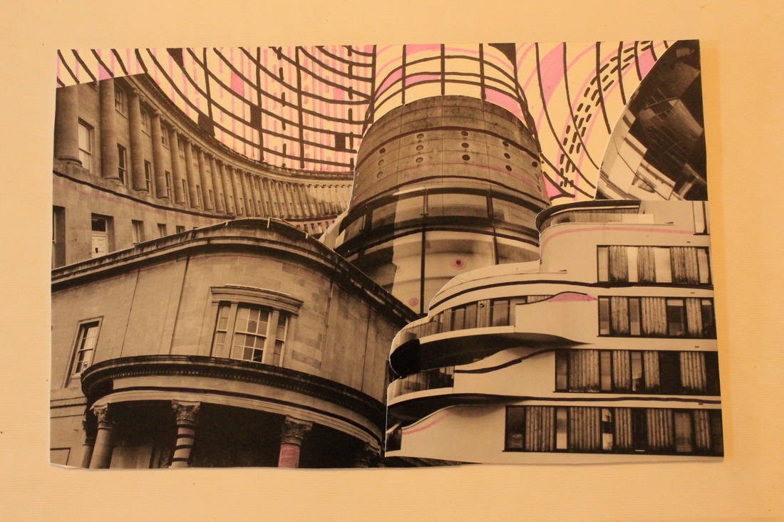
more Mix media experimentation
Plan: For my next mixed media experimentation I plan to explore collages on grey and newspaper backgrounds. I want to explore the effectiveness of this with both a Photoshop and handmade collage. I want to continue extending the lines of these collages to help me add colour.
|
|
Critical Analysis
WWW: I was really pleased with the grey and newspaper backgrounds as I think both work well with the monochrome shades in the images and do not have the sharp harsh boundary made by my previous white background. I also think the grey and silver extension lines work well on the second Photoshop collage. I think both of these experiments help to further develop my interest in creating collage work that reflects the my interest in cubism and in the work of photgraphers and artists Jeff Ray and Victoria Rick.
EBI: Whilst I was happy with the images in the handmade collage I think a bigger collage with more images on a more focused theme would be even more effective. Next Steps: To search through my architectural images to create a larger collection of themed images to use in a collage. To create a list of clear objectives for my final image.
Final PIECE ideas
My previous shoots and mixed media experimentations have helped me to understand and develop the elements that I wish to incorporate in my final piece. I wish to create a final image that incorporates the following elements:
- Monochrome images which focus on line and angle.
- A handmade collage which creates an uneven boundary line.
- A collage which reflects my interest in cubism.
- A mixture of old and modern buildings to create contrast in the collage.
- A grey and/or newspaper background for the handmade collage.
- Use of pen and paint to extend the lines and angles within the collage.
- The addition of a single colour to highlight the shapes created by the extended lines and key lines within the images.
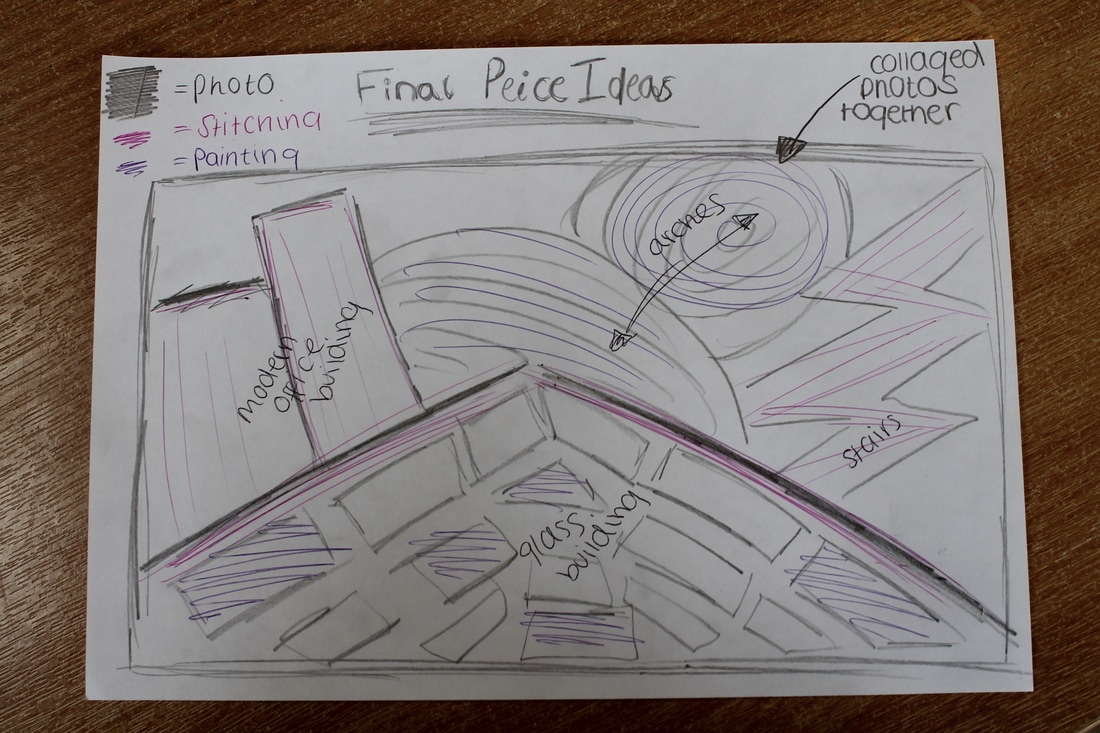
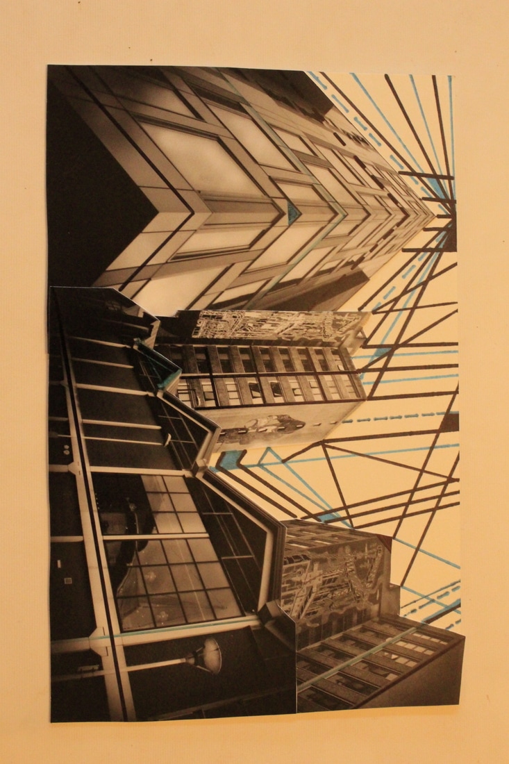
IDEA 1: In this idea I would collage together a mixture of old and new photographs of architecture. The main feature on the photograph being the glass building from shoot seven. When I have done this on Photoshop I am going to print it off. When it is printed of I am going to paint and sew into it to emphasize the curves, lines and contrast.
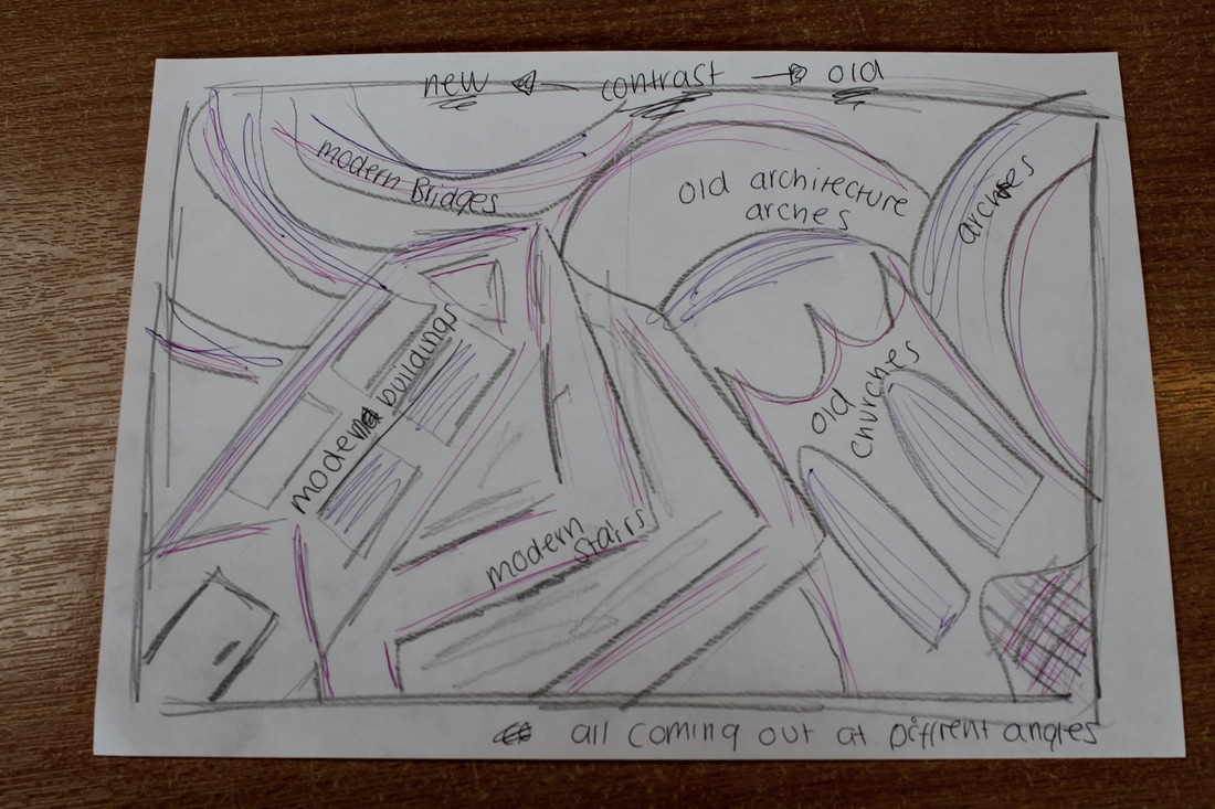
IDEA 2: For this idea I am going to collage photographs together on Photoshop, one side of the edit will be new architecture and the other old and they will blend together in the middle. The architecture will come out from all different angles. I will then print it off and work into it by sewing and painting onto it. This will emphasize the angles, lines, curves and contrast in the photographs.
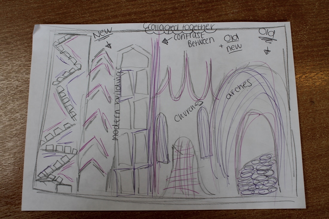
IDEA 3: For this idea I am going to collage the photographs together, one side of the edit being new and the other old and they meet together in the middle. All the buildings/architecture will come out from the bottom of the photograph. Then I will print it off and work into it by sewing and painting. This will help exaggerate the curves, lines and contrast.
final piece
Plan:
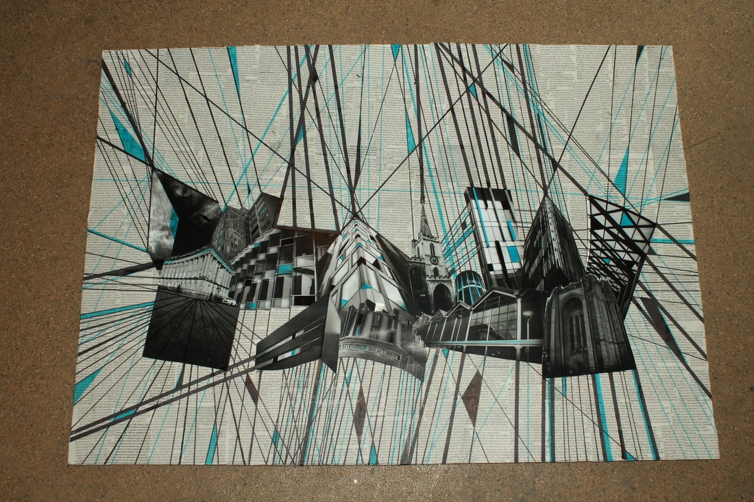
I plan to create a large A2 collage piece. I intend to create the background using ripped, torn and cut newspaper pieces. This will create a background with tones that will blend well with my monochrome images and the urban theme of newspaper will work well with my urban architectural images. This also reflects my exploration of the work of Azalea Tsunamy. I then intend to cut up a wide variety of monochrome architectural images that focus on lines and angles and use these to create a handmade collage with and uneven border. Within this collage I aim to include examples of both modern and old architecture, my collage creation should therefore reflect my interest and work on the photographers Victoria Rick, Ezra Stoller and Richard Bryant. After the collage is finished I aim to use pen to extend the key lines within the collage into the newspaper background area. These extended lines should create new shapes and patterns that will allow me to carefully add a pop of single color. Finally I will add this new pop of color to the architectural images within my collage. I hope that this final stage of my collage will reflect my interest in the work of Jeff Ray. I also want my final piece to show elements of cubism and my research into it, I think drawing the lines onto the photograph will show this.
I plan to create a large A2 collage piece. I intend to create the background using ripped, torn and cut newspaper pieces. This will create a background with tones that will blend well with my monochrome images and the urban theme of newspaper will work well with my urban architectural images. This also reflects my exploration of the work of Azalea Tsunamy. I then intend to cut up a wide variety of monochrome architectural images that focus on lines and angles and use these to create a handmade collage with and uneven border. Within this collage I aim to include examples of both modern and old architecture, my collage creation should therefore reflect my interest and work on the photographers Victoria Rick, Ezra Stoller and Richard Bryant. After the collage is finished I aim to use pen to extend the key lines within the collage into the newspaper background area. These extended lines should create new shapes and patterns that will allow me to carefully add a pop of single color. Finally I will add this new pop of color to the architectural images within my collage. I hope that this final stage of my collage will reflect my interest in the work of Jeff Ray. I also want my final piece to show elements of cubism and my research into it, I think drawing the lines onto the photograph will show this.
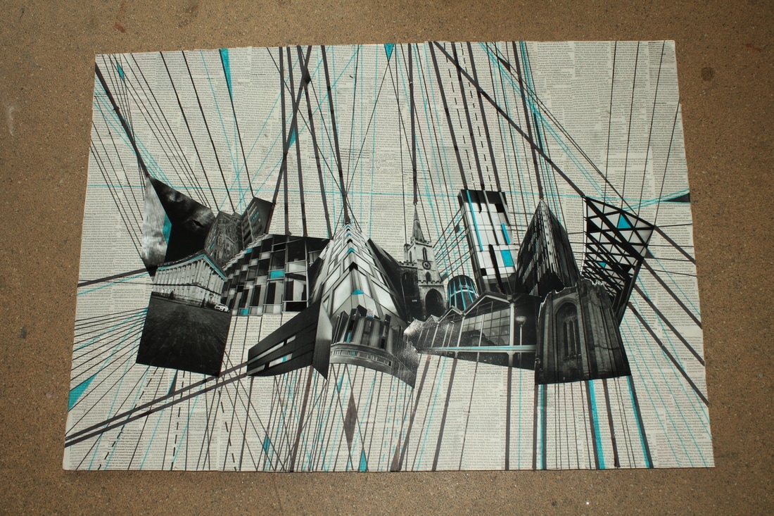
Critical Analysis:
I have successfully grouped together all my ideas to produce a final piece. I initially wished to create a piece that looked at famous architecture but in a non tourist way, I think I have achieved this. I have looked at different ways of photographing architecture and different aspects of architecture through out my project, then for my final piece I came to the conclusion that line and angles were the most effective. I have been inspired by all the artist I have looked at and used them for inspiration and influence in my final piece. I used Frederick H Evans as a influence in my work as I chose to do do angles and lines in my final piece and also have it in monochrome like his own work, he uses strong lines within his work also. I was also influenced by Richard Bryant to include old and new/modern architecture and to look at the contrast between the two, therefore in my final piece I had old and new architecture included in it. For my photographs again I was also inspired by Ezra Stoller and his use of unusual and dramatic camera angles, I used this in my final piece in some of the photographs I took (tower building-triangular). As well as being inspired by the way he takes his photos I was also influenced by the way he edits and I aimed in some of my photos for my final piece to edit my photographs like him, he uses lots of contrast in his editing to make the lines really stand out. The more experimental and mix media ideas in my final piece were inspired by Victoria Rick, Azalea Tsunamy and Jeff Ray. The collage element of my final piece was inspired by Victoria Rick as in her work she collages buildings together and I wanted to include this in my final piece. The newspaper element in my final piece was inspired by Azalea Tsunamy, as she used newspaper in some of her work, she uses it to emphasize architecture, I wanted to try this in my work by having newspaper as the background on the final piece. Jeff Ray influenced me to look at different ways of manipulating my photographs by using things like pen and paint, so therefore in my final piece I used pen to extend the lines in the architecture. My final image also reflects my research into cubism and it includes some elements of cubism within it.
WWW: Work is successful in fulfilling both initial and developing aim to create a non touristy image of famous architecture which represents a specific aspect of architectural design i.e. lines and angles. Final piece does this by blending dramatic lines, angles and camera angles from famous old and modern architectural images from Bath, Bristol, Paris and Liverpool whilst taking inspiration from a wide variety of different photographers and artists. I think the newspaper background was particularly effective, and its helped to blend with the monochrome photos instead of having just a harsh white background. The use of the pen lines inspired by Jeff Ray are also particularity successful as it lengthens the architecture and continues the lines on.
EBI: To improve I think the dotted lines are not as effective as the solid lines on the final image and I think it would look more effective if the lines were solid. I also think more lines could be added to make the final piece look more dramatic and effective. Also I think the colored in parts of the final piece were particularly effective and I think the overall piece would look more effective if there were more colored in elements to it.
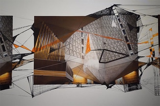
final Piece - refined
I want to develop my final piece to improve it. I want to add more solid lines to the piece, to emphasize the lines and angles within the buildings more. I also want to make the dotted lines solid as I feel it will be more effective and make it more dramatic. I am also going to add more colored in areas as I think it will make the final piece look better and will make it more interesting to look at. I need to re stick some of the newspaper back down as well as it is coming up at some points.
Critical Analysis:
WWW: The added lines create a dramatic and more effective look, making the piece overall much more successful. The extra lines add to the theme of lines and angles that I was aiming for in the final piece. The more colored in parts are also successful as they add more depth to the piece and fills blank spaces making it more interesting.
EBI: To improve if I were to do it again I would try to make the lines more precise as some lines bled. I would also color more carefully as some of the color went wrong in some places. The photograph in the bottom left corner is not effective and I feel does not look good within the collage. The photograph has a very solid clean cut edge and it doesn't work in the collage, if I were to do its again I would use a different photograph along the bottom of the collage.
evaluation of project-architecture
I started my project my looking at all different types of architecture photography, looking at the different ways architecture is photographed and the aspects it has within it. I started by making a mind map (which I later refined) and a mood board, which helped with my initial ideas. I conducted a shoot in Paris, to experiment with architecture photography, the photos were quite boring and generic, it made be realize I needed to look at different angles and details, to look at it in a different perspective. This helped me to find the artist Fredrick H Evens, I liked his work, use of line and his use of monochrome, but I still wanted to experiment with color at this point. I conducted four more shoots, though out these shoots I realized that black and white was the most effective with my architecture photography and that I wanted to continue the theme of black and white. After shoot two I also produced a refined mind map to help focus my ideas, and help me look at different aspects of architecture. I also explored many different aspects of architecture, line, angles, detail, ect. I then went on to look at another artist to look for more ideas and inspiration, I found a photographer called Ezra Stoller. His work was very different to Fredrick H Evans, but I wanted to incorporate his work into mine. Ezra Stollers uses very different angles and perspectives which I liked and wanted to explore. I also liked the way he edited, he used lots of contrast in his editing, this was different to how I was editing mine. I wanted to experiment with the way he edited as I think my editing before was slightly dull. I did a photo shoot that was inspired my Ezra Stoller, which was slightly successful but not completely, the editing wasn't quite right. So I conducted another shoot, aiming to edit my photos more successfully in the style of Ezra Stoller, this went well and was extremely effective, the editing was much better and in the style of Ezra Stoller. My photographs had developed by looking at Fredrick H Evans and Ezra Stoller. I still wanted to get some more inspiration, so I researched another photographer called Richard Bryant. Richard Bryant although didn't look at black and white photography he looked at a different aspect of architecture that I had not yet explored. He looked at contrast especially between old and new, I found this interesting as I had been taking photographs of both old and new architecture and felt it may be a way to blend the two. After researching him I conducted a shoot inspired by him, where I looked at the contrast between old and new/modern architecture. This shoot was successful as I brought together ideas and inspirations from all artists, I edited like Ezra Stoller, photographed contrast like Richard Bryant and used black and white photography like Fredrick H Evans. I then felt I need to look at some more artists and ways of developing my ideas for architecture photography. When looking and researching for new ideas and artist, I saw the use of collages in architectural photography, I thought it was very effective and intriguing and I wanted to look more into it. When looking at colleged architecture photographs I found some artist that I liked and that inspired me. The first artists and photographer I found was Victoria Rick, she uses collages to present her work, she collages together different city buildings and she does this in monochrome which i liked as it fitted with my work that I had already previously done. I also came across a pinterest artist that I liked who also used collages in her work and also mix media (which I experimented with later on), her name is Azalea Tsunamy. I liked the way this artists left the sky in her work and was not all buildings she had some space in her collages where there were no buildings. From looking at these artists and photographs I created some collages using Photoshop, I used the layers on Photoshop to create this. Some of these were effective however some were not effective at all and looked like a jumble of buildings. I felt it may be more effective to collage the pictures together by hand (which later on I explored). I then wanted to explore more ways of using collages and experimenting with my photos, so I did some more research. I found cubism which I felt was interesting and would work well if incorporated into my project, I created a mood board for cubism to help develop my ideas. I also found and artist and photographer called Jeff Ray, I really liked his work as he used architecture photography and mix media together. I like the way he used different things in his work like pen and paint. It was similar to the pinterest artist Azalea Tsunamy who also used mix media in her work but she used newspaper. I then wanted to experiment with using mix media with the photographs I had done. So I conducted a shoot were I used singular photographs I had taken (my most successful ones so far), the collages I did on Photoshop and then I also made some collages from photos I had taken previously bu cutting up and sticking to make the collages. After this I used pen and paint to work into the photographs and extend the lines, using one color, just like Jeff Ray did. These were effective and successful but there was something missing from them, the background were plain. I then went onto conduct another shoot inspired by Ezra Stoller, Fredrick H Evans and Richard Bryant, to make sure I had more photographs to work with as I felt my final piece was going to be a collage. This shoot was very successful, as in incorporated all of my inspirations from artists and different aspects of architecture. I then felt from my last mix media shoot, where I felt the background were plain, that I needed to conduct another one. In this shoot I used newspaper like Azalea Tsunamy a background where I then hand collage photos on to and also I used on of my Photoshop collages on a grey background. I then to both used Jeff Rays ideas and influence and I drew lines and extended lines with the collages. I found that that the handmade collage with a newspaper background was the most effective and that, that is what I wanted to do for my final piece. I then went onto sketch some final ideas and bullet point ideas for my final piece. The I wrote a plan for my final piece and the conducted it. Id decided to focus on line and angle as I felt it was most successful when I was doing the mix media pieces as curves was not as effective. I started by covering a A2 piece of paper in cut up pieces of newspaper just like my second mix media shoot, this was inspired my Azalea Tsunamy. I then collaged my best photographs from my shoots I had taken in previous shoots, I chose the ones with lines and angles, the photos I chose were in the style of, edited and inspired and influenced by Fredrick H Evens and Ezra Stoller. I also chose old and new architecture this was inspired by Richard Bryant. Then I started using pen to extend and emphasize line, this was inspired by Jeff Ray. Once I had finished it I analysed it and then went on to develop it more. Overall I think my project was successful and I produced a successful final piece. I used inspirations from many different artists to produce a unique and different final outcome.
AO1:
WWW: I created mind-maps which I refined to develop my ideas. They were detailed which helped with my development of ideas as well. I critically analysed artists and their work which helped me understand their work and produce my own ideas. I also explained the process and techniques I was unseeing through out.
EBI: I could of looked into more mix media artists to help by further my own ideas and refine them. I think this would of helped me develop my mix media ideas further.
AO2:
WWW: I produced nine shoot, each developing my ideas through out. I used a variety of editing techniques and also other processes and techniques.
EBI: I could of done some more shoots using mix media. I could of created step by step guides of how I did some of the processes.
AO3:
WWW: I created mood boards and mind maps to show my ideas and the refined them to help my ideas develop.
EBI: I could of used more words in my mind maps as it may of helped me heave a clearer picture and idea of where I wanted to go.
AO4:
WWW: I produced an effective and successful final piece that has developed through all my ideas. The piece is influenced and inspired by all my artist and has developed from my initial idea.
EBI: Some of the photos at the bottom had harsh lines which did not look effective if I were to do it again I would of changed this. Possibly if I were to of done it again I would use more mix media things for example sewing and painting.
